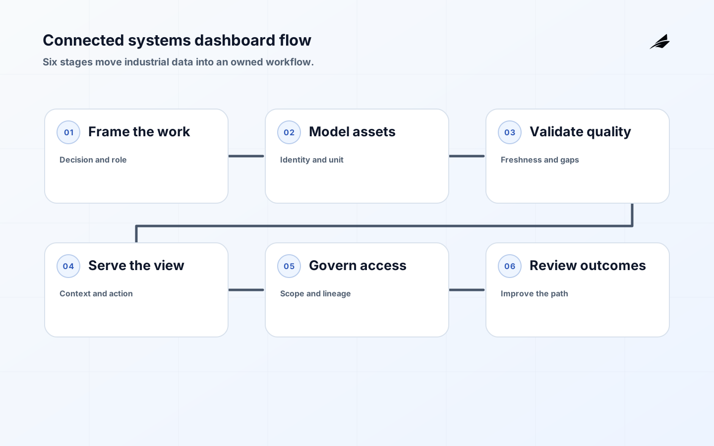
Industrial dashboards for connected systems are most useful when they make a distributed operation legible. The dashboard should connect a measurement to an asset, an asset to a condition, and a condition to an owned action. That sounds simple until data arrives late, units differ, assets are renamed, or a metric is calculated from several sources. AWS IoT SiteWise describes a model for collecting and organizing industrial data, while the product decision remains local: which operational question deserves a view, what evidence is sufficient, and how will a person respond? This guide uses that distinction to move from dashboard selection to a dependable connected-systems workflow.
Start with work, not widgets
Interview the person who will use the dashboard during a normal shift and during an exception. Capture the decision, cadence, handoff, and consequence. A reliability lead may need a fleet-level view to choose inspection priorities; a line supervisor may need a minute-by-minute view of one process; an executive may need a weekly trend with confidence and context. Combining all three into one page creates noise and ambiguous ownership. Make the first version answer one question with one next action. Then define which information must be visible without hovering, exporting, or asking an engineer to interpret it.
| Use case | Useful primary view | Do not hide |
|---|---|---|
| Shift handoff | Current state and unresolved exceptions | Age, owner, and last confirmation |
| Maintenance triage | Assets ranked by evidence and impact | Measurement quality and inspection status |
| Process review | Trend, baseline, and comparison | Unit, window, and calculation rule |
| Leadership | Outcome and risk summary | Scope, confidence, and source date |
Build an asset and measurement model
The dashboard should not infer asset identity from a display label. Use stable identifiers and a hierarchy that represents the operation: site, area, line, machine, component, and measurement. Store unit, sampling interval, calibration or quality state, source, observed time, and ingestion time. Keep a change history when a sensor moves or a label changes. AWS IoT SiteWise is a useful official reference for asset models and industrial measurements; OPC UA offers another vocabulary for information modelling. The dashboard becomes trustworthy when a user can tell whether a change is physical, semantic, or caused by the data path.
Make freshness and quality visible
Never present a value without its age and quality state when freshness affects the decision. Distinguish current, delayed, stale, estimated, interpolated, missing, and invalid. A blank tile might mean no events, a broken query, or an intentional filter; a labelled state is safer. Calculate freshness from observed and received times, and set the limit from the work rather than from a convenient polling interval. A maintenance decision may tolerate an hour; a safety-adjacent control-room view may not. Link the quality state to an owner and next check, not only to a colour.
Choose the right data path
Separate telemetry transport, operational state, historical analysis, and dashboard delivery when they have different requirements. MQTT is effective for publish and subscribe messaging, but the dashboard’s query model may be a time-series store, a relational projection, or a curated warehouse. Do not build an expensive cross-system query for every tile. Materialize the decision-ready fields, preserve lineage to the source, and version calculations. MQTT 5.0 clarifies the messaging boundary; your design must still decide which downstream system is authoritative for the business result.
Use a representative slice for design: one site, two asset types, one normal period, one maintenance event, and one data gap. Trace a value from message to chart and verify the unit, time zone, aggregation, filter, and access scope. This is where teams discover that a “daily average” includes missing intervals or that two machines share a human-readable label. A small trace is more useful than a large screenshot review. Compare the result with how founders should think about industrial dashboards, what changes when MQTT brokers move into production, and what changes when industrial dashboards move into production before expanding sources.
Secure and govern the view
Access should follow operational scope. A plant user may see one site, a reliability group several sites, and a central administrator configuration without unrestricted payload access. Check permissions server-side for every query and state-changing action. If the dashboard can acknowledge, assign, or close an exception, retain actor, time, target, previous state, and reason. NIST operational technology security guidance can help teams reason about the protection boundary, while the OpenTelemetry Logs Data Model helps make audit evidence consistent. Governance should be visible where a user makes the decision.
| Control | Implementation choice | Measure |
|---|---|---|
| Data quality | State plus age beside each decision metric | Unknown and stale minutes |
| Lineage | Source and calculation version on demand | Untraceable result count |
| Access | Role and asset scope on every request | Denied and overbroad attempts |
| Change | Review threshold, unit, and model edits | Unreviewed definition changes |
Run the connected view as a supportable service
Assign owners for ingestion, semantic definitions, access policy, interface support, and decision outcomes. Create a runbook for a stale feed, a duplicated asset, a bad unit, a failed backfill, and a disputed calculation. Monitor dashboard latency, source freshness, query errors, stale-state duration, user acknowledgement, and manual exports. Review the oldest unresolved exception with the person who can repair the source or the rule. A dashboard that shows a problem but cannot help the organization resolve it becomes an expensive noticeboard. The operating routine should feed the next release with evidence about what users miss, ignore, or misunderstand.
Measure the result
Measure completed decisions rather than screen activity alone. Useful outcomes include shorter time from detection to inspection, fewer duplicate checks, fewer manual corrections, faster shift handoff, and lower time spent reconciling reports. Pair those with trust measures: percentage of metrics with an owner, source freshness compliance, correction age, and unresolved data-quality exceptions. Segment results by site and asset type so strong performance in one area does not hide a broken integration elsewhere. If the dashboard cannot improve one measurable behaviour, narrow the scope or revisit the decision definition before adding more charts.
Use a staged delivery sequence
- Write the decision brief and acceptance evidence.
- Map assets, measurements, units, identities, owners, and source health.
- Build one traceable data path with explicit stale and missing states.
- Test access and exception workflows with real operators.
- Run a controlled review cycle and compare decisions before and after.
- Expand sources only when support and correction ownership are ready.
Implementation checks for the first connected view
A useful implementation review follows one value through the entire system with an operator watching. Start at the physical or logical source, confirm identity and unit, inspect validation, compare stored and displayed timestamps, and verify the access scope. Repeat with a late message, an invalid unit, a renamed asset, and an empty interval. If the result changes without a visible explanation, the model or interface needs another state. This exercise turns abstract data quality into a concrete support habit.
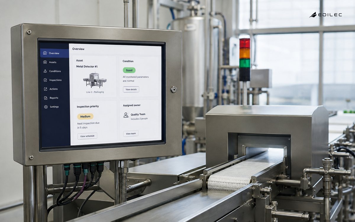
When the first slice is stable, ask what the team still does outside the dashboard. Manual exports, screenshots in chat, duplicate inspection lists, and verbal corrections are clues about missing workflow design. Do not automatically automate every workaround. Choose the one that creates the most risk or wasted time, then add the smallest change that makes ownership and evidence clearer. The founder’s industrial dashboard guide helps frame that choice around the decision rather than the interface.
- Reconcile a displayed result with the source and transformation version.
- Test a stale result and a corrected result with the person who acts on it.
- Record the manual workaround that the next release should remove.
- Keep a decision owner for every new metric and alert.
Scenario review before the first dashboard
Before building the loop, ask a small group to run the scenario matrix end to end. Include a direct request, an ambiguous observation, a duplicate, a sensitive report, an urgent issue, and a request the team will decline. For each dashboard scenario, confirm the asset owner, data lineage, permission, next action, communication, and measure. This exercise exposes missing fields and unclear authority while the cost of change is low. It gives operations, product, engineering, and support a common vocabulary for the first connected view.
Treat the first dashboard release as a measurement instrument. Choose one asset group, one decision, and one review cadence. Avoid modelling every site before the team has traced real readings, late events, and corrected values. The industrial dashboard guide for founders can inform the next stage, while this connected-systems scope should make the first metric traceable and the first operator action reversible.
- Name the problem and customer job the first loop will support.
- Test the data contract with real examples before designing every field.
- Record who can prioritise, escalate, communicate, and close.
- Define the post-release evidence that would change the roadmap.
Key takeaways
- A connected-systems dashboard should answer a named operating question.
- Stable identity, unit, time, quality, and lineage matter more than widget count.
- Freshness must be visible where it changes the decision.
- Access and correction history belong inside the workflow.
- Measure decisions and trust, then scale with evidence.
Frequently asked questions
Do I need a complete asset model before building a dashboard?
You need a complete model for the first decision slice, not necessarily for every site. Start with the hierarchy, identity, units, owners, and quality states required to trace and operate that slice safely.
How should dashboard refresh intervals be chosen?
Tie the interval and stale limit to the decision’s response window. Use observed and received times, and show the state when the limit is exceeded rather than silently reusing an old value.
Which KPI proves an industrial dashboard works?
Choose a decision outcome such as faster inspection or fewer reconciliation hours, then pair it with data-quality and ownership measures. Dashboard visits alone are not evidence of value.
Conclusion
Industrial dashboards for connected systems succeed when they turn traceable data into owned action. Keep the model explicit, show uncertainty, secure the decision boundary, and operate the dashboard with a recovery routine. A narrower, trustworthy view will improve more work than a broad catalogue of unowned metrics.