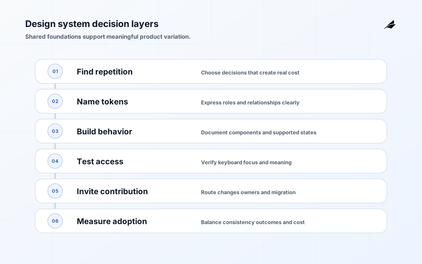
A design systems guide should begin with a shared way to make product decisions. A design system can include colors, spacing, typography, components, code, content guidance, accessibility rules, examples, and contribution practices, but its value is not the number of assets in a catalog. The value is that several teams can solve similar interaction problems with consistent behavior while still expressing the specific context of their product and users.
The plain-language test is simple: can a designer or engineer explain why a pattern exists, when it is safe, what states it supports, how it behaves for keyboard and assistive technology users, and who can change it? If the answer is only “copy this component,” the organization has a library, not a durable system. Start with repeated decisions that create defects or slow delivery, then document and implement the smallest shared rule that improves them.
For product context, pair this guide with Edilec's internal tool UX guide, internal tool pre-build decisions, React state design checklist, and technical debt checklist. A good system reduces accidental inconsistency without hiding workflow state or creating another maintenance burden.
Start with repeated decisions, not a catalog
Inventory the decisions teams repeat: how focus looks, how errors are written, how a destructive action is confirmed, how a table shows pending data, how spacing changes at a breakpoint, or how a disabled control explains its reason. Choose a domain where inconsistency causes real cost, such as account settings, operations screens, or forms. Describe the current variants and the user consequence before proposing a universal component.
Keep product semantics separate from visual sameness. A warning in a payment workflow may need stronger evidence and approval than a warning in a profile form. A data table used for investigation needs different density and keyboard behavior from a marketing comparison table. The system should offer a shared foundation and a way to declare meaningful variation. Otherwise teams either fork the system or force a generic pattern that makes the product less clear.
| System layer | Shared decision | Product-specific decision |
|---|---|---|
| Token | Color role, spacing scale, type step | Brand expression or risk emphasis |
| Primitive | Focus, label, input, icon behavior | Data fields and domain terminology |
| Pattern | Error, approval, pagination, empty state | Workflow states and next action |
| Component | Implementation and API contract | Allowed content and business rules |
| Guidance | Accessibility and contribution evidence | Audience, policy, and support route |
Use tokens to express relationships
Design tokens name decisions such as color roles, spacing, typography, radius, elevation, motion, and breakpoints so a product can change a relationship in one place. The W3C Design Tokens Community Group is developing shared vocabulary and format work; treat the community effort as an evolving reference and define the local contract your tools support. A token should say what role it serves, not only store a hex value like #123456.
Use semantic layers. A raw color may be a palette value; a semantic token can mean surface, text, border, action, success, warning, or danger. A component should consume the semantic role so themes, contrast adjustments, and brand changes do not require rewriting every screen. U.S. Web Design System components are a useful example of connecting tokens to design and implementation. Document contrast and state behavior so tokens do not make an inaccessible choice easier to copy.
Build components around behavior and states
A component contract should cover anatomy, properties, content, keyboard interaction, focus, loading, empty, error, disabled, read-only, selected, and responsive states. Show when a component is appropriate and when a simpler native element is better. A button, link, menu, dialog, and combobox may look similar in a screenshot while requiring different semantics and user expectations. Implementation APIs should make unsafe combinations difficult or at least visible in review.
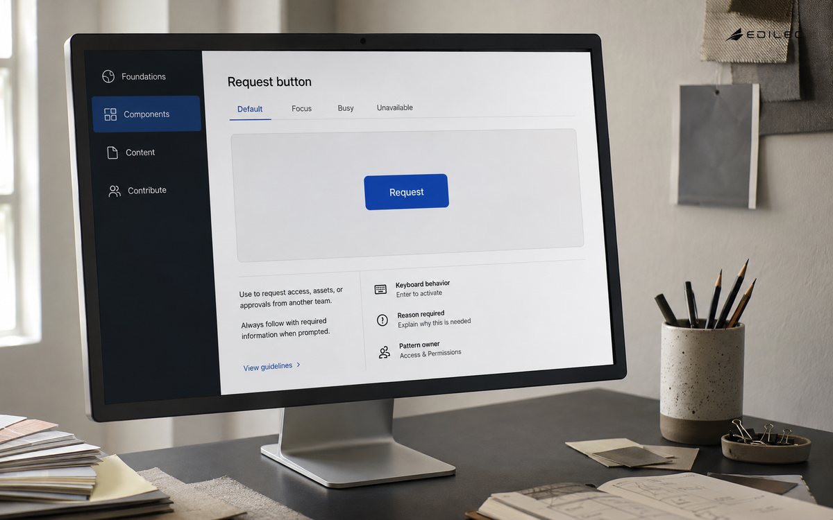
Use accessible standards as constraints, not decoration. WCAG 2.2 provides testable success criteria for labels, contrast, keyboard operation, focus, timing, and error identification. The ARIA Authoring Practices Guide provides interaction patterns, but native HTML remains the preferred foundation when it provides the needed behavior. Test the complete state, including focus restoration after a dialog and announcement of a validation result.
| State | User needs to know | System requirement |
|---|---|---|
| Loading | What is happening and what can wait | Stable layout and progress or status |
| Empty | Whether no data is expected or a filter is wrong | Context and next action |
| Error | What failed, what was saved, and how to recover | Specific message and preserved input |
| Disabled | Why the action is unavailable | Permission or policy explanation |
| Success | What changed and what comes next | Durable result and undo or follow-up |
| Focus | Where keyboard interaction is now | Visible, logical, restored focus |
Treat content and terminology as system parts
A component can be visually consistent and still confuse users if labels, errors, dates, units, and action verbs vary. Define writing rules for confirmation, validation, empty states, pending work, and permissions. Provide examples that show a normal record and a difficult one. Avoid generic “something went wrong” messages when the user can correct an input or contact a known owner. Content guidance belongs beside the component because behavior and wording work together.
Preserve domain language where it carries authority. A finance team may use invoice, credit note, and settlement differently from a support team using ticket and refund. The design system can standardize sentence structure, hierarchy, and accessible labeling while letting product owners define the underlying business term. This prevents a shared vocabulary from becoming a false simplification that hides real workflow differences.
Create a contribution and change path
Name owners for foundations, components, content guidance, accessibility evidence, and release communication. A contribution should include the problem, affected products, current variants, proposed behavior, states, accessibility and test evidence, migration plan, and deprecation impact. A small review group can protect the shared boundary while domain teams retain ownership of their workflows. Governance is useful when it makes a decision clearer, not when every spacing change requires a committee.
Version behavior when necessary. A changed component API, focus pattern, token meaning, or error message can break consumers even when the visual result looks similar. Publish migration notes, codemods or examples where helpful, and keep a compatibility window for important products. Remove deprecated variants after measured adoption; otherwise the system carries multiple meanings and teams learn to bypass it.
Adopt through a real product workflow
Choose a pilot that includes forms, data, errors, permissions, responsive behavior, and a meaningful user outcome. Migrate one journey rather than replacing every button in an application. Compare defects, accessibility findings, delivery time, visual consistency, and user comprehension before and after. A shared component does not deliver full system value when the team preserves bespoke state and content rules.
Make the right path easier to use than the fork. Provide package versions, documentation, examples, test utilities, design assets, upgrade notes, and a responsive maintainer. Do not punish a product team for a legitimate exception; review whether the system needs a new variant or whether the local need is genuinely unique. A healthy system accumulates evidence from products and improves its guidance instead of demanding blind compliance.
Test accessibility, visual behavior, and meaning
Automate what can be stable: unit behavior, keyboard sequences, token snapshots, visual regression, lint rules, and accessibility checks. Storybook's accessibility testing documentation shows how component-level checks can fit into a development workflow. Treat automated findings as evidence, not a complete guarantee. A component can pass a rule scan while its label is misleading, its focus order is wrong for the task, or its error message fails to explain recovery.
Test real compositions. A modal may work alone but fail when a form inside it has validation errors; a table may pass at one width but lose row context at zoom; a token change may meet contrast in light mode and fail in dark mode. Include keyboard, screen reader, touch, zoom, reduced motion, localization, long content, and high-density data where the product needs them. The evidence should be easy for a consuming team to rerun.
Measure system value without rewarding uniformity
Track adoption of appropriate patterns, number of active variants, contribution lead time, upgrade effort, accessibility defects, repeated UI defects, support questions, and delivery time for representative work. Pair those signals with user outcomes such as completion quality, error recovery, or confidence. A high adoption percentage can be harmful if teams use a pattern outside its safe context, while a lower percentage may reflect legitimate domain differences.
Review the cost of the system too. Count stale documentation, broken examples, unmaintained packages, unresolved contributions, and time spent waiting for guidance. A design system becomes a form of technical debt when its code and documentation diverge or when consumers cannot tell which version is supported. Keep the maintenance burden visible so the system remains a product with a service level, not a static archive.
Review the system as a living product
Review a foundation, a common component, and a complete product workflow with designers, engineers, accessibility specialists, product owners, and users. Look for state gaps, confusing content, inconsistent authority, failed keyboard paths, and migration pain. Ask whether a new team can discover the supported pattern, understand its limits, and contribute a change without private knowledge. Those are better readiness questions than whether the catalog page looks complete.
Retire patterns with the same discipline as adding them. Deprecate an unsafe component, notify consumers, provide a replacement or exception path, measure adoption, and remove the old implementation and documentation. Keep decisions and evidence in version control. A design system earns trust when its guidance matches what products actually ship and when a change to a shared rule is communicated before it reaches every product at once.
Key takeaways for design systems
- A design system is shared decisions, behavior, guidance, code, accessibility, and contribution—not only a component library.
- Start with repeated product problems and make tokens semantic so relationships can change safely.
- Document component states, content, keyboard behavior, permissions, and responsive boundaries together.
- Use WCAG and ARIA guidance as constraints while preserving product-specific workflow meaning.
- Adopt through a real journey, provide a fast contribution path, and version breaking behavior.
- Measure user and maintenance outcomes, not uniformity alone, and retire weak patterns deliberately.
Design system questions
What is a design system in plain language?
It is a shared way to decide about visual foundations, components, content, accessibility, states, documentation, and contribution. It helps teams create predictable behavior while leaving room for product-specific data, language, and workflow requirements.
Is a design system the same as a component library?
No. A component library is an implementation asset. A design system also explains tokens, interaction states, content, accessibility, usage boundaries, ownership, versioning, and how a team decides whether a new pattern belongs in the shared foundation.
How should a team measure design system value?
Measure appropriate adoption, delivery and defect trends, accessibility outcomes, contribution and upgrade effort, support questions, and user task quality. Also measure maintenance cost. A system is valuable when it reduces repeated decision cost without forcing unsafe or confusing uniformity.
Conclusion: shared decisions with room to vary
A design system works when it helps teams make the same important decisions consistently and the different decisions intentionally. Start with repeated problems, express relationships through semantic tokens, document behavior and content, test accessibility in real compositions, govern contributions lightly, and measure both product outcomes and maintenance cost. That plain-language discipline turns a library of parts into a shared product capability that can evolve without losing context.