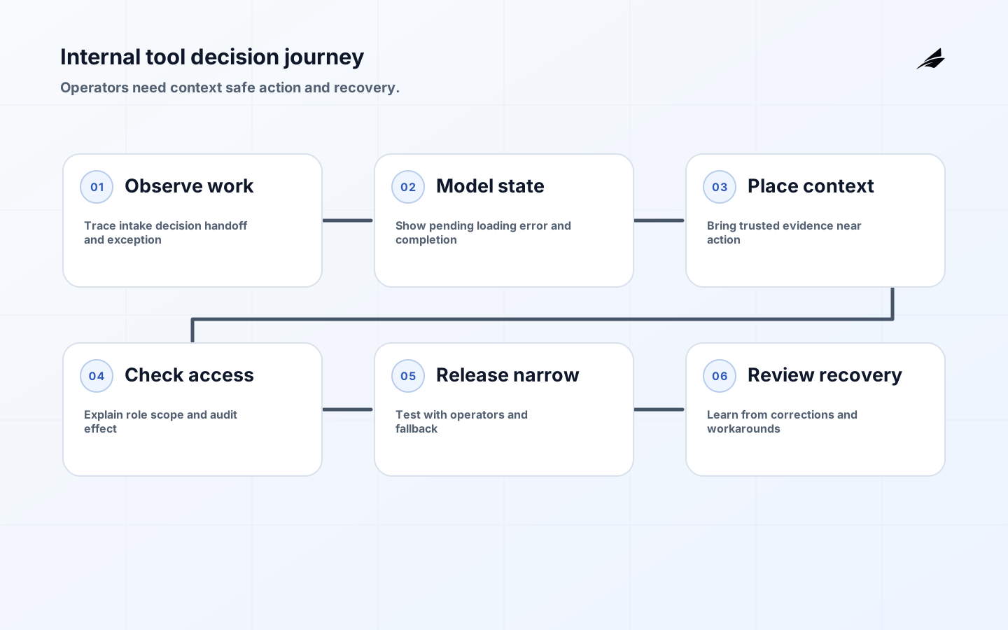
Internal tool UX is the design of software used by people who carry an operational responsibility: reviewing an account, approving a refund, dispatching work, reconciling a record, or responding to an incident. The user may know the business deeply, but that does not make ambiguity harmless. A hidden state, destructive shortcut, missing context, or inaccessible control can create a customer-visible error faster than a public product bug because the operator is often working under time pressure and with incomplete information.
The right goal is not to make an internal tool look like a consumer app. It is to make the important decision legible, the safe path efficient, and uncertainty recoverable. That requires a journey model, trustworthy data boundaries, clear permissions, accessible interaction, explicit states, useful feedback, and evidence that helps a second person understand what happened. The interface is where policy and systems behavior become action, so design and engineering need to review it together.
Use this guide with Edilec's React state design checklist, internal tool UX decisions before the first build, and design systems guide. Together they connect interaction state, early product decisions, and reusable UI rules.
Map the complete operator journey
Observe a real task from its trigger to its handoff. Record what arrives, which fields the operator trusts, what they look up elsewhere, which decision they make, what the system changes, and how they know the work is complete. Include the unhappy paths: a duplicate request, a stale record, a slow dependency, a missing approval, and a need to reverse the action. A screen map alone will miss the spreadsheet, chat message, and browser tab that operators use to fill gaps in the product.
Write the journey as states and decisions rather than as a list of screens. A refund may be requested, verified, approved, sent, settled, rejected, or pending review. Each state needs a visible owner, next action, timestamp, and reason where appropriate. Do not call a request successful because a button click reached the server; show whether the business effect completed, is queued, or needs a person. This distinction prevents an operator from repeating a side effect just because the first response was slow.
| Journey moment | Interface should show | Design question |
|---|---|---|
| Intake | Source, identity, urgency, and due time | Can the operator judge whether this belongs here? |
| Investigation | Authoritative facts and relevant history | Which data is trusted and when was it refreshed? |
| Decision | Allowed action, consequence, and approval | What must be confirmed before changing state? |
| Processing | Progress, queue state, and cancellation rule | What happens if the dependency is slow? |
| Completion | Result, record ID, and next owner | Can another person verify the outcome? |
| Exception | Reason, evidence, and recovery route | Can work resume without starting over? |
Make state and uncertainty visible
Design explicit states for loading, empty, partial, rejected, pending, completed, and unavailable conditions. A blank table may mean no records, a permission problem, a failed request, or a filter that removed everything; those meanings need different actions. Show what the operator can do now, what the system is doing, and what will happen next. If a value is estimated or stale, label it. Precision about uncertainty is more useful than a polished screen that suggests confidence the system does not possess.
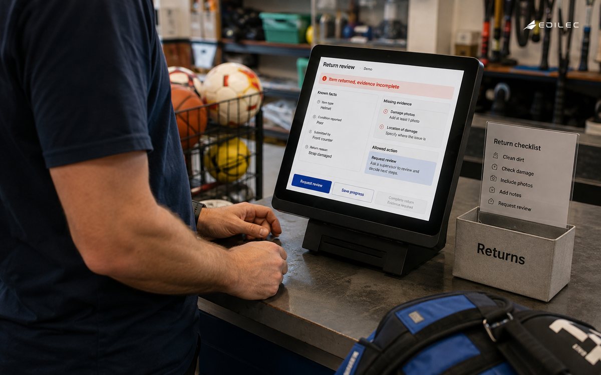
Use confirmations for consequences, not for every click. A good confirmation states the record, the action, the irreversible effect, and the approval or reason required. For reversible work, provide undo or a clearly named correction path. For long-running operations, return a durable operation reference and let the user leave the page without losing visibility. The related background jobs field guide is useful when the interface must represent queued work instead of pretending it completed synchronously.
Make the tool usable under real constraints
Accessibility is part of operational reliability because people use internal tools across devices, environments, abilities, and levels of fatigue. WCAG 2.2 provides testable guidance for keyboard access, focus, contrast, reflow, labels, errors, and timing. Apply it to dense tables, filters, dialogs, charts, and status messages. A keyboard trap in a modal or a color-only warning can block the very person needed to resolve an incident.
Use semantics before custom interaction. The ARIA Authoring Practices Guide shows patterns for dialogs, tabs, grids, comboboxes, and disclosure controls, but a pattern is not permission to add ARIA where native HTML already works. Test keyboard sequence, screen-reader announcement, zoom, reduced motion, focus restoration, and error recovery with the actual workflow. Include assistive-technology users in research when the tool carries important decisions rather than treating accessibility as a final visual audit.
| Control | Acceptance check | Failure it prevents |
|---|---|---|
| Navigation | All actions and data reachable by keyboard | A blocked operator during an urgent task |
| Focus | Focus moves into and out of dialogs predictably | Action taken on the wrong record |
| Status | Loading, success, and error announced and visible | Repeated submission or missed failure |
| Density | Zoom and reflow preserve relationships | Misread rows or clipped controls |
| Permissions | Hidden and disabled actions explain the reason | Unsafe workaround or false expectation |
Design permissions as part of the workflow
A tool should show the difference between not allowed, not yet approved, not applicable, and temporarily unavailable. Do not hide every restricted action so completely that operators cannot understand the process; in some contexts, an explanation and route to request access is safer. For high-impact actions, show who is acting, which account or tenant is affected, what approval applies, and what audit record will be created. OWASP ASVS gives a useful verification vocabulary for authentication, authorization, validation, logging, and data protection.
Keep UI permission checks and server enforcement aligned but independent. A hidden button improves clarity; it does not secure the operation. Test direct requests, stale roles, multi-tab changes, delegated support access, and bulk actions. When a permission changes during an open task, the user should receive a clear result and a safe recovery path rather than a generic error. Record denied attempts at an appropriate level without leaking protected data into logs.
Build a narrow, observable first path
Choose a workflow with a measurable consequence and a willing operator group. Prototype the journey with real terminology and representative records before selecting a large component framework or automating every branch. Write acceptance cases for normal completion, invalid input, delayed dependency, duplicate request, permission denial, correction, and audit review. The first release should be small enough that the team can observe questions and exceptions rather than ship a polished surface around assumptions nobody has tested.
Release with a cohort, feature flag, or limited queue when the risk warrants it. Keep a manual fallback and make the stop condition explicit. NIST's Secure Software Development Framework supports integrating security practices throughout development; for internal tools, that means threat modeling the workflow, protecting sensitive data, reviewing dependencies, testing misuse, and preserving evidence before launch rather than bolting on controls after an incident.
Measure work and recovery, not clicks
Useful measures include completion time for the business task, rework, exception rate, correction age, abandoned operations, approval delay, support escalations, and accessibility defects found in production. Segment by workflow, role, and case complexity so a fast average does not hide a group that cannot finish. Pair aggregate measures with a small set of case reviews. The important question is whether the tool helped a person make the right decision with less uncertainty, not whether it increased button clicks or page views.
Instrument the boundary between interface and service with operation IDs and bounded context. OpenTelemetry's observability primer describes traces, metrics, and logs as complementary signals. Use them to connect a visible pending state to queue age, dependency latency, validation failure, and final outcome. Avoid logging sensitive values or uncontrolled user text. A support engineer should be able to find the operation and explain the state without querying production tables by hand.
Review the design after real exceptions
Run a review with operators, support, engineering, security, and the owner of the business policy. Walk through one successful case and several failures using the shipped interface, not a prototype. Ask whether the tool showed enough context, whether the primary action was safe under pressure, whether status matched the backend, and whether the audit record explained the final result. Treat workarounds as evidence of a missing capability or an unclear rule, not as proof that users are ignoring the design.
Keep a decision log for shortcuts, manual queues, feature flags, and known limitations. Each temporary control needs an owner, a review date, and an exit condition. Revisit the workflow when policy, data source, role model, or downstream consequence changes. A growing internal tool becomes dependable when a new operator can learn its states and a maintainer can understand why a control exists without relying on the memory of the first project team.
Key takeaways for internal tool UX
- Observe the full operator journey, including intake, uncertainty, handoff, correction, and audit review.
- Make state, freshness, ownership, permissions, and next actions visible in the decision surface.
- Treat WCAG and semantic interaction patterns as reliability requirements for dense operational workflows.
- Keep server authorization authoritative while making the UI explain why actions are available or blocked.
- Release a narrow path with real operators, measurable outcomes, telemetry, and a manual fallback.
- Use exceptions and workarounds to improve the workflow rather than hiding them as user error.
Internal tool UX questions
Where should a team start with internal tool UX?
Start with one consequential workflow where uncertainty currently costs time, money, trust, or customer impact. Observe it from trigger through handoff, name the authoritative record and exception owner, then design the smallest change that makes the next decision safer or faster.
How much UX process does an internal tool need?
Every tool needs clear states, safe actions, permissions, accessible interaction, and a route to recover from uncertainty. Add deeper research, usability sessions, accessibility testing, and richer telemetry when the workflow is frequent, high consequence, or spread across multiple systems.
Should internal tools prioritize speed over polish?
Prioritize safe task completion over decorative polish. Removing unnecessary steps is good, but hiding context, warnings, or recovery information shifts cost to operators and support. The best fast tool makes the correct action easy without making the wrong action invisible.
Conclusion: design for recovery
Internal tool UX is successful when people can make consequential decisions with the right context, understand what the system did, and recover when reality differs from the happy path. Map the journey, expose states, design access and accessibility into the workflow, instrument the outcome, and review actual exceptions. That practice produces custom software that reduces operational effort without transferring hidden complexity to the people who depend on it.