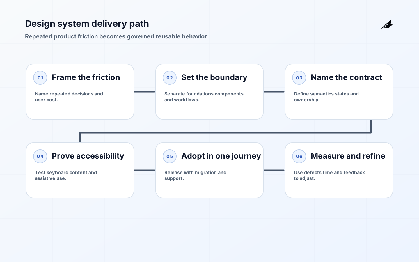
A design system earns executive support when it reduces repeated decisions without hiding important differences. It is not a gallery of polished controls; it is a maintained operating capability for visual foundations, interaction behavior, content, accessibility, implementation, and change. A company with several product teams may rebuild form validation, empty states, navigation, tables, and destructive actions in parallel, then discover that users receive different answers to the same question. The CTO’s decision is whether the cost of that drift is large enough to justify a shared product with owners, a release path, and an adoption strategy. The useful goal is dependable reuse, not uniformity for its own sake.
Start with the delivery problem, not the component catalog
Begin with evidence from delivery and user work. Compare two or three journeys that cross product boundaries: submitting a form, correcting a failed payment, reviewing a dense record, or handing a task from an operator to a customer. Record where teams make the same decision differently, how often the difference causes rework or support contacts, and what a consistent behavior would make easier. A system is worth funding when it shortens a recurring path, improves a consequential interaction, or makes a quality obligation repeatable. Link the decision to a broader frontend performance review so reuse does not quietly add runtime weight.
Write a one-page mandate before choosing a package or design tool. Name the products in scope, the users of the system, the decisions it will standardize, and the decisions it will leave local. Set an accountable product owner, a design and engineering maintainer, an accessibility reviewer, a support route, and a release policy. Include an explicit non-goal such as rebuilding every legacy screen. That boundary protects the system from becoming a central approval queue while giving teams a clear answer about new work.
| Layer | Decision it owns | Evidence before wider adoption |
|---|---|---|
| Foundations | Meaningful color, type, spacing, motion, elevation, and density choices | Named tokens, theme examples, contrast checks, and documented usage rules |
| Components | Reusable interaction, semantics, states, and API | Keyboard and screen-reader checks, visual regression, examples with long content |
| Patterns | A recurring task assembled from components | Journey guidance, content rules, error and empty states, user research |
| Governance | Contribution, release, deprecation, and exception decisions | Named owners, changelog, version policy, migration notes, support channel |
Set a boundary teams can actually use
A shared boundary should follow a repeated user need rather than a folder structure. A button may be a component; “approve an invoice” is a workflow that may remain product-owned while using shared buttons, alerts, permissions language, and audit patterns. Ask whether the behavior, states, and accessibility contract will remain stable in several contexts. If only the color or markup looks similar, document the visual reference and leave the implementation local until stronger evidence appears.

When a pattern deserves a shared home
Promote a pattern when teams can state the same user intent, required states, semantic structure, and extension points. A date field, for example, needs more than a calendar icon: it needs a label, locale behavior, keyboard input, validation, an unavailable date state, and a message that explains correction. The shared system should own those decisions and publish the contract. The consuming product should still control domain vocabulary, permissions, and the next action.
Keep the source of truth visible. Token names, component APIs, examples, tests, and release notes should live where both designers and engineers can inspect them. The Design Tokens Format Module describes a platform-agnostic vocabulary for exchanging token data, but its draft status is a reason to record the local format and migration plan rather than assume a specification removes integration work.
Give design tokens a semantic contract
Public systems make the distinction between values and guidance visible. The GOV.UK Design System pairs components with usage advice and research, while the U.S. Web Design System publishes foundations, components, and implementation material for government products. Inspect those examples for how a team explains intent and support; do not import their visual language without checking the needs, content, and operating context of your own users.
Raw values are hard to govern because their purpose is invisible. Prefer names that describe intent, such as text-critical, surface-raised, focus-visible, or space-control-gap, and define where each token may be used. Store the value, description, type, and lifecycle status together. Keep aliases deliberate: a semantic token may point to a theme value, while a component token may express a local relationship. Do not create a token for every one-off measurement; abstraction without reuse increases cognitive load and makes change harder to review.
Test tokens through the contexts that made them necessary. A color that passes contrast on a light surface may fail on a selected row; a spacing scale that works for a marketing card may make a dense operator table unusable. The U.S. Web Design System’s published foundations and components are useful references for showing how a vocabulary becomes practical guidance. Treat them as examples, not a reason to copy a visual language that does not fit your product or users.
Make accessibility and content part of reuse
A component that renders correctly but loses focus, hides an error, or relies on color alone is not a reusable success. Define keyboard behavior, focus visibility, name and role, error association, contrast, zoom, motion, and responsive behavior in the component contract. Use WCAG guidance to set a baseline, then test with realistic content and assistive technology. Automation can detect some regressions; it cannot decide whether an instruction is understandable or whether a task remains clear when a dependency is unavailable.
| Shared concern | Failure a user may experience | Control to require |
|---|---|---|
| Focus and keyboard | A dialog opens but the user cannot locate or close it | Focus placement, escape behavior, tab order, and a manual keyboard check |
| Validation | The field is marked invalid but the correction is unclear | Programmatic label and error association plus plain-language next action |
| Content length | A long name or translated label breaks the action | Long-content, localization, zoom, and narrow-viewport examples |
| Status and motion | A change is announced only by color or animation | Textual status, suitable live-region behavior, and reduced-motion treatment |
| Permission | A control appears usable but fails after submission | Visible authority state, server-side enforcement, and recoverable explanation |
Roll out through real product work
Adoption is a migration problem, so start with one product and one journey where inconsistency is visible. Build the component, integrate it into the journey, and capture the time spent on API questions, accessibility fixes, documentation gaps, and visual exceptions. Use that evidence to improve the system before offering it to every team. Set a rule for new work, such as “use the supported component when the contract fits,” while allowing legacy screens to migrate on a planned trigger rather than forcing a risky rewrite.
Publish packages and documentation together. A version should state behavior changes, deprecated properties, supported accessibility guarantees, and migration steps. Pair visual regression with interaction tests and a small consumer test suite. A test strategy decision guide can help place fast component checks near the change and reserve broader journey tests for behaviors that cross boundaries. Keep package size and runtime cost visible; a system that makes every route download every control is not free reuse.
Govern changes without becoming a bottleneck
Use lightweight governance with explicit decision rights. A contribution request should state the recurring user problem, affected teams, proposed contract, accessibility evidence, ownership, and migration impact. Reviewers should be able to say “not shared,” “shared foundation,” “product pattern,” or “pilot with an owner.” Keep an exception register and review repeated exceptions monthly; three similar exceptions are often a better signal than a roadmap request.
What to do with an exception
Do not turn an exception into a permanent fork by default. Give it a named owner, a compatibility boundary, a support expectation, and a date or condition for reconsideration. If it handles sensitive roles or approval actions, align its permission language with role-based operations guidance. The central system may provide the primitives while the product team keeps the workflow, provided the distinction is documented.
Measure whether consistency improves delivery
Choose measures that connect reuse to outcomes. Track time to deliver a common interaction, duplicated implementations, accessibility defects in shared flows, time to upgrade, bundle impact, support questions, and team confidence. Compare a migrated journey with a similar local implementation rather than reporting adoption as a win by itself. A component may be used widely because a mandate made it unavoidable; the more important question is whether it made the journey easier to change and safer to use.
| Signal | Useful question | Decision it supports |
|---|---|---|
| Migration lead time | How long does a product need to adopt a supported component? | Improve documentation, API shape, or pairing before expanding |
| Duplicate behavior | How many local controls solve the same task differently? | Prioritize a missing pattern or stop investing in low-value catalog items |
| Defect recurrence | Do shared flows repeat the same accessibility or validation issue? | Raise component test coverage or change the contract |
| Upgrade effort | Can consumers move versions without emergency coordination? | Improve deprecation policy, release notes, or compatibility |
| Runtime cost | Does shared delivery change load or interaction performance? | Split packages, remove unused code, or revise the implementation |
CTO takeaways for design systems
- Fund a design system when repeated decisions create a measurable user or delivery burden.
- Define foundations, components, patterns, and governance as separate layers with visible owners.
- Make accessibility, content, state behavior, and performance part of the reuse contract.
- Adopt through one representative product journey and publish migration evidence.
- Use exceptions and operating measures to improve the boundary rather than enforcing uniformity blindly.
Questions teams ask about design systems
Is a small product too early for a design system?
A small product may need only a token vocabulary, accessible form rules, and a few documented components. Start when repeated work is already costing time or quality, not because a library is fashionable. Keep the first boundary small enough for the team to maintain.
Who should own the system?
A cross-functional owner is more durable than a design-only or engineering-only owner. Design, engineering, accessibility, content, product, and support each hold part of the contract. One person can coordinate decisions, but the system needs a clear service-level expectation and a contribution path.
Should every old screen be migrated?
No. Migrate where a screen changes often, creates user confusion, carries accessibility risk, or blocks a supported capability. Stable low-risk legacy work can remain while new work uses the current system, provided ownership and an eventual trigger are recorded.
Conclusion: make reuse accountable
A design system is a shared product decision with a maintenance cost and a measurable payoff. Define the recurring problem, make behavior and accessibility explicit, release through a real journey, and govern variation with evidence. When the system helps teams change important work safely, it becomes a delivery capability rather than another catalog to keep polished.