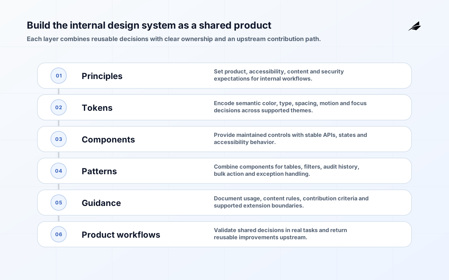
A design system for internal platforms is a maintained set of principles, tokens, components, patterns, content rules and contribution practices used across operational software. Its purpose is not to make every screen identical. It should make common decisions dependable so product teams can focus on domain workflows, exceptions and evidence.
Internal platforms need particular care because they combine dense data, repeated actions, permissions and consequential mistakes. A polished button library alone will not resolve inconsistent status language, inaccessible tables or unsafe bulk actions. The system has to encode interaction and operating knowledge as well as visual style.
Define the system as a product
Name the users of the design system: application designers and developers, plus the employees who use resulting tools. Assign a product owner and accessibility responsibility. State supported frameworks, browsers, themes and product categories. A system serving data-heavy desktop operations may make different choices from a public mobile service, while still meeting applicable accessibility requirements.

Inventory existing interfaces before designing foundations. Group repeated patterns, identify divergent versions and record why they differ. Observe real tasks. A status badge that appears reusable may carry different lifecycle semantics in finance and support; standardize visual treatment and behavior only after clarifying domain meaning.
| Layer | What it should contain | What it should not pretend to own |
|---|---|---|
| Principles | User, accessibility and operating values | Detailed domain policy |
| Tokens | Named color, spacing, type, motion and elevation decisions | Business statuses without governance |
| Components | Tested controls with states and APIs | Complete multi-step workflows |
| Patterns | Compositions for forms, tables, approval and errors | One rigid screen template |
| Guidance | Usage, content, accessibility and migration rules | A substitute for user research |
Start with high-value foundations and workflows
Prioritize foundations that affect every surface: typography, focus, color roles, spacing, layout, icons, motion and responsive behavior. Use semantic tokens such as text-critical rather than raw palette names in application code. The Design Tokens Format Module 2025.10 defines a vendor-neutral exchange format; it is a W3C Community Group report, not a W3C Recommendation. Adoption should follow tool compatibility and migration needs.
Then select components from evidence: buttons, inputs, selects, dialogs, notifications, tabs and tables are common, but internal platforms often need filters, saved views, batch selection, status histories, audit panels and exception queues. Build complex patterns only where multiple products share interaction and policy. Leave a documented extension path for domain-specific needs.
Treat accessibility as a component contract
Use WCAG 2.2 as the testable baseline selected by the organization and the ARIA Authoring Practices Guide as implementation guidance for relevant widgets. Prefer native HTML semantics before ARIA. Document keyboard behavior, focus movement, labels, announcements, error association, contrast and zoom behavior for every interactive component.
A component passing an automated check is not sufficient. Test keyboard-only use, screen readers, high zoom, reflow and forced-color modes as relevant. Composite patterns need task testing because individually accessible controls can form an inaccessible workflow. The GOV.UK Design System's published accessibility strategy is a useful example of treating accessibility as ongoing design, testing and communication work.
Design component APIs and content together
Keep component APIs small, typed and composable. Expose semantic variants and controlled escape hatches rather than dozens of booleans. Define controlled and uncontrolled behavior where relevant, stable identifiers, validation hooks and localization. Avoid coupling visual components directly to a product's network or permission logic.
Content is part of behavior. Standardize labels for common commands, destructive confirmations, empty states, validation summaries and status language. Use specific verbs and explain recovery. A generic error toast that disappears does not help an operator repair a record. Patterns should show inline context and preserve entered data.
| Pattern | Required states | Evidence to publish |
|---|---|---|
| Data table | Loading, empty, partial, error, selection and pagination | Keyboard model, responsive strategy and examples |
| Form | Initial, validating, invalid, submitting and saved | Label and error rules with focus behavior |
| Dialog | Open, blocked, confirmed and dismissed | Focus entry, trap, return and escape behavior |
| Bulk action | No selection, mixed eligibility, progress and partial failure | Preview, result summary and recovery path |
| Notification | Informational, warning, error and success | Persistence, announcement and action guidance |
Build a maintainable technical architecture
Separate tokens, primitive components, composed patterns, icons and documentation into clear packages only when consumers benefit from independent release. Keep source, generated assets and release automation reproducible. Use visual examples as executable fixtures. Storybook documents interaction, accessibility and visual testing workflows that can make component states reviewable.
Choose a release policy and communicate compatibility. Semantic Versioning can describe intended public API impact when applied consistently, but visual and behavioral changes also need review. Publish migration notes, deprecate before removal and provide codemods only when they are tested against consumer code. Avoid silent token changes that alter meaning across many applications.
Make contribution faster than workarounds
Publish a lightweight proposal path: problem evidence, affected products, user and accessibility impact, proposed API, alternatives and maintenance owner. Small fixes should move quickly; new complex patterns deserve cross-product review. The central team should curate and enable, while consumer teams contribute expertise and tests.
Define decision rights. The system team owns shared quality and release; product teams own domain outcomes; security and accessibility specialists review proportionately. Track requests and explain declined proposals. If teams cannot meet delivery needs through contribution or extension, they will fork the system.
Plan adoption without a visual rewrite
Select pilot products with real need and cooperative owners. Adopt foundations and a small set of components in new or changing workflows first. Wrapping legacy markup can provide a transition boundary, but avoid permanent adapters that prevent accessible behavior. Measure migration by retired variants and improved tasks, not imported package count.
- Inventory duplicate components and rank them by risk and frequency.
- Pilot one dense workflow, including errors and permission states.
- Publish migration examples and an exception process.
- Support teams through office hours or a shared help channel.
- Deprecate legacy variants only when replacement behavior is proven.
- Remove old CSS and packages so adoption reduces maintenance.
Understand cost, risk and value
Cost includes research, design, engineering, accessibility testing, documentation, release automation, support and migrations. Recurring capacity is essential; an unfunded system decays as frameworks, browsers and products change. Estimate by priority components, supported environments, assurance depth and consumer count, then validate with a pilot.
| Risk | Control | Measure |
|---|---|---|
| Library without adoption | Co-design pilots and migration support | Active supported consumers and retired variants |
| Inaccessible composition | Test complete patterns and tasks | Defects by severity and remediation age |
| Fork proliferation | Fast contribution and documented extensions | Untracked variants and duplicate packages |
| Breaking change | Compatibility review and migration window | Consumer failures and time to migrate |
| Central bottleneck | Distributed contribution with clear quality gates | Proposal lead time and maintainer load |
Measure task quality, consistency defects, accessibility findings, component reuse, release adoption, support load and product-team time spent rebuilding common behavior. Interpret reuse carefully: a high-use component with unresolved defects spreads risk. Review qualitative feedback from operators and maintainers alongside counts.
Use a practical rollout plan
Frame principles and ownership, inventory the estate, establish tokens and accessibility foundations, build a small component set, pilot in a real workflow, then expand through measured contribution. Each stage should retire something: an inconsistent token, duplicate component or unsupported pattern. A system that only adds a new layer increases complexity.
Before broad rollout, prove documentation, release, rollback and incident communication. Components can cause production incidents across many tools. Maintain release channels, consumer tests and a way to pause or revert a problematic version. Communicate security and accessibility fixes with clear urgency and impact.
Decide what belongs in the shared system
A shared asset should solve a repeated problem, carry meaningful quality requirements and have an owner willing to maintain it. Repetition alone is not enough. Two approval screens may look similar while expressing different policy, evidence and reversal rules. Share the accessible dialog, form and status-history primitives, then keep domain approval logic in the product unless several teams can govern one pattern together.
Use a candidate assessment that considers frequency across products, user-risk reduction, accessibility complexity, expected stability and the cost of centralized change. A simple layout utility may be broadly reusable and cheap to maintain. A highly configurable workflow builder may create an API larger than the problems it replaces. Start narrow and expand from proven consumer needs.
| Candidate | Share when | Keep local when |
|---|---|---|
| Primitive control | Semantics and interaction are common | A platform constraint requires a documented adaptation |
| Composed pattern | Workflow states and content rules repeat | Domain policy or evidence differs materially |
| Data visualization | Meaning, accessibility and interaction can be governed | The analytical question needs a purpose-built view |
| Page template | Information hierarchy and navigation repeat | A rigid template would distort the task |
Document supported escape hatches. Product teams may compose lower-level components, add domain content or request a temporary exception, but they should not disable keyboard behavior or bypass required states. Review exceptions for patterns worth bringing back into the system. This keeps governance connected to delivery pressure and prevents the shared library from becoming either a bottleneck or a decorative option.
Security-sensitive components need an explicit response path. Authentication surfaces, file upload, rich text, links and data export can carry vulnerabilities beyond ordinary visual defects. Track supported versions, publish urgent fixes, test consuming applications and define when a release must be adopted. The design system team should coordinate with security owners while keeping product teams responsible for server-side policy and safe integration.
Support more than one application technology only when the user experience and maintenance case justify it. A token package may serve several stacks, while complex components may need native implementations with shared behavior specifications and tests. Publish which implementation is authoritative for behavior and how parity is assessed. Otherwise, nominally shared components can diverge while keeping the same name.
Key takeaways
- Treat the internal design system as a funded product with users and owners.
- Standardize shared interaction and content behavior, not just visual styling.
- Make WCAG-aligned accessibility part of every component contract.
- Provide contribution, extension and migration paths that product teams can use.
- Measure task outcomes, defects, adoption and retired duplication together.
Frequently asked questions
Is a component library a design system?
It is one implementation layer. A functioning design system also includes principles, tokens, patterns, content, documentation, governance and contribution practices.
Should we adopt an existing design system?
Existing systems can accelerate foundations and accessible patterns. Evaluate framework fit, maintenance, licensing, visual flexibility and workflow coverage. Internal domain patterns and governance will still require ownership.
Should every internal tool be forced to adopt it?
Set minimum accessibility, security and brand requirements, then use supported adoption and exceptions. Mandates without migration capacity create forks and superficial compliance.
When does a design system pay off?
Value appears when products ship consistent, tested behavior with less repeated work and operators complete tasks with fewer usability failures. Measure these outcomes rather than assuming package installation equals benefit.
Conclusion
A strong internal-platform design system is shared infrastructure for human work. It turns repeated accessibility, interaction and content decisions into maintained assets while leaving domain teams room to solve real workflows. Begin with evidence, prove the system in a difficult task and grow through governance that makes the supported path genuinely useful.