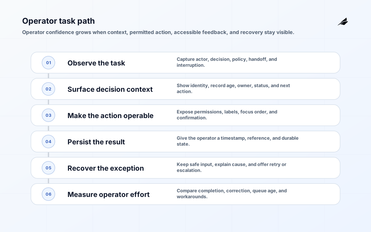
Internal tool UX deserves the same product discipline as a customer-facing application, but its success measure is different. A warehouse coordinator, claims analyst, support agent, or finance operator is usually trying to complete a consequential task under time pressure. The interface must expose the right context, reduce avoidable decisions, preserve a useful audit trail, and make recovery obvious. Start with the work, not a component library. Interview people while they perform a real case, record interruptions and handoffs, and identify which fields are authoritative. The WCAG 2.2 recommendation is a baseline for making states perceivable, operable, understandable, and robust.
Set the internal tool UX work boundary
Write the job to be done as an observable outcome: approve a refund, reconcile an invoice, route a case, or correct a customer record. Name the actor, decision, evidence required, policy constraint, expected duration, and handoff. A screen that can display every field may still fail if the operator cannot tell which value changed, which rule blocked submission, or whether the action actually committed. Map the normal path and the exceptions separately. The exception map often determines the design: expired credentials, missing documents, duplicate records, partial integrations, and an action that needs a second person’s approval.
| Work signal | UX decision | Evidence |
|---|---|---|
| Urgent decision | Keep status, owner, and next action visible | Time to confident action |
| Repeated lookup | Support keyboard flow and stable filtering | Search and rework rate |
| High consequence | Show policy, confirmation, and audit detail | Correction and reversal rate |
| Exception path | Offer recovery and escalation instead of a dead end | Unresolved queue age |
Model states before arranging screens
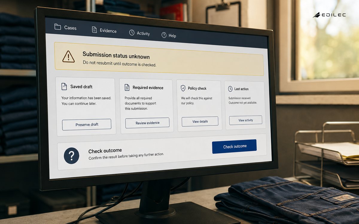
An internal tool is a state machine with a visual surface. Define loading, empty, partial, stale, blocked, submitted, failed, and permission-limited states before polishing the happy path. Explain what the operator can do now, what has already happened, and what will happen next. Avoid a generic red toast that disappears before a person can act. If an external system accepts a request asynchronously, show the request identifier and reconciliation status. If two people can edit the same record, show freshness and conflict handling. The USWDS form guidance is a useful official reference for labels, errors, and recovery; the Material interaction guidance adds practical feedback patterns.
Tune information density to operator decisions
Density is not a virtue on its own. Put high-frequency, high-value fields near the decision and move supporting detail into an expandable region with a stable label. Preserve column order, filter state, and keyboard position when an operator returns from a detail view. Use plain labels rather than internal database names. Dates need a time zone or a clear local convention; statuses need definitions; numbers need units and an indication of whether they are current. Design for zoom, reflow, contrast, focus, and non-pointer input from the beginning, not as a final accessibility sweep.
| Area | Ask | Good outcome |
|---|---|---|
| Context | Can the operator identify the case and its owner? | Identity, status, and freshness are visible |
| Action | Is the next permitted action clear? | One primary action and a reason for disabled states |
| Feedback | What proves the action worked? | Persistent result, timestamp, and reference |
| Recovery | What if the dependency fails? | Retry, safe exit, queue, or named escalation |
Trace one operator journey end to end
Choose one representative workflow and implement it through data access, authorization, validation, UI states, telemetry, and support documentation. A clickable mockup can test vocabulary and sequence, but it cannot reveal stale data, permission mismatches, race conditions, or slow dependencies. Instrument time to load, time to action, validation failures, retries, abandonment, and the rate of manual workarounds. Let operators see enough evidence to diagnose their own next step. This vertical slice also exposes architectural boundaries earlier than a collection of disconnected screens.
Design failure and accessibility as normal states
The error path is part of the task. Preserve entered values where safe, explain the field or dependency at fault, and distinguish a rejected business decision from a technical outage. Provide accessible names, logical focus order, visible focus, keyboard operation, and text alternatives for non-text content. Test with zoom and assistive technology as well as automated checks. The USWDS form guidance offers reusable patterns, the W3C criteria provide the conformance frame, and NN/g’s usability heuristics support visible system status; none replaces observation with the actual operators who depend on the tool.
- Measure completed work and correction effort, not clicks alone.
- Keep policy and data definitions close to the action they govern.
- Make asynchronous work visible with an owner and reconciliation status.
- Preserve context across search, detail, edit, and return.
- Treat keyboard access, focus, zoom, and readable contrast as core behavior.
- Pilot with representative operators and record workarounds before expanding.
Operate the interface as a living workflow
After release, review completion time, queue age, error categories, permission denials, support contacts, and reversal or correction rates by workflow. Pair telemetry with short observation sessions because a workaround may never appear in an event log. Give the product owner authority to retire fields, change defaults, and clarify policy. Treat design-system changes as product changes when they alter focus, confirmation, or feedback. A dependable internal tool becomes quieter over time: fewer uncertain calls, fewer duplicate entries, and fewer cases escalated simply because the interface hid the answer.
Key takeaways for internal tool UX
Internal tool UX succeeds when it makes a real decision easier to make correctly. Define the workflow and its exceptions, model every meaningful state, provide accessible and recoverable controls, deliver one measurable end-to-end slice, and keep ownership close to operating evidence. A clean screen is useful; a clear, auditable, resilient task is the actual product.
A practical acceptance review in practice
During acceptance, let operators choose a normal case, an exception, and a recovery case. Observe whether they can identify the record, understand its freshness, complete the primary action, and prove the result without consulting another system. Check that permissions are explained, not merely enforced; that a disabled action has a reason; and that an asynchronous request exposes a reference and owner. Review the focus path after validation, save, cancel, and dependency failure. Measure the time from opening the case to confident action, then repeat after training to separate learnability from interface friction. Keep a small log of workarounds and translate each repeated workaround into a design question. If the tool is used in a noisy environment, test keyboard shortcuts, zoom, contrast, and long lists. If it is used during a handoff, test whether another operator can understand the state without verbal context. These checks make internal tool UX accountable to real work and give the team a clear basis for deciding what to simplify, what to instrument, and what to defer.
Ask operators to complete a real case while the team records pauses, lookup, correction, and recovery. Confirm that status, ownership, freshness, and the next action remain visible at each step. Test keyboard-only use, zoom, focus after errors, and the behavior of a slow or missing dependency. Compare the result with the baseline and document any workaround that remains. This evidence is more useful than a general usability score because it connects the interface to the work it is supposed to improve.
Internal tool UX FAQ
What should be designed first?
Start with one high-value workflow and its failure cases. Define actors, decisions, data, permissions, handoffs, completion evidence, and measurable friction before selecting page patterns.
How much information belongs on one screen?
Keep information needed for the immediate decision visible and make supporting evidence easy to reach. The right density is the one that reduces lookup and correction time without hiding status or ownership.
When is an internal tool ready to expand?
Expand when representative operators complete the workflow reliably, key failure states are recoverable, access and audit behavior are understood, and telemetry shows the service can be supported by a named owner.
A worked internal tool UX example
Imagine a support supervisor assigning an urgent case while several agents edit the queue. The useful screen shows the case identifier, customer, service level, current owner, last update time, policy reason, and next permitted actions before it shows secondary history. When the supervisor selects an agent, the interface rechecks availability and displays a conflict if another assignment won the race. A successful assignment produces a durable confirmation with timestamp and reference; a timeout leaves the case visibly unresolved with a safe retry, not a success toast. Keyboard focus moves to the result, the action has an accessible name, and the error identifies the field or dependency that needs attention. A pilot measures time to confident assignment, reassignment rate, duplicate work, queue age, and calls for help. If operators maintain a private spreadsheet because the tool hides future shifts, that workaround is evidence of missing context, not resistance to change. The product owner can respond by improving the workflow rather than adding unrelated dashboard tiles.
Use observation to decide what to simplify
Watch three people complete the same case and note every pause, lookup, handoff, and correction. Compare the observed path with the intended path. If the same policy question appears repeatedly, move the explanation beside the decision. If a field is copied from another system, consider an authoritative integration rather than a wider form. If an error is repaired by a manager, make the approval state visible. Document the empty, stale, partial, and permission-denied states with the same care as the populated view. This approach produces an internal tool that is faster because it is clearer, not because it hides complexity.
Conclusion
The best internal tool UX respects the operator’s attention and the business consequence of each action. Design around decisions, expose state, make errors recoverable, and validate with real work. That approach produces software people can trust during both routine volume and the exceptional cases that test every workflow.