Internal tools for non-technical teams should make operational decisions clearer without requiring users to understand databases, APIs or system architecture. The interface must reflect the language, evidence and exceptions of the work. When it exposes implementation details or assumes perfect data, people compensate with spreadsheets, messages and risky shortcuts.
Non-technical is not a measure of intelligence. A support agent, finance analyst or operations coordinator may have deep domain expertise while lacking interest in system internals. Good internal tool UX respects that expertise, reduces memory burden and makes consequential actions understandable and recoverable.
Research the work, not the requested screen
Observe users completing real tasks with representative records. Ask where information originates, what makes a case unusual, who must approve it and how users know the outcome is correct. GOV.UK's Service Manual guidance starts with learning user needs; for internal software, this means studying policies, handoffs, interruptions and unofficial tools as well as stated feature requests.
Map the workflow as states and decisions. Distinguish work waiting for the user, work waiting on another system, blocked work and completed work. Capture frequency and consequence. A rare action that can issue a refund may deserve more design attention than a frequent low-risk filter.
- Identify primary roles, goals and domain vocabulary.
- Collect real examples of normal, boundary and failed cases.
- Observe copy-and-paste, private notes and spreadsheet handoffs.
- Map permissions, approvals and separation-of-duty requirements.
- Record environment constraints such as shared screens, slow networks or keyboard-heavy work.
- Agree what users need to know when an automated step is uncertain.
Shape information around decisions
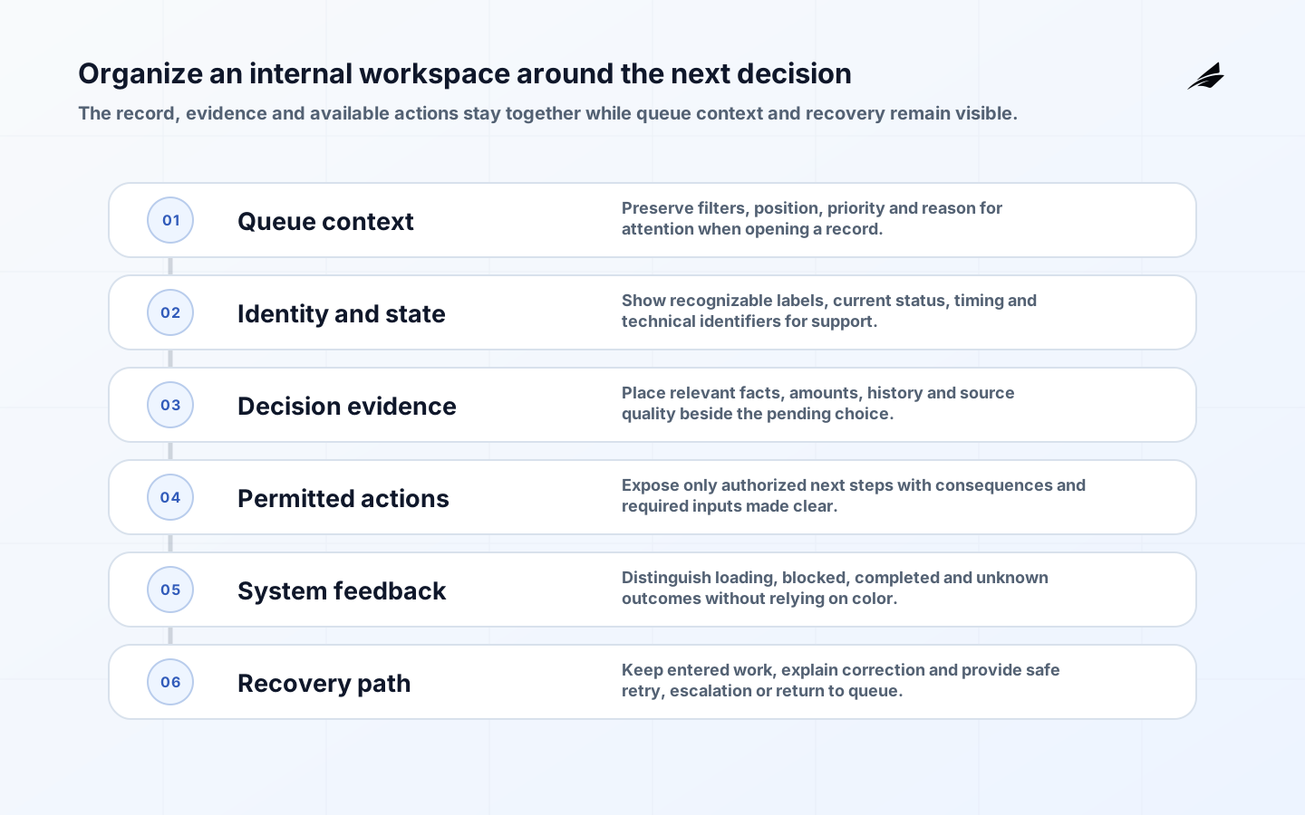
Organize screens by the next decision rather than database tables. Show the identifying facts, current state, relevant history and permitted actions together. Progressive disclosure can keep secondary detail available without overwhelming the primary task. Preserve context when users move between a queue and a record.
Use domain language consistently and explain unfamiliar terms at the point of use. Replace raw identifiers with recognizable labels while retaining identifiers for support. Display dates with time zone where timing matters, and qualify amounts, units and status. Never use color alone to communicate state.
| User question | Interface response | Avoid |
|---|---|---|
| What needs my attention? | Prioritized queue with reason and age | A generic table sorted by creation time |
| Why is this blocked? | Specific status, missing evidence and owner | An internal error code |
| What will this action do? | Preview of affected record and next state | A vague confirmation dialog |
| Did it work? | Durable outcome and reference | A brief success toast only |
| How can I recover? | Reversible action or clear escalation | Telling users to contact an unnamed administrator |
Design forms for accurate completion
Use a single-column flow where it helps reading order, persistent labels, appropriate input types and concise hints before the field. Mark optional fields explicitly when most are required. Group related information with headings. Preserve entered values after validation failure and focus the error summary or first invalid field according to the chosen accessible pattern.
Validate when feedback is useful, not on every keystroke. Explain the problem and correction in domain language. USWDS form guidance provides public examples of labels, required markers, validation and error summaries. Apply WCAG 2.2 criteria selected by the organization, including error identification, labels, predictable behavior and accessible authentication where applicable.
Make actions, permissions and automation safe
Use safe defaults and make high-impact actions distinct. Confirm only when users need to review a meaningful consequence; repeated generic confirmations train people to dismiss them. For destructive or bulk actions, show scope, ineligible items, expected effect and recovery before execution. Require a reason only when someone will use it for review or communication.
Do not hide unavailable actions without explanation when users reasonably expect them. Show permission or state constraints and the next responsible step. Enforce authorization on the server regardless of interface state. NIST SP 800-63B-4 addresses authentication and authenticator management, including usability considerations; the interface should not rely on employees remembering fragile workarounds to stay safe.
Automation needs visible boundaries. Tell users what was checked, what remains uncertain and when human review is required. Preserve an audit history proportionate to the workflow. Avoid presenting a recommendation as a final decision when policy assigns accountability to a person.
Build accessible, resilient interaction
Prefer native controls and established patterns. WCAG 2.2 provides testable accessibility criteria; the ARIA Authoring Practices Guide offers guidance for custom widgets and keyboard behavior. Complex grids, comboboxes and dialogs demand careful focus and announcement design. Use them only when they improve the task over simpler HTML.
Test keyboard-only navigation, screen readers, zoom, reflow, contrast and visible focus. W3C's cognitive accessibility guidance also emphasizes clear language, familiar design, help and prevention of serious mistakes. Accessibility testing should include actual workflows and disabled users where possible, not only automated scans.
Design queues, tables and search for operations
Operational tables need stable columns, clear sort state, filters users understand and a strategy for narrow viewports. Keep selection stable across pagination only if the scope is unmistakable. For bulk work, show the selected count and preview effects. Allow users to save useful views when naming, ownership and update behavior are clear.
Search should tolerate the formats users actually have, such as an order reference with spaces or punctuation, without silently broadening sensitive queries. Explain no-result states and preserve filters. A queue should expose aging and blockers, not merely volume. Provide a way to return to the same working position after reviewing a record.
| Pattern | UX requirement | Operational measure |
|---|---|---|
| Work queue | Reason, priority, age and owner are visible | Oldest actionable item and backlog age |
| Record view | Current state, evidence, history and actions align | Resolution time and correction rate |
| Bulk action | Scope, eligibility, progress and partial failure are clear | Failed items and recovery time |
| Search | Accepted identifiers and active filters are visible | No-result and reformulation rate |
| Export | Contents, sensitivity and generation state are explicit | Unused exports and access exceptions |
Design errors as recoverable states
Separate user-correctable input, permission denial, conflict, dependency outage and unknown outcome. Each requires different language and action. Preserve a correlation reference for support without making the user interpret it. Do not claim an action failed when a timeout leaves its outcome unknown; show that verification is in progress and prevent unsafe repetition.
For asynchronous work, display queued, processing, completed, partly completed and failed states. Keep results available beyond a temporary notification. Let users retry only when the operation is safe, and explain what will happen. Provide undo for reversible changes and an escalation route for irreversible or policy-bound corrections.
Provide security without user traps
Use organization-managed identity, least privilege and sensible session behavior. Avoid unnecessary reauthentication, but apply step-up controls when risk requires them. WCAG 2.2 includes accessible authentication considerations; do not make cognitive puzzles the only path. NIST's Human-Centered Cybersecurity program is a useful reminder that security behavior and usability influence each other.
Mask sensitive values by default when full detail is unnecessary, but allow authorized users to reveal what their task requires. Make exports and copy actions deliberate. Avoid shared accounts because they undermine both accountability and personalized workflow. Communicate session expiry before users lose unsaved work.
Pilot with real work and supported users
Prototype the hardest states, not only the happy path: missing data, mixed permissions, partial completion and dependency outage. Run usability sessions with representative users, including new starters and experienced operators. Measure task completion, errors, confidence and the need for facilitator help. Fix vocabulary and workflow problems before visual polish.
Roll out to a bounded team or workflow with staffed support. Migrate active work deliberately and explain which system owns each state. Monitor bypasses, exception age, correction, support questions and accessibility findings. Keep rollback and data reconciliation plans because switching the interface back may not reverse completed business actions.
- Train through realistic tasks and reference material, not a feature tour.
- Provide a named support route inside the tool.
- Collect feedback with record context while protecting sensitive data.
- Review permission denials and repeated corrections for design problems.
- Expand only after users can recover from common failures.
- Retire duplicate spreadsheets and forms with an agreed archive plan.
Measure whether work became safer and clearer
Compare baseline and post-launch task completion, handling time, error and rework, exception age, abandonment, manual bypass and support demand. Segment carefully by task complexity and role. Faster completion is not an improvement if correction or risk increases. Pair telemetry with interviews and observation.
Create an operating rhythm with a product owner, domain representative, engineering, support and accessibility input. Review unresolved exceptions and user workarounds. Publish changes in user language. Internal tools need ongoing ownership because policies, source systems and teams change after launch.
Support learning and onboarding
Design first-run guidance around a real task, then let the interface remain understandable without a tour. Use realistic practice records where mistakes are safe. Keep policy help close to the decision and distinguish guidance from mandatory rules. For infrequent or high-risk work, provide a short checklist and a visible path to a knowledgeable person. Review new-starter sessions separately from expert use so efficiency shortcuts do not make the tool impossible to learn.
Key takeaways
- Design around domain decisions, exceptions and evidence rather than database structure.
- Use clear language, persistent context and forms that preserve user work.
- Make high-impact actions understandable, authorized and recoverable.
- Test accessibility and failure states across complete operational tasks.
- Pilot with supported users and measure rework, bypasses and outcomes together.
Frequently asked questions
Should we build exactly what users request?
Treat requests as evidence of a need, then observe the underlying task. Users may propose a familiar screen because they cannot see other system constraints. Co-design the solution and validate it with real work.
Can training fix a complicated internal tool?
Training supports domain knowledge and infrequent procedures, but it should not compensate for inconsistent labels, hidden state or unsafe interaction. Fix recurring interface problems and keep training focused on judgment.
Are dense interfaces always bad?
No. Experienced operators may need high information density. Use hierarchy, alignment, meaningful defaults and progressive detail so density supports scanning rather than becoming clutter.
What is the best first success measure?
Choose one outcome tied to the workflow, such as correct completion without assistance, then guard it with quality and risk measures. Avoid relying only on page speed or login counts.
Conclusion
Internal tool UX is successful when people can understand the current state, make the next responsible decision and recover when systems or data fail. Respect domain expertise, reduce unnecessary memory and encode safety into the workflow. A bounded pilot with real exceptions will teach more than a broad prototype of ideal screens.