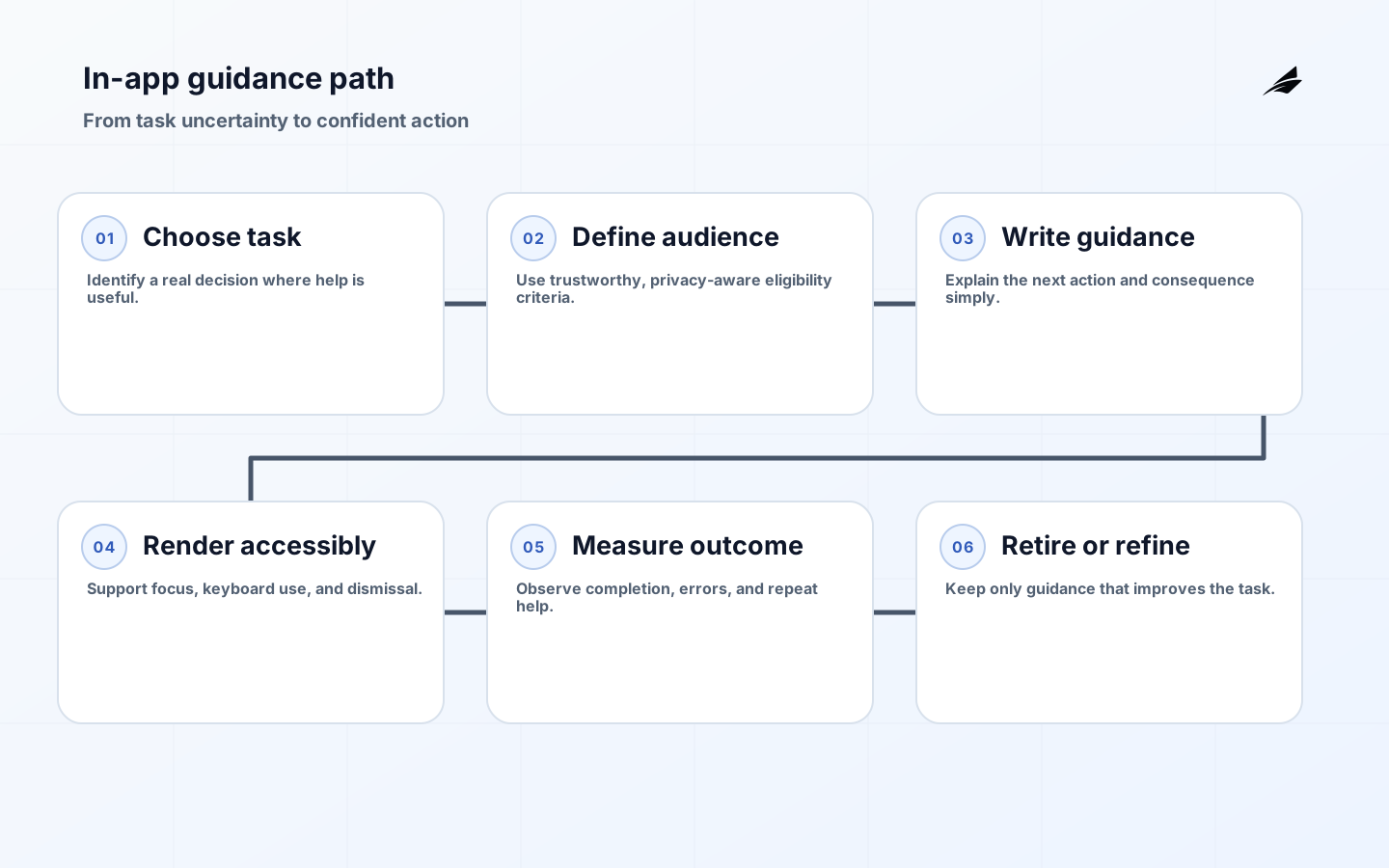
In-app guidance is a product-engineering concern because it shapes what a customer can trust in the product, what an operator can explain, and what a delivery team can change safely. For engineering teams, the work is not to collect more tooling or policy language. It is to make one important decision visible: what state is authoritative, who owns it, which controls enforce it, and how the team learns when reality differs from the plan.
Why In-app guidance Matters
In-app guidance can quickly become a layer of popovers competing with the product for attention. Teams add tours to compensate for unclear workflows, then target more prompts when people dismiss them. The result is a brittle system that breaks with each release and excludes customers who use keyboards, screen readers, smaller screens, or a different role. Guidance should help a person make the next worthwhile decision; it should not narrate every pixel of an interface.
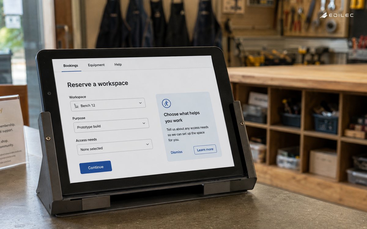
Start with a task and a moment of uncertainty. A useful prompt appears when the product can responsibly infer that a person may benefit from a specific explanation or next step. It is optional, dismissible, and does not block the underlying task unless the task itself has a true prerequisite. Prefer stable product UI and durable help content over coordinates and scripted clicks. If a workflow requires a guided tour to be understandable, first ask whether the workflow should be simplified.
Build the Operating Model
Organize guidance into three types. Contextual explanation clarifies a field, status, or consequence at the point of decision. Progress guidance shows what remains in a multi-step task and links to recovery when blocked. Learning guidance introduces a capability after a customer has reached a relevant moment. Each type should have a clear audience, trigger, success signal, and retirement rule. This keeps the system from accumulating prompts that nobody owns or can measure.
| Guidance type | Best use | Design constraint |
|---|---|---|
| Contextual explanation | Clarify a consequence near a decision | Do not obscure the field or action. |
| Progress guidance | Explain a multi-step setup state | Show current state and a recovery route. |
| Learning prompt | Introduce a relevant capability | Use frequency caps and an easy dismissal. |
| Blocking confirmation | Protect a consequential irreversible action | Use only when the action truly needs a pause. |
Define a guidance record with audience criteria, trigger event, content version, UI anchor, accessibility behavior, dismissal policy, and outcome event. The criteria must be privacy-aware and based on trustworthy server or client state, not on opaque profile guesses. Make anchoring resilient to layout changes by using semantic identifiers controlled by the product team. Record whether a prompt was eligible, shown, dismissed, completed, or suppressed so the team can distinguish a broken trigger from an unhelpful message.
Design the Architecture and Controls
Treat guidance as product content delivered through a controlled component, not injected markup from an unreviewed third party. Keep the component keyboard-operable, manage focus deliberately, and announce dynamic status only when it is useful. Avoid auto-advancing interfaces and time-limited instructions. Store no more behavioral history than is needed for frequency capping and evaluation. Where a guide links to documentation, use a stable destination that explains the task outside the transient UI.
Guidance fails when it is too frequent, too generic, or too hard to escape. A tooltip that obscures the control it describes is worse than no tooltip. A modal that captures focus without a clear close action can stop a customer entirely. A role-agnostic prompt can ask a regular user to configure billing. Test guidance during error states, translated layouts, reduced motion, keyboard navigation, and interrupted sessions. Those conditions reveal whether the component supports the product or merely decorates it.
Roll Out with Evidence
Inventory existing prompts and remove the ones with no owner, purpose, or outcome evidence. Pick one high-friction task and define the exact uncertainty to address. Write concise content, implement it with the shared component, and test it with the actual roles who perform the task. Compare completion, errors, and dismissals against a baseline. Keep the guidance only if it improves the task without shifting problems into support or creating an accessibility regression.
| Signal | What it can reveal | First response |
|---|---|---|
| High prompt exposure, low task completion | The guidance does not address the real blocker | Watch the task and revise the product flow. |
| Frequent repeat prompt | Dismissal is not respected | Fix frequency capping and stored state. |
| Keyboard trap or lost focus | The component is inaccessible | Correct focus order and close behavior. |
| Prompt broken after release | Anchor is coupled to fragile layout | Use owned semantic identifiers and regression tests. |
Operate and Measure
Measure eligibility, exposure, dismissal, task completion, time to completion, error rate, repeat help use, and support contacts for the guided task. Read the metrics with context: high dismissal may mean the prompt is well targeted to people who already know the task, or it may mean it appears at the wrong time. Pair data with usability feedback. The goal is confident action, not maximum interaction with the guidance system itself.
- Guide a task decision, not every interface element.
- Use optional, dismissible guidance by default.
- Build prompts with accessible focus and keyboard behavior.
- Give each guide an owner, trigger, and success signal.
- Remove guidance that no longer earns its place.
Implementation Detail
For a first implementation, choose a single moment such as a user creating their first approval rule. The guide can clarify what happens after the rule is saved, point to the required condition, and offer a link to fuller documentation. It should not automatically advance through fields or prevent the user from reading the surrounding page. Use a stable semantic anchor owned by the product component, and verify that the same explanation remains sensible when the page is translated, narrowed, or used with keyboard navigation.
Content needs product review, not only marketing review. Ask the feature owner what misunderstanding most often leads to a failed task, then write one plain explanation of the decision and consequence. Avoid phrases such as 'click here' when the guide can name the outcome instead. Keep the content versioned with the feature behavior so a permission or workflow change cannot leave an obsolete prompt behind. A concise, accurate explanation is more valuable than a sophisticated animation attached to stale product knowledge.
Review Before Scaling
Add regression tests for behavior as well as appearance. The trigger should not display for an ineligible role, reappear after dismissal without a valid reason, cover its own close control, or move focus into an unreachable region. Test reduced motion and responsive layouts. For analytics, verify that a suppressed guide is recorded differently from a displayed guide and that task completion does not imply the person read the prompt. These distinctions protect the team from drawing confident conclusions from noisy interaction events.
Create a retirement review for guidance. When a product flow becomes clearer, the prompt may be unnecessary. When a guide repeatedly points to the same limitation, the limitation may deserve a product change instead. Give teams a recurring view of prompts with high exposure, low completion, or old content versions. Removing weak guidance is a feature improvement: it reduces visual competition, lowers maintenance, and makes the remaining help more credible to customers who truly need it.
For regulated or high-consequence workflows, ask whether guidance is merely explanatory or could influence a decision that needs a stronger confirmation. A prompt should never imply approval, conceal a consequence, or nudge a user past a required review. Make the product action itself authoritative and use guidance to clarify it. This preserves the distinction between helpful education and an unsafe substitute for product controls. Review this evidence with the owner of in-app guidance, the people who operate the surrounding workflow, and the team responsible for customer communication. Agree on one change, one measure, and one follow-up date. That closed loop keeps local fixes from becoming unexamined policy and makes the next decision easier to defend.
Key Takeaways
- Make in-app guidance a named operating decision rather than an implicit implementation detail.
- Keep customer impact, evidence, and recovery visible to the team that owns the workflow.
- Start with a narrow path, learn from real outcomes, and expand only after the controls hold.
Frequently Asked Questions
Where should a team start with in-app guidance? Start where an incorrect decision would create meaningful customer, commercial, or operational harm. Map the current state, the owner, the boundary, and the evidence available during failure. How much process is enough? Use the smallest process that makes the decision repeatable, reviewable, and recoverable. Add rigor when the data, action, or customer consequence makes a shortcut unsafe.
Conclusion
Strong in-app guidance work is not a one-time project. It is a durable agreement between product, engineering, and operations about how the system behaves under ordinary and difficult conditions. When the contract, controls, telemetry, and recovery path agree, engineering teams can improve the product without turning each release or customer exception into a new source of uncertainty.
The practical continuity test for in-app guidance is whether a qualified teammate who did not design the workflow can inspect the current state, understand the relevant decision and its limits, and take the next safe action without improvised access or tribal knowledge. Keep the owner, evidence location, escalation route, and recovery rule visible. That discipline makes routine operations calmer and gives the organization a reliable starting point when a customer, release, or incident exposes a new edge case.
Sources
The implementation advice in this in-app guidance guide is grounded in WAI-ARIA Authoring Practices Guide, Web Content Accessibility Guidelines 2.2, WAI-ARIA overview, NIST Privacy Framework. These references are useful for checking platform-specific controls and terminology during delivery; the decisions here still need to be applied to the product's data, risk, and customer context.