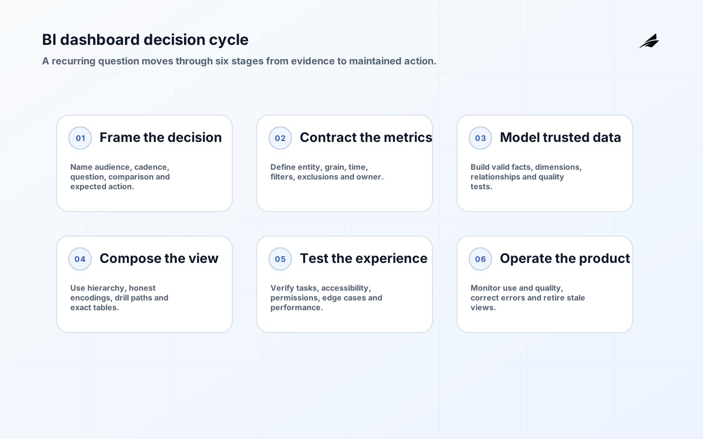
BI dashboards for data analytics should compress a recurring decision into a trustworthy, inspectable view. They should not display every available measure or replace analysis with colored tiles. A useful dashboard names its audience, cadence, questions, definitions, freshness and next actions. This guide covers discovery, metric contracts, data modeling, visual design, accessibility, performance, release and governance so teams can build a working decision surface rather than an attractive report that decays after launch.
Use the dashboard adoption and scaling guide to plan rollout, the semantic layers planning guide to centralize shared meaning, and the data-pipeline guide for upstream delivery. Assign a business owner who can remove unused content and a technical owner responsible for data quality, access and performance.
Start with audience, decision and cadence
Observe how the target users make a real decision today. Record questions, source evidence, comparison periods, thresholds, segmentation, handoffs and actions. An executive weekly review, a support queue and a finance reconciliation need different detail and latency. Write a one-sentence contract: for whom, how often, which decision and what action follows. Reject requirements that cannot name a user or action. A dashboard may support exploration, monitoring or communication, but trying to optimize all three on one page creates clutter.
Prototype with actual labels and realistic extreme values. Ask users to answer tasks without coaching: identify what changed, explain the driver, locate a segment and decide an action. Capture mistakes and missing context. The UK Government Analysis Function's dashboard testing guidance recommends testing design and accessibility rather than assuming a familiar chart is usable. Include keyboard and assistive-technology users where the audience requires it.
| Dashboard type | Core question | Appropriate cadence |
|---|---|---|
| Executive scorecard | Are outcomes on plan and why? | Weekly or monthly |
| Operational queue | What needs attention now? | Near real time to daily |
| Diagnostic analysis | Which segment explains change? | On demand |
| Financial control | Do totals reconcile and close? | Daily to period end |
| Product adoption | Which behavior predicts value? | Daily or weekly |
Write metric and filter contracts
For every visible measure, define entity, grain, numerator, denominator, exclusions, time zone, event time, late-data treatment, owner and authoritative source. State whether a displayed value is provisional, restated or closed. Give filters precise behavior, especially for relative dates and cohort dimensions. Preserve the applied filter context in exports and links. Tooltips should clarify unusual definitions, but the primary label must remain understandable without hovering.
Use a dimensional model that supports valid grouping and aggregation. Microsoft's star-schema guidance for Power BI explains how dimensions support filtering and grouping while fact tables support summarization. The principle applies beyond Power BI: model facts at declared grain, give dimensions stable keys, manage slowly changing attributes intentionally and prevent many-to-many joins from multiplying measures. Test dashboard totals against known fixtures and authoritative records.
Build an information hierarchy
Place the decision state first: title, period, freshness, primary outcome and comparison. Follow with drivers, then diagnostic detail and an exact table. Use layout and grouping to show relationships rather than enclosing every number in a card. Keep persistent filters in a predictable region and distinguish page filters from chart interactions. Avoid horizontal scrolling for the main workflow. On smaller screens, prioritize the key status and actions rather than shrinking a desktop grid into unreadable tiles.
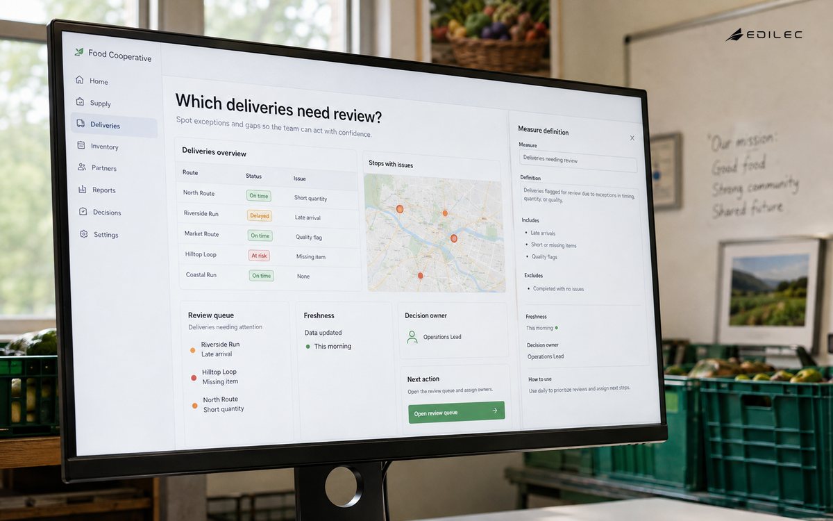
Limit first-view measures to what users can interpret together. Show a target or prior period only when the comparison is valid. Explain breaks in series, methodology changes and incomplete periods. Titles should state the measure and context, not Chart 1. Use annotations for important releases or policy changes. Provide definitions and lineage through a details panel or linked catalog, while keeping the dashboard itself focused on decisions.
| Analytic relationship | Effective encoding | Common failure |
|---|---|---|
| Trend over time | Line with consistent intervals | Categorical axis in arbitrary order |
| Category comparison | Sorted bars from common baseline | Many slices in a pie |
| Part to whole | Stacked bars for few stable parts | Comparing angles across periods |
| Distribution | Histogram, box plot or percentiles | Average without spread |
| Exact records | Searchable table | Labels crowded onto every mark |
| Status | Text, value and restrained cue | Color alone |
Choose honest visual encodings
Match marks to the question. Lines show ordered time, bars compare magnitude from a common baseline, scatterplots reveal relationships, and tables support lookup and reconciliation. Start quantitative axes at zero for bars unless a clearly explained exception is necessary; line charts may use a focused range when it does not exaggerate interpretation. Avoid 3D, decorative area and dual axes that make relationships hard to judge. Keep units, precision and sort order consistent.
Color should encode a small, stable meaning and remain legible without hue. The U.S. Web Design System data-visualization guidance notes that underlying data and plain-language information provide additional ways to consume what a visualization communicates. Pair status color with text or symbols, preserve sufficient contrast and offer a table or summary. Do not use red and green as the sole distinction, and test palettes under common color-vision differences.
Make interaction and meaning accessible
Apply WCAG 2.2 to the dashboard's web experience: keyboard operation, visible focus, programmatic names, sensible order, error identification, reflow, contrast and alternatives for non-text content. Charts need concise descriptions of purpose and material trend, not a dump of every point. Data tables need headers and should reflect the same filter context. Hover-only details exclude keyboard, touch and many assistive-technology users, so provide focus and persistent alternatives.
Test at 200 percent zoom, narrow widths, high contrast, keyboard only and representative screen readers. Ensure loading, empty, error, partial-data and permission-denied states are announced and understandable. A disabled export or unavailable filter needs a reason. Localize date, number and currency formats for the audience while preserving precise underlying values. Accessibility is part of acceptance and regression testing, not a final color review.
Engineer freshness and performance explicitly
Set data latency from the decision. An operational queue may need minutes; a board scorecard may use a closed monthly snapshot. Publish source coverage, last successful refresh and known delay. Use incremental processing, aggregates, extracts or caches according to query patterns, but define invalidation and row-level security behavior. Avoid issuing a separate expensive query for every tile when one modeled result can serve several views. Budget the dashboard's warehouse and license cost.
Set performance targets for initial render, filter response, export and peak concurrency. Measure at realistic data volume and user entitlements. Reduce high-cardinality visuals, unnecessary precision and unbounded default date ranges. Precompute only stable expensive logic and keep its refresh lineage visible. Where a platform supports dashboard-as-code, such as the official LookML dashboard workflow, version control can improve review and repeatability; user-created content still needs inventory and ownership.
Test data, behavior and decisions before release
Create test fixtures for time boundaries, missing dimensions, duplicate facts, late records, zero denominators, negative adjustments and restricted users. Reconcile a closed period and sample drill-through records. Test filter combinations, bookmarks, exports, links, mobile layouts, time zones and caching. Run permission tests with actual roles rather than administrator accounts. Record accepted discrepancies and methodology versions so later investigations do not treat intentional differences as defects.
Pilot with a small user group during the meeting or workflow the dashboard is meant to support. Observe whether users trust it, reach the expected detail and take the intended action. Track questions that require outside spreadsheets; they may reveal missing context or a separate exploratory need. Release with named support, definitions and a short change log. Retire the replaced report or explain why both remain, otherwise duplicate truths survive.
Operate adoption, quality and retirement
Monitor viewership, query errors, refresh success, latency, exports, metric discrepancies and decisions influenced. Usage alone is not success; a frequently opened dashboard may be mandatory but unhelpful. Interview users after business changes, and review whether alerts or meetings actually use the measures. Assign remediation targets for failed refreshes and quality incidents. Communicate material corrections to people who acted on earlier data.
Quarterly, remove unused filters and visuals, review permissions, revalidate metric owners and challenge stale targets. Give every dashboard an owner, purpose, audience, criticality and review date. Archive or redirect products that lose their decision. Preserve historical snapshots needed for audit or comparison, but do not leave unsupported live pages searchable. A smaller governed portfolio improves trust and reduces query, license and support cost.
Key takeaways
- Design one dashboard around a named audience, decision, cadence and action.
- Define metric grain, time, filters, ownership and restatement before visualization.
- Use visual hierarchy and honest encodings, with tables and plain-language context.
- Test accessibility, permissions, edge-case data and real user tasks together.
- Measure operational quality and retire dashboards that no longer support a decision.
Frequently asked questions
How many KPIs should a dashboard show?
There is no universal count. Include the smallest set needed to understand the decision state and material drivers. If users cannot explain what action each KPI changes, remove or relocate it. Diagnostic measures can live in a drill-down rather than competing on the first view.
Should every dashboard be real time?
No. Freshness should match action speed and source reliability. Real-time pipelines add cost and can display unstable partial data. State latency and use closed snapshots where reconciliation matters. Reserve real-time delivery for decisions that can and must respond immediately.
Can natural-language BI replace dashboards?
It can help exploration, but recurring governed decisions still benefit from stable definitions, visible context and comparable history. Natural-language systems need the same access, semantic, freshness and evaluation controls. Use them as another client of trusted analytics, not an exemption from modeling.
Conclusion
A strong BI dashboard makes a recurring decision faster without concealing uncertainty or meaning. Begin with the user and action, build governed measures, choose truthful encodings, make the experience accessible, and operate it like a product. The result is not more data on screen; it is a dependable path from evidence to a better-informed choice.