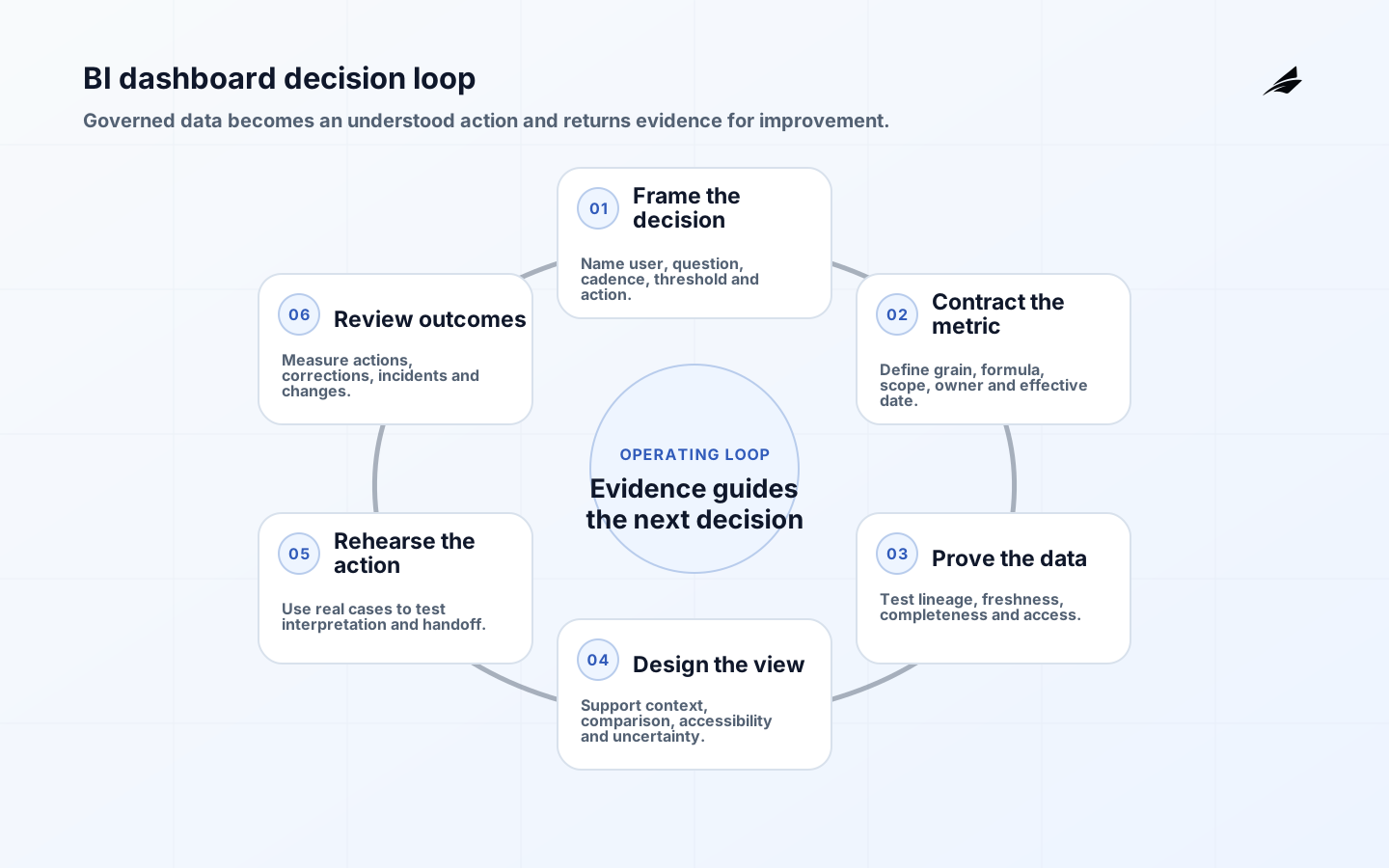
BI dashboards for data analytics are useful when they help a person take a better next action. They are not a compressed warehouse, a gallery of charts, or a substitute for management attention. The best dashboard begins with a reader who has a recurring decision, a limited amount of time, and a need to understand what changed. That reader may need to spot a service breach, compare demand with capacity, or decide which account needs follow-up. Design for that sequence: orient the reader, show the material signal, provide enough context to explain it, and offer a route to the records or owner behind the number.
Use Edilec’s metric layer guide to govern definitions, the data pipeline guide to protect delivery, and the executive dashboard playbook to connect measures with a leadership cadence.
Frame the reader's decision
Write a short dashboard brief before building visuals. It should name the reader, their decision cadence, the decision or question, the measures involved, the required freshness, and what they can do next. A leadership dashboard may orient a weekly review, while a supervisor view may need case-level detail every morning. Combining them indiscriminately produces a cluttered interface that serves neither. This does not mean every audience needs a separate data model; it means presentation and drill paths should reflect the job. Dashboard adoption guidance explains how to test whether the resulting tool becomes part of that job.
| Dashboard level | Reader need | Appropriate detail |
|---|---|---|
| Executive | Direction and material exceptions | Few trusted measures, trend, and links to accountable owners |
| Manager | Priorities and resource trade-offs | Segmented measures, drivers, and comparison periods |
| Operator | Cases requiring action now | Record-level queues, state, and assigned ownership |
| Analyst | Investigation and pattern discovery | Filters, definitions, source context, and export controls |
Design the information order
Put the decision-relevant signal before explanatory detail. Show the selected period, data freshness, and material filters where they cannot be missed. Use comparisons deliberately: a change against yesterday is not necessarily meaningful if the operating cycle is weekly or seasonal. Avoid relying only on colour or a single KPI card; use labels, thresholds, and accessible contrast so readers understand what requires attention. A chart should answer one question clearly. If it needs a long verbal explanation to establish the population or formula, improve the metric definition or move supporting detail into a discoverable description rather than asking the reader to infer it.
- Use the first screen to answer what changed, how material it is, and which decision owner should care.
- Show freshness, selected time range, and critical filters next to the affected measures.
- Use consistent names and units across pages, subscriptions, and exported data.
- Provide drill-through to contributing records or a well-defined investigation view for material exceptions.
- Design keyboard, screen-reader, and colour-independent cues as part of the normal interface, not an afterthought.
Build a dependable BI dashboard
A well-designed view still fails if its data arrives late, filters apply inconsistently, or access is too broad. Build dashboard logic on tested models and shared measures where possible. Specify refresh schedules against the decision window and expose data status when a dependency is delayed. Test the experience with real roles, including a user who should not see restricted rows. Treat report deployment as an application release: use a controlled workspace or environment, review changes, validate subscriptions and alerts, and provide a rollback or restore path. That discipline makes the dashboard easier to trust after the first demonstration ends.
| Risk | Design or control | What to verify |
|---|---|---|
| Stale result | Visible freshness and dependency status | Refresh time meets stated decision window |
| Metric drift | Shared definition with tested model | Sample reconciles to source or governed total |
| Unauthorised access | Role and row-level access design | Test results with representative accounts |
| Alert fatigue | Thresholds tied to actions and rate limits | Recipients act on rather than ignore notifications |
Review use and meaning
A dashboard needs regular review because the business, source systems, and users change. Look for questions that repeat, exported spreadsheets that compensate for a missing path, and metrics that are frequently disputed. Those signals can indicate a useful improvement, but they can also indicate that the original decision is obsolete. Speak with readers during the decision cycle, not only in an annual satisfaction survey. Ask which actions were supported, which elements they ignored, and what they could not verify. Archive or simplify views that no longer have a named decision owner. A smaller set of dependable dashboards is more valuable than a large catalogue of uncertain ones.
Work through a practical case
A customer-success team needs to prevent avoidable churn. Its manager dashboard begins with accounts approaching renewal that have a recent drop in product activity, not a generic engagement score. The view shows the activity definition, data date, account owner, renewal window, and a link to the account record. It compares like-for-like cohorts, while an analyst page offers detail on usage events and data gaps. The team tests the list against a small set of known accounts before broad release. When a product event stops arriving, the dashboard displays its affected freshness state instead of implying that activity has fallen. The design protects both action and trust.
Plan the next review
Plan a dashboard review around a real decision meeting rather than an abstract design critique. Observe which questions readers ask first, which filters they change, where they leave the dashboard for another system, and whether an alert produced a useful action. Compare the intended audience with the actual audience and inspect data freshness, access events, and support tickets from the same period. This evidence can distinguish a chart that is genuinely unnecessary from one that is valuable but poorly placed. Make only one or two changes per cycle, then observe the next decision meeting. A careful loop protects readers from constant layout churn while steadily improving the dashboard's ability to communicate a trustworthy signal.
- Bring one real exception from the previous decision cycle and trace it from chart to record.
- Check the first screen on the devices and access roles used by the intended audience.
- Review whether thresholds still correspond to a decision, staffing capacity, or service commitment.
- Compare exported data with the in-product view to find missing investigation paths or access friction.
- Record retired pages and definitions so past reports can be interpreted without keeping stale navigation alive.
Build confidence before adding interactivity. Every filter, bookmark, alert, or drill action introduces a state that should be understandable, accessible, and tested. Show what filter context is active and give readers a simple path to return to the default view. This matters when a dashboard is discussed in a meeting or shared through a link, where one person's local selection can otherwise be mistaken for the agreed result. A predictable interaction model makes a dashboard easier to use under time pressure and easier for support teams to diagnose.
Rehearse the decision before launch
Example: a weekly revenue dashboard
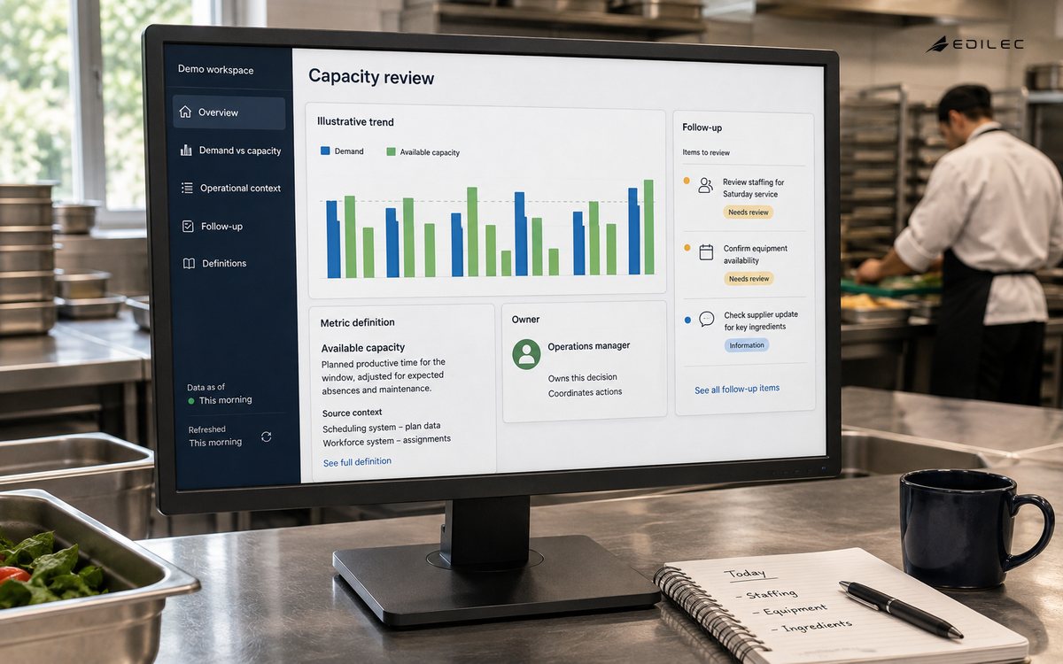
Suppose regional revenue falls 11 percent week over week. A useful dashboard says whether the period is complete, identifies the comparison basis, distinguishes booked revenue from collected cash, and exposes material segments and exceptions. A finance lead should be able to tell whether the movement reflects demand, a late source, a currency rule, refunds, or a metric change. Ask finance, sales operations, analytics, and data engineering to work through representative cases and narrate what they believe happened, which evidence they trust, and what they would do next.
Record disagreements instead of averaging them away. If informed readers interpret a label differently, fix the metric contract or interface. Test partial periods, empty states, keyboard navigation, zoom, color-independent status, narrow screens, exports, and permission boundaries. After release, review correction requests, recurring drill paths, data incidents, abandoned views, and decisions attributed to the dashboard. Views alone do not establish value; the operating question is whether people recognized a relevant change and took a better action with less uncertainty.
Key takeaways
- Start a BI dashboard with a named reader, recurring decision, and required freshness.
- Order information from material signal to explanation to actionable record detail.
- Use governed measures, visible status, access testing, and controlled releases to make the view dependable.
- Review actual decision use, exports, disputes, and support questions after launch.
- Retire views that no longer have a clear owner or operational purpose.
Current implementation guidance reinforces that dashboards are organizational products, not merely visual files. Microsoft's Fabric adoption governance guidance recommends iterative, right-sized governance aligned with business units, while the dbt Semantic Layer illustrates how governed metric definitions can be made available to downstream tools. Use these ideas with the metric layers guide and executive dashboard playbook: assign measure owners, version definitions and test whether the dashboard supports the intended decision without exposing unnecessary detail.
Provenance and accessibility need explicit acceptance evidence. The W3C PROV overview provides a model for describing entities, activities and agents behind information, useful context for tracing a reported measure to its inputs and transformation. Microsoft's Power BI accessibility tools describe platform capabilities, but teams must still test reading order, keyboard navigation, alt text, contrast and meaningful labels in the finished report. Record the source revision, refresh outcome and metric definition alongside each material release so a disputed number can be investigated rather than reinterpreted. Include this evidence in the normal release record and sample it after deployment. Recheck exports and subscriptions because they can present a different accessibility and security context from the interactive report.
FAQ
How many metrics belong on a dashboard?
Include only the measures needed to recognize state, diagnose material variation, and decide the next action. Put specialist detail behind a deliberate drill path.
Should every team use the same view?
Share governed definitions, but tailor latency, detail, and action controls to executive, operational, and analytical work.
How many KPIs should a dashboard have? Enough to support the stated decision without hiding the important signal. The right count varies by audience; a first page should usually prioritize a small number of measures with clear drill paths. Should every dashboard allow exports? No. Exporting may be appropriate for controlled analysis, but it can create stale copies or expose data outside the intended access model. Decide based on the use case, classification, and whether the dashboard already provides the needed investigation path.
Conclusion
Dependable BI dashboards make the route from event to action visible. Start with the decision, govern each metric, preserve provenance, design for honest comparison and accessibility, and rehearse interpretation. Then maintain owners for freshness, corrections, definition changes, and outcomes. That discipline turns a display into a durable management product.