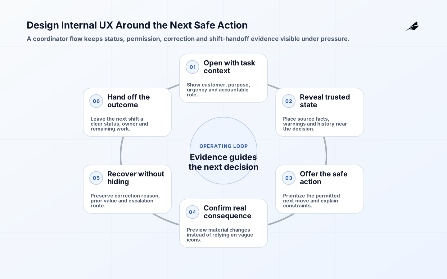
Internal tool UX is an operating decision, not a technology label. A coordinator needs to find a customer, correct an address, request approval for a refund, and tell the next shift what happened. A polished dashboard that obscures status or forces copy-and-paste between systems can slow that work more than an unstyled but clear form. Internal users carry domain knowledge, but they also work under interruption and time pressure. This guide helps founders turn internal tool ux into a clear promise, a delivery path, and a reviewable operating practice. The aim is not to remove every trade-off. It is to make the trade-off explicit enough that a team can change the system without guessing who depends on it or how failure should be handled.
Start internal tool ux with an outcome and a boundary
Begin with the user or operational outcome that internal tool ux must improve. Name the decision-maker, the data or behavior that is authoritative, the expected time boundary, and the consequence of a wrong result. Internal tool UX starts with the job, the decision, and the consequences of a wrong action. Record the trusted record, permissions, required evidence, exception path, and how a user knows a change was accepted. Accessibility is part of this boundary: the Web Content Accessibility Guidelines give testable success criteria for perceivable and operable interfaces, while business workflows must still make their domain states understandable. The useful test is whether a new engineer and a support owner can explain what the system promises without reading implementation details.
| Decision area | Question to settle | Evidence to retain |
|---|---|---|
| Outcome | Which user or business result must improve? | A concrete scenario and success measure. |
| Boundary | What belongs inside this capability and what remains external? | Owner, interface, and dependency map. |
| Failure | What can safely retry, wait, or require review? | Recovery rule and escalation route. |
| Change | Who approves a behavior change and how is impact checked? | Decision record, test evidence, and rollout plan. |
Define the internal tool ux promise
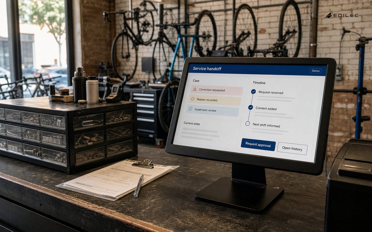
A promise turns a broad engineering intention into behavior a team can verify. State the inputs, permitted transitions, output, permissions, timing, and recovery rule in language that product, support, and engineering can all use. Avoid a promise such as “reliable” or “scalable” without a context. Instead, say what happens when data is delayed, a caller retries, a worker is unavailable, or an operator needs to correct a record. This is also where internal tools becomes concrete rather than decorative.
- What real decision or workflow makes internal tool ux worth maintaining?
- Which actor owns the authoritative change, and which actors only observe it?
- What invalid, delayed, duplicate, or denied case must the design handle?
- Which contract, state, or dependency can a reasonable consumer rely on?
- What evidence will show that the intended outcome occurred?
- Who can pause, repair, or roll back the behavior during an incident?
Build internal tool ux in small, testable slices
Do not begin by standardising every adjacent system. Observe several real tasks before designing screens. Put the primary task, current state, warnings, and next safe action in one predictable place. Use progressive disclosure for uncommon detail, but never hide an approval, irreversible action, or data-quality warning behind visual tidiness. Build one frequent workflow end to end, including empty, loading, denied, failed, and corrected states. The WAI-ARIA Authoring Practices can guide keyboard and widget behavior when native controls are insufficient. Keep the first slice narrow enough that its normal and failure paths can be exercised before its assumptions spread. design systems provides useful adjacent context when the work crosses an existing service or workflow boundary.
Use examples as design material: one ordinary case, one boundary case, one invalid request or state, one delayed dependency, and one correction. Review the examples with the people who will operate the result. A technically valid implementation can still be wrong if it leaves a support owner unable to explain a disputed outcome or a user unable to recover from a predictable interruption. For Internal Tool UX: A Practical Guide for Founders, make those examples part of the review record so later changes preserve the same decision.
| Stage | Practical choice | Check before progressing |
|---|---|---|
| Discover | Map users, owners, data, and dependencies. | The team agrees on the problem and scope. |
| Design | Write behavior and recovery examples. | Important states and permissions are explicit. |
| Deliver | Release one bounded path with instrumentation. | Normal and adverse cases have been tested. |
| Operate | Review outcome and exception signals. | An owner can diagnose and improve the path. |
Operate internal tool ux with evidence
Watch completion time, error correction, abandoned work, support requests, manual bypasses, and the age of exceptions. Pair numbers with direct observation: a faster completion time may mean a user skipped an essential verification. Give people a way to report a confusing record or unavailable action in context. The tool earns trust when a manager can reconstruct a decision without asking the original operator to remember it. Use a small set of measures that connects implementation behavior to the intended workflow. For example, separate a technical signal such as timeout rate from a business signal such as completed corrections. Review the measures at a regular cadence and include the people who handle exceptions; they often see the first mismatch between a documented promise and an actual customer journey.
Avoid common internal tool ux failure modes
The common failure is importing consumer-app patterns into a high-consequence workflow: sparse context, ambiguous icons, optimistic updates with no clear confirmation, and important history hidden to keep the page clean. Another is treating operations staff as a homogeneous role. Design permissions, vocabulary, and work queues for the distinct decisions they actually make. Treat these as design signals, not reasons to abandon the approach. The corrective move is usually modest: name the owner, constrain the interface, add one realistic test, preserve a correlation record, or delay retirement until the relevant users have moved. error handling is a useful companion when the issue is a broader change or reliability concern.
- No one can name the consumer, owner, or support route for a behavior.
- A successful technical response is mistaken for a completed business outcome.
- Recovery depends on an undocumented manual step or a single person’s memory.
- Metrics show volume but not correctness, delay, or user impact.
- A migration or shared abstraction has no retirement condition.
- Production evidence contradicts a design assumption but the documentation is unchanged.
Use a internal tool ux implementation checklist
Use this checklist as a conversation before release, not as a ceremonial sign-off. Each answer should point to a test, a visible behavior, an owner, or an operational record. For deeper delivery confidence, pair the work with React state design and revisit the plan when the first production evidence arrives. In this KM-SW-0037 implementation, the checklist should be reviewed by the people accountable for internal tool ux.
- Write the internal tool ux outcome, owner, boundary, and failure consequences in plain language.
- Capture normal, boundary, denied, delayed, duplicate, and correction examples.
- Define an interface or state model that makes the permitted behavior inspectable.
- Protect access and sensitive data at the service boundary, not only in the user interface.
- Release behind a controllable rollout or cohort when the blast radius warrants it.
- Instrument technical health and the business outcome separately.
- Document a bounded recovery, rollback, or repair action before dependency failure forces an invention.
- Set a review date and a criterion for expanding, changing, or retiring the first slice.
Key takeaways
- Internal tool UX should begin with a valuable outcome and a named operational boundary.
- A clear promise includes failure, recovery, ownership, and evidence, not only happy-path behavior.
- Small releases with realistic examples reveal risk earlier than broad standardisation.
- Operational measures must distinguish a healthy component from a completed user outcome.
- A documented retirement or improvement decision keeps temporary work from becoming permanent uncertainty.
Frequently asked questions
When should a team invest in internal tool ux? Invest when a recurring workflow, reliability risk, or delivery constraint has a clear cost and a team can name the behavior it needs to improve. How much design is enough? Enough to describe ownership, ordinary and adverse cases, access, recovery, and a measurable outcome before the first release. Should every related system use the same pattern? No. Share a pattern when it preserves a genuine contract or reduces meaningful risk; keep an exception when its constraints differ and record why. What is the first operational metric to add? Add the signal that tells an owner whether the intended user or business result happened, then pair it with the technical signal most likely to explain a failure.
Conclusion
Well-run internal tool ux gives a team a way to make change legible. Start with an outcome, make the promise testable, release one controllable slice, and learn from production evidence. The authoritative references used here, including Web Content Accessibility Guidelines (WCAG) 2.2 and MDN Web Docs: Accessibility, are useful for the underlying standards and platform details. Apply them to the actual workflow, people, and recovery decisions in front of the team; that is where an engineering practice earns its value. Over the next month, shadow one operator performing a frequent task and capture where they search, wait, correct, or leave the tool. Improve the most consequential state and retest it with the same role. This is a disciplined way to turn internal tool UX from screen opinion into a measurable reduction in operational friction.