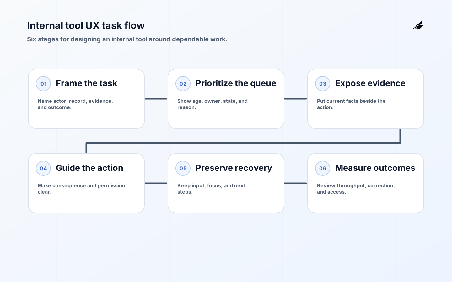
Internal tool UX is judged in the middle of repeated work: a case worker scans a queue, checks a record, makes a consequential decision, corrects an input, and moves to the next item. A polished dashboard can still fail if it hides ownership, loses filters, erases a draft, or reports success before the system has committed the result. Good internal tool UX makes the workflow, evidence, state, and recovery path visible without adding noise. This guide shows how to design the task before the screen, shape queues and record views around decisions, give feedback that people can act on, build accessibility into repeated interactions, and measure whether the tool improves dependable throughput rather than simply looking efficient.
Design the workflow before the dashboard
Write one representative task from intake to durable outcome. Name the actor, the record they need, the evidence they must inspect, the action they may take, the permission boundary, and the exception that stops the normal path. A queue is not a list of database rows; it is a prioritization surface that should explain what needs attention and why. A detail page is not a form with every field; it is a decision surface that should show current state, provenance, history, and the next allowed action. The W3C Forms Tutorial recommends asking only for information needed to complete the process, a principle that also reduces cognitive load in internal tools.
| Workflow moment | Design question | Evidence the interface should show |
|---|---|---|
| Queue entry | Why is this item here and who owns it? | Priority, age, owner, state, and source. |
| Record review | What facts support the next decision? | Current values, recency, provenance, and history. |
| Action | What will change and what authority permits it? | Clear action, consequence, validation, and permission. |
| Exception | What can the person correct or escalate? | Specific error, preserved input, next step, and owner. |
| Completion | What proves the result is durable? | Status, reference, timestamp, and audit entry. |
Make queues support prioritization and flow
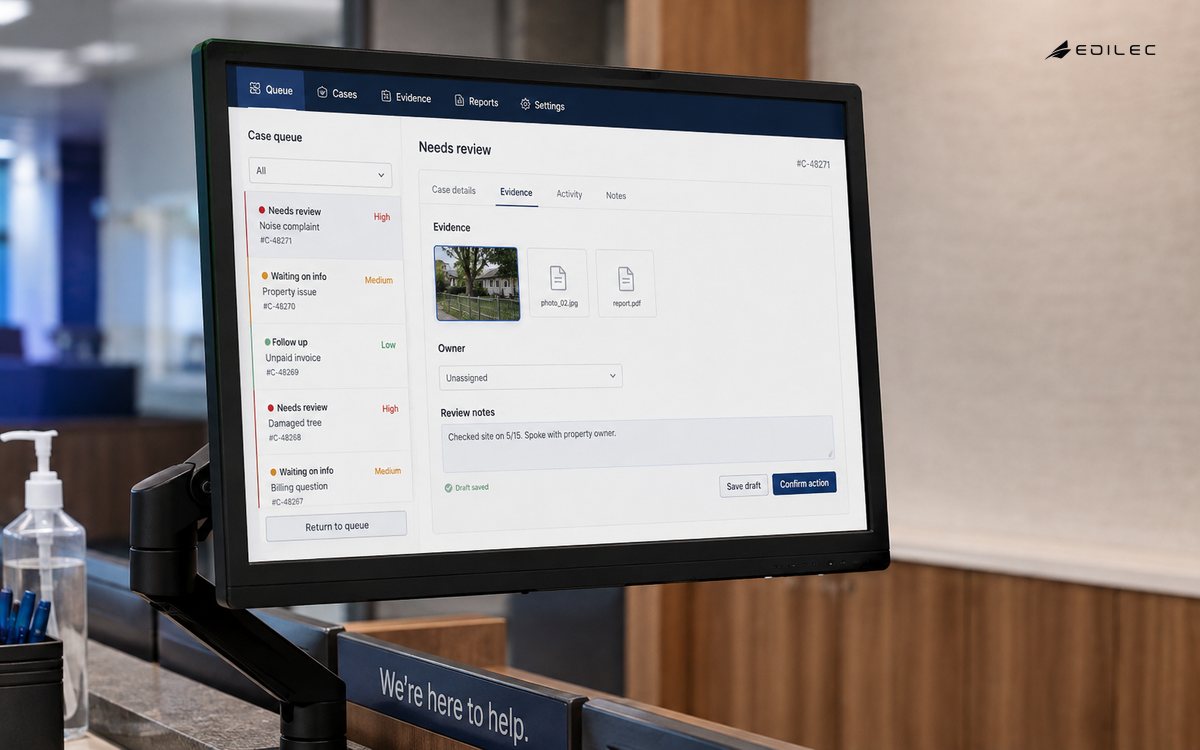
A useful queue lets a person answer what to work on next without opening every record. Show the status, age, owner, risk, and the reason an item needs attention. Use filters that have predictable scope and preserve them when the user returns from a detail page. If sorting by urgency changes the decision, make the rule legible rather than presenting an unexplained score. Keep pagination, bulk selection, and keyboard movement consistent with the user’s working rhythm. For long-running work, show whether an item is waiting on a person, a dependency, or an automated process. A queue that hides why work is blocked creates side spreadsheets and manual handoffs, even if its individual rows look clean. The Plain-language Guide to Error Handling is a useful adjacent reference when blocked work needs a consistent recovery message.
Put decision evidence beside the action
On the record view, group information by the decision it supports rather than by the database table that supplied it. Put identity, current state, last update, source, and ownership near the main action. Link to history without replacing the present state with a timeline that requires interpretation. Display timestamps with a clear time zone and distinguish “last checked” from “last changed.” If a value is imported, say where it came from and what a user may do when it is wrong. These small cues reduce the need to open multiple screens or ask another team for context, which is often the real cost of a weak internal interface.
| Interface area | Reliable pattern | Common failure to avoid |
|---|---|---|
| Primary action | One clear action for the current state. | Several equally prominent buttons with different consequences. |
| History | Readable events with actor, time, reason, and source. | A raw audit dump that hides the decision context. |
| Status | Plain language plus visible pending or blocked state. | A spinner or color that implies completion. |
| Permissions | Explain unavailable actions without exposing sensitive data. | A hidden button that makes the workflow seem broken. |
| Filters | Persisted, reversible filters with a visible count. | A reset or route change that silently changes scope. |
Make feedback specific, persistent, and actionable
A person should know whether an action was accepted, rejected, still processing, or completed. Use a clear message close to the action and a durable status when work continues after the request. An error should identify the affected field or record, explain what is wrong, and say how to correct it when a correction is possible. WCAG 2.2 error identification requires a text description of detected input errors; the GOV.UK error message pattern also emphasizes keeping entered values so people can fix rather than re-enter them. The W3C User Notification tutorial shows how summaries can link back to affected fields. Do not use a generic red banner for a service outage, a permission denial, and a malformed field; each needs a different next action.
Status messages should inform without stealing focus from a repetitive task. W3C guidance on status messages explains how important changes can be made programmatically available to assistive technology without forcing a context change. Use that distinction in the product: a saved filter can announce a result count without moving focus, while a blocking dialog that requires a decision should manage focus intentionally. Keep messages stable long enough to be understood and provide a history or status field when the result matters after the toast disappears.
- Keep entered values when validation or a recoverable service failure occurs.
- Name the field, record, or action that failed and give a concrete correction or escalation path.
- Distinguish accepted, processing, completed, denied, and unknown outcomes.
- Use non-interruptive status updates for routine changes and deliberate focus management for blocking decisions.
- Record a safe business reference so a user or support operator can return to the result later.
Build accessibility into repeated work
Accessibility is not a final audit for an internal tool; it is part of whether people can perform the job reliably. Ensure every control has a meaningful accessible name, focus order follows the task, keyboard users can operate the queue and record actions, and zoom or reflow does not hide the evidence needed for a decision. The WCAG 2.2 requirements for keyboard access, labels, and input assistance provide a concrete baseline. W3C’s labeling guidance explains why an associated label helps both assistive technology and the larger clickable target that benefits touch and speech input.
Test the path with real keyboard and interruption patterns
Test the exact sequence people repeat: open the queue, move to the next item, inspect the record, edit a field, submit, recover from an error, and return to the queue. Verify that focus is not lost when content changes, that a modal can be closed without trapping the user, and that an inline validation message is discoverable without a mouse. Try a slow network, a session timeout, a permission change, a long record, and a browser refresh while a draft is present. A tool that works in a design review but fails under interruption creates hidden labor for the person using it.
Prototype with production-like information and consequences
A prototype made from neat sample records cannot reveal the hard parts of operational work. Include long names, missing values, stale timestamps, duplicate-looking records, permission differences, multiple owners, and an exception that needs escalation. Use realistic volumes to test queue scanning, filters, pagination, and keyboard movement. Put destructive or high-impact actions behind a review step when the consequence is difficult to reverse, and make the reason part of the audit record. The Internal tools that scale with operations and Design Systems Checklist for Reliable Digital Operations are useful companion reads when repeated patterns need to remain consistent across several tools.
Prototype the recovery path as deliberately as the success path. What should happen when a record changes while it is open, an approval is no longer valid, a dependency times out, or the user lacks permission after entering a long note? Preserve information, explain the conflict, and offer a safe next step. Avoid silently refreshing the whole screen if it could erase the person’s work. A small amount of explicit state makes the tool trustworthy because the user can see what the system accepted and what still needs attention.
Measure throughput, correction, trust, and access
Measure the complete task, not only click count or page speed. Track time from queue entry to durable outcome, correction and reversal rates, abandoned records, support-assisted work, manual exports, and the number of items that remain blocked. Pair those measures with accessibility defects, keyboard completion, status-message failures, and the time it takes to recover from an error. A faster form can be a worse tool if it creates incorrect records that another team must audit. Review outcomes by role and workflow, because a design that works for an administrator may be unsafe for a high-volume operator with narrower permissions.
| Measure | What it reveals | How to inspect it |
|---|---|---|
| Task completion time | Whether the tool removes or relocates effort. | Time a representative task from queue to durable result. |
| Correction rate | Confusing labels, defaults, hidden state, or validation. | Track edits, reversals, and support-assisted corrections. |
| Abandonment or workaround | A path that is too slow, inaccessible, or untrusted. | Compare incomplete records, exports, and manual handoffs. |
| Accessibility defects | Repeated barriers for keyboard or assistive users. | Test critical journeys with keyboard and assistive technology. |
| Outcome ambiguity | Where status or recovery is not understandable. | Review pending, denied, and reconciled actions. |
Internal tool UX takeaways
- Anchor every screen in a complete user task, including its exception and escalation path.
- Show queue priority, record evidence, authority, and current state close to the action that uses them.
- Make feedback distinguish correction, denial, pending work, and durable completion.
- Preserve data and focus through errors, delays, refreshes, and permission changes.
- Measure reliable task outcomes and correction cost, not visual polish or click reduction alone.
Internal tool UX FAQ
What should an internal tool dashboard show first?
Show the work that needs attention, why it matters, who owns it, how old it is, and which action is available next. The first view should support prioritization, not display every field the database contains. Link to detail evidence without making a person reconstruct the current state from several screens.
How should an internal tool handle form errors?
Identify the affected field or record in text, explain the problem and how to correct it, preserve entered values, and provide a summary or direct link when several errors exist. If the person cannot fix the issue, explain the service or permission problem and give an escalation or retry route instead of treating it as bad input.
Why prioritize accessibility for an internal tool?
Internal users still have different abilities, devices, and working conditions, and repeated barriers multiply over every task. Keyboard access, clear labels, readable status, predictable focus, and recoverable errors improve accuracy and reduce support cost for everyone, while providing a measurable baseline for compliance and inclusive operations.
Conclusion: design internal tools for the work between clicks
Internal tool UX earns trust by making decisions and recovery visible under real operating pressure. Start with the workflow, shape queues around prioritization, place evidence beside actions, and make status messages honest and accessible. Test realistic records, interruptions, permissions, and keyboard paths, then measure durable outcomes and correction cost. A good internal tool does not merely help a person move faster through screens; it helps them make the right decision, understand what the system did, and recover safely when the normal path breaks.