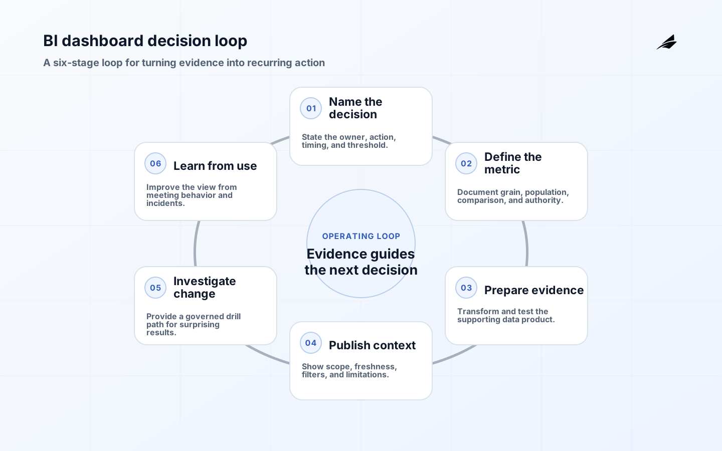
BI dashboards are interfaces for recurring decisions. Their raw material is data, but their value comes from helping a person notice a meaningful change, understand its scope, and choose a next action without rebuilding the analysis. This first-principles view prevents a common failure mode: treating a dashboard as a collection of attractive charts. A chart earns a place only when it answers a question, compares the right population and period, and lets a reader inspect what caused the result. BI dashboards therefore combine a decision contract, a metric model, a publication process, and an investigation path.
Name the Decision. Before the Chart
Write the decision in everyday language before choosing a chart: “Should we move support capacity tomorrow?” or “Which onboarding step should we investigate this week?” Then record the decision owner, timing, action threshold, and acceptable data latency. This prevents a dashboard from mixing incompatible cadences. A daily exception queue needs current, actionable detail; a monthly performance review needs stable comparisons and context. The contract also provides a useful test when requests arrive: a new metric belongs only if it changes the decision, explains a driver, or helps recover from a bad signal.
- Name the recurring decision and the person accountable for it.
- Specify the event or threshold that should change the next action.
- Set the grain: customer, order, account, day, or another clear unit.
- Show the comparison period and included population beside the result.
- Define what readers should do when a result is incomplete.
Give Every Measure a Contract
A metric is a shared claim, not simply a formula. It needs a name, business definition, grain, numerator and denominator where relevant, inclusion rules, source authority, owner, and freshness expectation. Consider conversion rate: it is meaningless until the eligible audience, event ordering, time window, exclusions, and identity treatment are known. Put this information in a governed semantic layer or documentation that readers can reach. Metric design for leadership explains why this work should happen before a leadership dashboard becomes the default meeting artifact.
| Metric component | Example question | Why it matters |
|---|---|---|
| Grain | Is one row an order, a customer-day, or an event? | Avoids accidental duplication in aggregates. |
| Population | Which users or transactions are eligible? | Makes the denominator and exclusions testable. |
| Time | Which timestamp and time zone define the period? | Prevents incompatible comparisons. |
| Authority | Which model is accountable for this result? | Gives disputes a route back to evidence. |
Show Why the Number Deserves Trust
A reader should not need to guess whether a number is current or final. Display the publication time, selected filters, period definition, and any active data limitation near material results. Preserve a drill path to contributing records or a supporting view, with access appropriate to the role. Quality checks should test the promise of the metric: expected source arrival, unique identifiers, valid categories, and reconciled control totals. The Microsoft guidance on governance supports the broader principle that ownership and appropriate controls are part of trusted content, not paperwork after release.
- Place freshness and scope beside time-sensitive headline values.
- Test input completeness, valid values, and unexpected duplication.
- Make filters persistent and easy to inspect when a view is shared.
- Link a material total to its accountable source or reconciliation.
- Record an owner and response route for each failed control.
Pilot the Dashboard Where Work Happens
Pilot the dashboard inside the meeting or workflow it is meant to improve. Observe what users ask first, what they export, and where they leave the interface to find context. Those behaviors reveal missing definitions, poor drill paths, or measures that do not influence action. Use a small set of representative edge cases when validating the first release, and codify recurring checks with tools such as dbt data tests. The companion guide to operational BI dashboards is useful for turning those observations into an operating cadence.
| Reader behavior | Likely design issue | Improvement |
|---|---|---|
| Exports every meeting | The dashboard lacks detail or a trusted drill path. | Add a governed investigation view or record link. |
| Questions the total | Definition or freshness is hidden. | Expose scope, timestamps, and source authority. |
| Ignores an alert | Threshold is not tied to an action. | Revisit the decision contract with the owner. |
| Maintains a parallel sheet | The model misses an important exception. | Document the exception and decide whether it belongs in the product. |
A Staffing Queue, Shown End to End
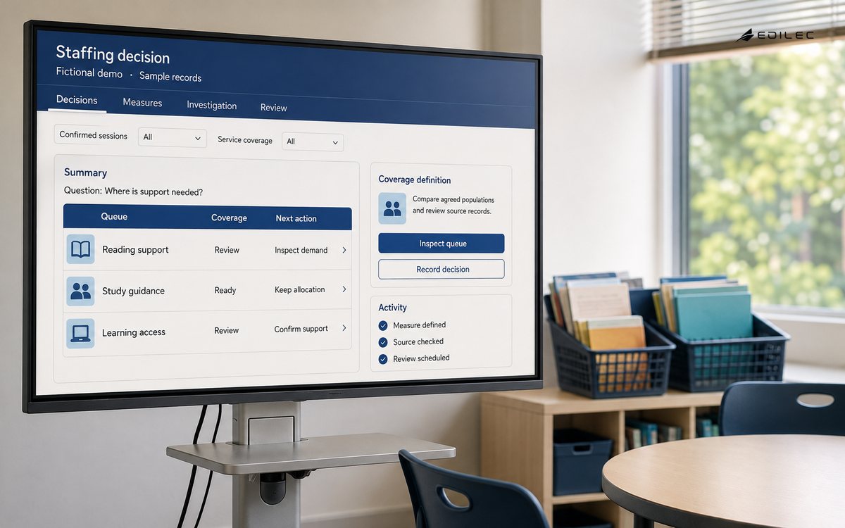
Take a support leader deciding how to allocate the next day’s staffing. The headline metric might be open cases nearing their service target, but a count alone is not enough. The dashboard needs the population definition, a time-to-target calculation, the current queue assignment, and a way to distinguish a case waiting on the customer from a case waiting on the team. It should also show when the underlying service data was last published. Those design choices let the leader decide whether to shift capacity, escalate a blocker, or wait because the apparent breach is caused by a known source delay.
A second view might summarize weekly support trends for senior leadership. It can share the same core definitions while using a different aggregation and investigation path. The daily queue is about immediate action; the trend view is about whether a process or product change is improving outcomes. Linking both views to the same modeled measures prevents debates about why two case counts differ, while allowing each interface to serve its particular decision. The common mistake is trying to make one crowded page satisfy both audiences and consequently making neither the action nor the analysis clear.
During a pilot, watch for workarounds with curiosity. If the team downloads data to calculate a percentage, find out whether the denominator is absent, the relevant comparison is hidden, or they do not trust the timestamp. If they maintain a manual annotation spreadsheet, decide whether the note represents an essential operating exception that should be captured in a governed workflow. A dashboard becomes mature when it reduces these repeatable detours by improving evidence and context, not when it prohibits users from asking the questions that exposed the design gap.
- Confirm that every headline visual links to a decision, comparison, or investigation step.
- Check that metric names include definitions accessible to a reader without technical privileges.
- Verify the selected filters, population, and reporting period remain visible when views are shared.
- Test the dashboard with normal, empty, late, and duplicate-input scenarios before broad release.
- Reconcile critical totals to accountable sources at the cadence appropriate to the decision.
- Review alert thresholds with the people who must take action when they are breached.
- Measure exports, manual calculations, and parallel sheets as signals of unmet reader needs.
- Maintain a named owner for meaning and a steward for technical freshness and quality.
- Record changes to definitions, visual logic, and historical treatment in reader-facing release notes.
- Remove charts that do not affect a decision or provide necessary explanatory context.
A simple review ritual keeps this work alive. Once a month, the dashboard owner and a small group of regular readers can inspect one metric definition, one quality incident or limitation, one reader workaround, and one proposed change. The point is not to turn dashboard maintenance into a long committee meeting. It is to ensure that the decisions made in the interface, the data promises behind it, and the way people actually use it remain aligned. Keep a short record of accepted changes and unresolved questions so the next release does not reopen the same debate without evidence.
Key takeaways
- A BI dashboard is a product for recurring decisions, not a chart gallery.
- Definitions, grain, freshness, and source authority are part of the interface.
- Trust grows when limitations and drill paths are visible.
- Use real meeting behavior to improve the dashboard after launch.
Frequently asked questions
What makes a dashboard different from a report? A dashboard usually supports ongoing monitoring and action; a report may be a point-in-time analysis or record. How many metrics should it contain? Only as many as support the decision and its investigation path. Can self-service BI be governed? Yes, by publishing clear data products, definitions, ownership, access controls, and quality expectations. What should happen when a data check fails? The response should be proportionate to decision risk: warn, hold a measure, investigate, or use an approved fallback.
Conclusion
BI dashboards work when the interface reflects the underlying decision clearly enough to be challenged. Start with the owner, action, time horizon, and evidence required; then construct measures and visuals that preserve that context. A small dashboard with explicit definitions, current status, and a reliable drill path will outperform a larger one that merely appears comprehensive. Treat it as a maintained decision service, and its usefulness will compound as teams learn which signals actually change the work.
A first-principles dashboard review should leave behind more than a polished screen. It should record the decision owner, measure contract, source authority, freshness state, audience, and action when a check fails. Keep one ordinary example and one disputed example so a new reader can see how the dashboard behaves when the evidence is incomplete. If users export a value, annotate it manually, or ask for a different denominator, treat that behavior as design evidence. The next revision should either improve the governed path or state why the request belongs elsewhere.
A dashboard review becomes more useful when it tests one real decision. Ask a manager to explain a movement, a steward to reconcile the total, and an operator to find the source and timestamp. Edilec's metric design guide and BI guide for founders provide adjacent patterns, while data quality guidance frames what happens when values are incomplete. Finish by recording whether the decision was made, deferred, or challenged, and preserve the evidence a later reviewer would need to reach the same conclusion. That small record keeps the dashboard accountable to the work rather than to its layout.
Authoritative context for BI decision design: Power BI adoption roadmap: governance; dbt data tests; Power BI star schema guidance; W3C Data Quality Vocabulary. These references anchor the article-specific guidance in current technical and operating practice, while the local owner remains responsible for applying the evidence to the BI decision design decision.