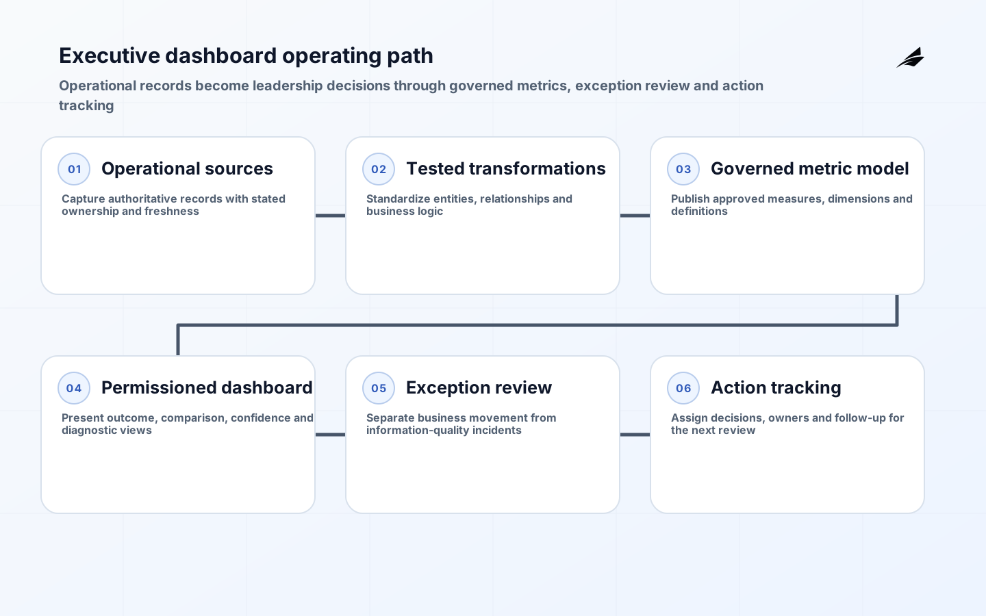
Executive dashboards should shorten the path from a material operating signal to an accountable decision. They should not become a decorative summary of every function's preferred measure. A leadership team needs a small set of indicators that explain whether the organization is meeting commitments, where a risk or opportunity is emerging and who will investigate it. That makes dashboard design an operating-model exercise as much as a reporting exercise. Before choosing a visual, agree the decisions made in the review, the business capabilities represented, the owners expected to act and the threshold that merits attention. Without those choices, a dashboard may look polished while sending managers away with different interpretations and no follow-through.
Set the executive review contract
Write a review contract for each headline measure. It should name the decision it informs, the executive sponsor, metric steward, source systems, reporting cadence, comparison baseline, target or tolerance and escalation route. This differs from a data dictionary because it includes what happens when the signal moves. A revenue trend may trigger a forecast review; an incident backlog may trigger capacity or risk action; a fulfillment measure may expose a dependency the leadership team needs to unblock. If a measure has no foreseeable action, it may be context rather than a dashboard headline. Keeping those roles explicit protects the dashboard from becoming an unranked list of departmental requests.
| Dashboard layer | Question it answers | Owner accountable for action |
|---|---|---|
| Enterprise outcome | Are priority commitments on track? | Executive sponsor |
| Capability health | Which operating area needs attention? | Capability owner |
| Exception view | What changed beyond tolerance? | Named investigation owner |
| Driver analysis | What evidence explains the movement? | Operational analyst or manager |
| Action register | What will be changed and reviewed next? | Decision owner |
Design metrics for decision, not display
A good executive metric is narrow enough to be interpreted consistently and broad enough to represent a meaningful outcome. Define its grain, population, numerator, denominator, period, source and treatment of missing or late records. Then define its comparison: plan, prior period, forecast, service commitment or tolerance. Percentages can conceal material volume changes, while totals can conceal changes in scale, so use both where the decision requires it. Avoid combining unrelated contributors into a single score merely because it fits on one tile. A composite can be useful when it has stable weighting, purpose and owner, but it should not hide the individual conditions that drive action.
Use measures that preserve causal humility. A dashboard can show a correlation or a changed operating result; it cannot establish why without supporting evidence. Provide a route from the headline to a scoped breakdown by region, service, customer segment, product, time or operational stage. Keep that diagnostic route governed so users do not unknowingly compare different populations or definitions. When a metric needs a manual adjustment, label it, record the rationale and make the effect reviewable. Leaders are better served by an incomplete but honest signal than by a seamless number that masks a broken pipeline.
| Metric design choice | Useful practice | Misleading shortcut |
|---|---|---|
| Population | State included entities and exclusions | Assuming a label describes its own scope |
| Time | Show reporting period and data-as-of time | Comparing incomplete current data to a closed period |
| Target | Name source and review date for the target | Treating a stale plan as a permanent benchmark |
| Breakdown | Use dimensions linked to an action owner | Adding filters that produce ungoverned slices |
| Adjustment | Retain reason and approver | Editing a published total without trace |
Build a governed data path
Executives see the end of a chain that starts with operational records. Map that chain from source application through extraction, transformation, metric logic, semantic model, dashboard and distribution. At each step, decide which system is authoritative, how often data arrives, what test catches a known failure and who owns remediation. Transformation models should be versioned, documented and tested for relationships, accepted values, freshness and reconciliation where those tests fit the data. A semantic layer or governed dataset can centralize metric logic, but only when change is controlled. Copying calculations into many reports creates a quiet divergence that eventually undermines the leadership conversation.
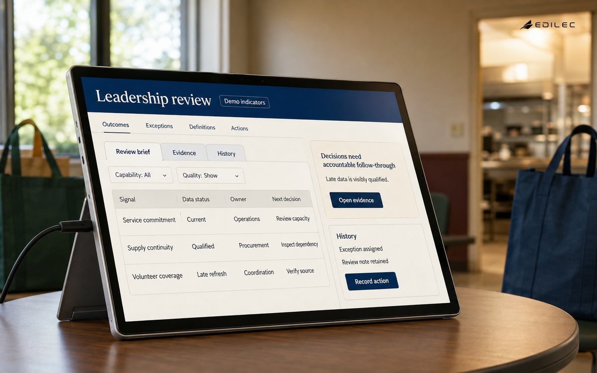
Security and access belong in the same path. Some executive measures are broadly shareable while their detailed records are not. Apply role, region or business-unit restrictions at a deliberate layer, and test both the visible aggregate and the drill-through behavior. Distribution should be auditable: know which workspace, export, subscription or embedded application exposes a report. Retention and privacy rules can affect whether a trend can be reproduced later. The aim is not to slow reporting; it is to ensure that a convenient leadership view does not become an uncontrolled channel for sensitive records.
Operate exceptions and data quality
Run two related but distinct exception processes. Business exceptions are meaningful changes in performance that need investigation or decision. Data exceptions are failures in freshness, completeness, validity, reconciliation or model behavior that make the displayed result unreliable. The dashboard should not blur them. A data-quality state can tell a leader that a measure is provisional without forcing every technical detail onto the overview. Behind it, the data team needs a specific incident path: what failed, affected reports, temporary mitigation, owner, expected correction and backfill decision. This lets the review continue with the right level of caution.
| Signal | Interpretation | Next action |
|---|---|---|
| Threshold breach | Potential business exception | Assign an investigation and decision date |
| Late refresh | Current values may be incomplete | Show status and route to data owner |
| Reconciliation difference | Definitions or records may differ | Compare against documented expected differences |
| Schema change | Metric model may no longer match source | Pause or qualify affected publication |
| Low report use | Dashboard may not fit the review workflow | Interview users and retire unused views |
Review the dashboard itself as a product. Track whether decisions reference it, whether actions have owners and whether teams bypass it with local exports. Frequent manual rework signals a missing governed view or an ambiguous metric. Conversely, high view counts alone do not prove usefulness. Ask whether a measure has changed a decision, prevented a surprise or helped an owner find a bottleneck. Maintain a visible change log for metric definitions, targets, source migrations and report layout changes so leadership can interpret trend breaks without relying on memory.
Roll out in waves
Begin with a single executive rhythm and a limited number of outcomes. Inventory the current packs, spreadsheets and manual narratives, then select the measures that are already close to a stable definition. Build the end-to-end path for those measures, validate it with the people who will review it and use the first meetings to refine thresholds and explanations. Add new domains only when the team can operate the existing definitions, quality checks and action register. A wave-based approach exposes issues in ownership and source readiness early, before the dashboard becomes a large integration program with too many stakeholders to resolve basic disagreement.
Maintain the decision history
Executive reporting benefits from a small decision history linked to the review cycle. Record the material signal, the interpretation accepted at the time, chosen action, owner and review date. This is not an attempt to automate leadership judgment. It is a way to learn whether the dashboard surfaced the right condition, whether the evidence was sufficient and whether recurring exceptions point to a structural issue. A later reviewer can distinguish a decision made with incomplete data from one ignored despite a clear signal, which makes both metric design and management practice easier to improve.
Plan for a defined service level for the dashboard itself. Set expectations for report availability, refresh window, support route, planned maintenance and severity of data incidents. The report does not need the same operational commitment as every customer-facing system, but it should not be ownerless. Clear support boundaries prevent leadership from receiving a broken or late view during a consequential review with no agreed route to determine whether the problem lies in the source, model, platform or distribution layer.
Keep presentation design consistent with the review sequence. An executive should see the outcome, its comparison and the current confidence before navigating to drivers. Stable placement and definitions reduce the meeting time spent locating or reinterpreting familiar information, especially when a new exception needs attention.
Key takeaways
- Treat every headline metric as a contract for a leadership decision and a named action owner.
- Keep enterprise outcomes, operational drivers and data-quality status visible but distinct.
- Centralize governed metric logic and preserve a traceable path back to authoritative records.
- Use exception processes for both performance movement and information reliability.
- Release dashboards in reviewable waves rather than attempting an all-enterprise summary at once.
Frequently asked questions
How many KPIs belong on an executive dashboard?
There is no fixed number. Include only the measures needed for the review's recurring decisions, then provide structured diagnostic detail elsewhere. A dashboard that cannot be discussed within its meeting rhythm has probably exceeded its useful scope.
Do executive dashboards need real-time data?
Only when the decision requires it. Faster refresh adds cost and operating complexity, and incomplete current-period data can mislead. Match freshness to the decision and display data-as-of information clearly.
Who owns an executive dashboard?
Ownership is shared but not vague: an executive sponsor owns decision relevance, metric stewards own definitions, data teams own the technical path and operational owners act on exceptions. One product or reporting owner should coordinate the whole service.
Conclusion
Executive dashboards work when they are woven into how leadership governs the business. Anchor them in decisions, preserve evidence behind the metrics and keep actions visible after the meeting ends. The result is not an executive screen for its own sake, but a dependable operating instrument that helps the organization notice, understand and address material change.