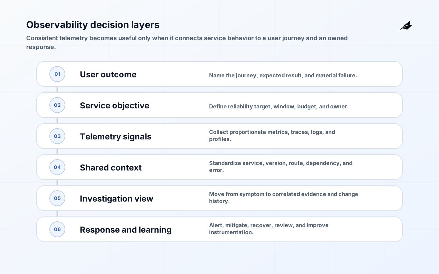
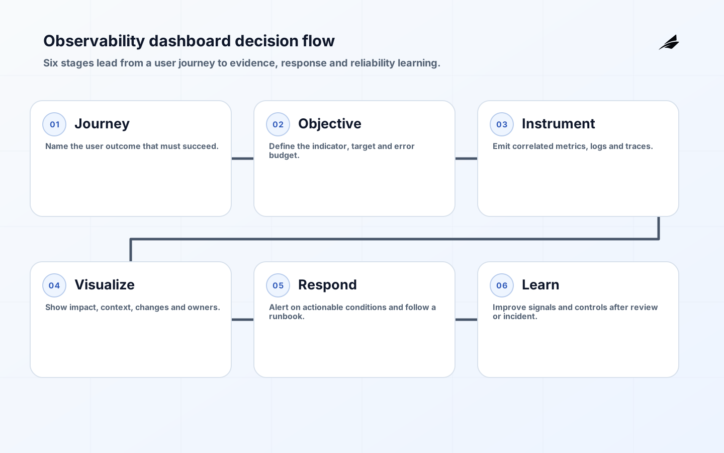
Observability dashboards should help an accountable person decide what to do next. A screen full of CPU charts may be technically interesting yet leave an IT manager unable to tell whether customers can complete the service that matters. Begin with critical user journeys: authenticate, submit an order, view a record, receive a response, or complete a scheduled job. For each journey, define a user-centered service level indicator, a target, the dependency path and the person who responds when it degrades. Then add operational detail progressively: the service overview should show impact and urgency; drill-down views should connect a metric to traces, logs, deployment changes and runbook actions. This hierarchy gives telemetry a job instead of turning the dashboard into a wall of unrelated numbers.
Start with user journeys and service objectives
Select indicators that represent the result a user experiences, not only host health. For a checkout journey, a successful, timely completed transaction is more informative than a healthy web server. Define the event, eligible population, good-event condition, data source, exclusions and owner. Set targets from observed behavior, customer expectation and the cost of failure, then explain the error budget or action threshold in plain language. Avoid presenting an availability percentage without its denominator or hiding excluded traffic. A dashboard should state which version of the indicator is being viewed and whether telemetry is incomplete. This makes reviews more honest when instrumentation changes or a dependency is temporarily invisible.
| Dashboard layer | Primary question | Useful contents |
|---|---|---|
| Service overview | Are users succeeding now? | SLIs, error budget, traffic and active incidents |
| Journey drill-down | Where does the journey fail? | Step timing, dependency status and traces |
| Component view | Which system needs attention? | Errors, saturation, queue and deployment markers |
| Operations view | Can the team respond? | Alerts, ownership, runbook and change calendar |
| Review view | What should change next? | Trends, incidents and action follow-up |
Correlate metrics, logs and traces
Metrics identify a change in behavior; traces show a request’s path across services; logs provide event detail. Design correlation identifiers and consistent service, environment and version attributes so an operator can move between these signals without guesswork. Record deployment, configuration and feature-flag changes as time markers. A latency spike without a route, version or dependency dimension is hard to act on. Standardize attributes carefully and avoid using logs as a dumping ground for credentials, customer records or uncontrolled prompts. Retention, access and redaction policies belong to observability design because an incident responder needs usable evidence without exposing sensitive material to everyone who can open a dashboard.
Instrumentation should be treated as a product dependency. Define ownership for libraries, collectors, schemas, sampling and alert rules. Test that a new service emits the trace context needed by its callers and that high-volume paths do not create unmanageable cost. Sampling can preserve useful traces, but document which failure or high-value paths are always retained and how a responder can request additional detail during an incident. Build synthetic checks for critical entry points, then compare them with real-user indicators; a successful synthetic probe does not prove that every customer path is healthy. The dashboard must show enough context to distinguish demand growth from a true degradation.
| Symptom | Correlated evidence | First investigation |
|---|---|---|
| Error budget burns | Failed journey events and traces | Check recent deploys and dependency errors |
| Latency rises | Step duration and queue depth | Locate slow hop or saturation |
| Jobs stall | Schedule, queue age and worker logs | Check ownership and poison messages |
| Alert noise | Alert history and incident outcomes | Tighten signal or retire rule |
| Telemetry gap | Collector health and schema errors | Restore visibility before assuming recovery |
Standardize context before adding more panels
Dashboards become useful when telemetry from different services describes the same request consistently. OpenTelemetry defines traces, metrics, logs, and baggage as distinct signals, while its semantic conventions provide common names for operations and attributes. Adopt a small contract for service name, environment, deployment version, route, dependency, tenant-safe correlation identifiers, and error type. Without this foundation, responders spend the first minutes of an incident translating panel labels rather than testing a hypothesis.
Keep high-cardinality and sensitive attributes out of metric labels; retain the detail in controlled logs or traces and link from the aggregate symptom. Each dashboard should name an owner, user journey, service objective, expected refresh interval, and response action. Record the query and instrumentation version as well, so a changed panel cannot silently rewrite the operational baseline during an investigation. Pair it with Edilec’s cloud monitoring and alerting guide, incident response operating model, and staging environment guide so the same signals support release validation, incident work, and post-incident learning.
Design dashboards for response
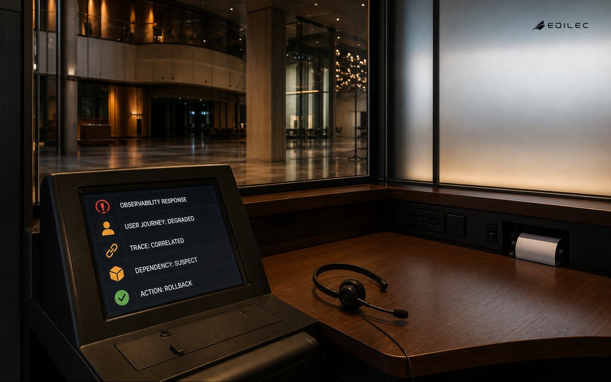
Every prominent alert should link to a named service, accountable responder, severity definition and first-action runbook. Page on user impact or imminent objective breach rather than every infrastructure fluctuation. Dashboards should make it obvious when the right action is to observe, roll back, scale, shed load, fail over or communicate. Include a current-change panel so operators can see active releases and planned maintenance, but do not require them to infer business impact from deployment status alone. Exercise the response path with a controlled failure. Can an on-call engineer find the affected journey, trace a representative request, identify the change boundary and execute the approved mitigation within the expected time? If not, revise the information architecture or runbook.
- Put user outcomes and objectives before component counters.
- Use common identifiers and attributes across metrics, logs and traces.
- Mark deployments, configuration changes and feature flags on timelines.
- Protect telemetry with access, minimization and retention controls.
- Link alerts to owners, runbooks and a tested first response.
Review dashboards for learning
A dashboard needs maintenance because services and failure modes change. Review it after incidents, major releases and service-objective breaches. Remove panels nobody uses, fix ambiguous labels, add the signal that would have shortened diagnosis and verify that action items actually improve the experience. Track alert precision, time to detect, time to mitigate, error-budget use and recurring dependency failures, but treat these as prompts for inquiry rather than a scorecard for individuals. Include product and support partners in review when they hold customer context that telemetry lacks. The best dashboard helps a team share a coherent explanation of what happened and what will be different next time.
Control cost and access
High-cardinality labels, verbose logs and unbounded trace retention can make observability unaffordable or expose too much detail. Set budgets by service, retain high-value event classes, sample deliberately and monitor the telemetry pipeline itself. Make cost visible without encouraging teams to suppress the signals needed for a severe incident. Access should be role-appropriate: a product manager may need aggregate journey health, while an incident responder may require restricted trace detail. Periodically test whether a former employee, an external account or a new dashboard role can see more than intended. Reliability evidence is valuable information and deserves the same stewardship as the production systems it describes.
Key takeaways
- Anchor the overview in critical user journeys and service objectives.
- Use correlated metrics, traces and logs to move from impact to cause.
- Treat telemetry schemas and pipelines as owned production dependencies.
- Alert on actionable impact and connect responders to tested runbooks.
- Review dashboards after incidents so they become easier to use under pressure.
- Manage telemetry cost and access without discarding necessary evidence.
Frequently asked questions
What should the first dashboard contain?
Start with one critical user journey, its success and latency indicator, current traffic, objective status, active incidents and a link to the owner’s response path. Add component detail only when it helps diagnose a change in that primary signal.
How many alerts are enough?
Enough to detect conditions that require timely human action. The right number depends on service risk and team capacity. Retire or redesign alerts that repeatedly wake people without changing a decision, and test important alerts through exercises.
Make dashboard ownership explicit
Assign an owner to each operational dashboard and to the indicators it presents. The owner should know the data source, calculation, intended audience, alert relationship, access group and review date. This avoids several near-identical dashboards disagreeing during an incident. Create a lightweight change process for renamed services, retired dependencies, new dimensions and indicator-definition changes. Annotate major changes so historical trends are not compared as though their measurement stayed constant. Give readers a route to report a confusing panel or missing decision context. Dashboards become reliable shared infrastructure when their semantic maintenance is as deliberate as the underlying telemetry pipeline.
Use reviews to align teams
A short service review can bring product, support, engineering and operations around the same evidence. Walk through objective status, notable customer symptoms, deployment changes, dependency behavior, alert quality and open reliability actions. Give each chart a decision question so discussion does not drift into status theater. Product partners can explain changed user behavior; support can surface friction that a metric does not capture; engineers can identify technical limits. Record decisions such as adjust an objective, improve an instrument, investigate a cohort or accept a temporary risk with an expiry. This shared review turns dashboards into a planning input as well as an incident tool.
Conclusion
Effective observability dashboards make service health legible from the customer journey down to the technical evidence. Design them as a response tool, maintain them through incidents and let clear ownership turn signals into reliable action.