Observability dashboards should shorten a real operating decision: pause a release, page an owner, isolate a dependency, protect capacity or tell customers what is happening. A collection of infrastructure charts cannot do that without service context. IT managers need a dashboard system that starts from user journeys and service objectives, connects metrics, logs and traces through consistent identity, marks changes, exposes ownership and gives each audience the detail required for its next action. This guide explains how to design that system, avoid chart sprawl and measure whether dashboards improve response rather than merely decorate a control room.
Key takeaways
- Start with a user journey and decision, then select telemetry.
- Give product, on-call, platform and leadership distinct views over shared definitions.
- Use consistent service, environment, version and tenant attributes across signals.
- Make release markers, ownership and runbooks part of the dashboard context.
- Review dashboard use during incidents and delete panels that do not change action.
Anchor dashboards in user journeys
Choose a small number of journeys that express the service promise: sign in, submit an order, upload a document or receive a report. Define success, observation window, latency or correctness target, population and owner. OpenTelemetry’s observability primer distinguishes availability from reliability and recommends user-perspective service indicators. Infrastructure signals remain essential for explanation, but CPU utilization cannot prove that an order completed correctly. Connect each journey to dependencies and create a direct route from outcome degradation to the traces, logs and resource signals that explain it.
| Audience | Decision | Minimum context |
|---|---|---|
| Service owner | Is the customer promise being met? | Journey SLI, objective, cohorts and release |
| On-call responder | Where is failure concentrated? | Errors, latency, traces, dependencies and runbook |
| Platform owner | Is shared infrastructure creating broad risk? | Demand, saturation, tenants and affected services |
| Security operator | Is behavior malicious or unauthorized? | Identity, access events and correlated service evidence |
| Leadership | Where is material reliability risk? | Objective trend, incidents, investment and owner |
Create one signal model across services
Metrics summarize behavior, logs record events and traces preserve the path of work. Profiles can explain code-level resource use. OpenTelemetry’s signals documentation describes these categories, but value comes from correlation. Propagate trace context through HTTP, queues and background jobs. Add stable resource attributes for service, environment, region, version and deployment, and business attributes only when privacy and cardinality are controlled. Use the project’s semantic conventions so independently instrumented services name common operations consistently. A trace that changes service names at every release is not a durable diagnostic record.
Design layered dashboards for different responsibilities
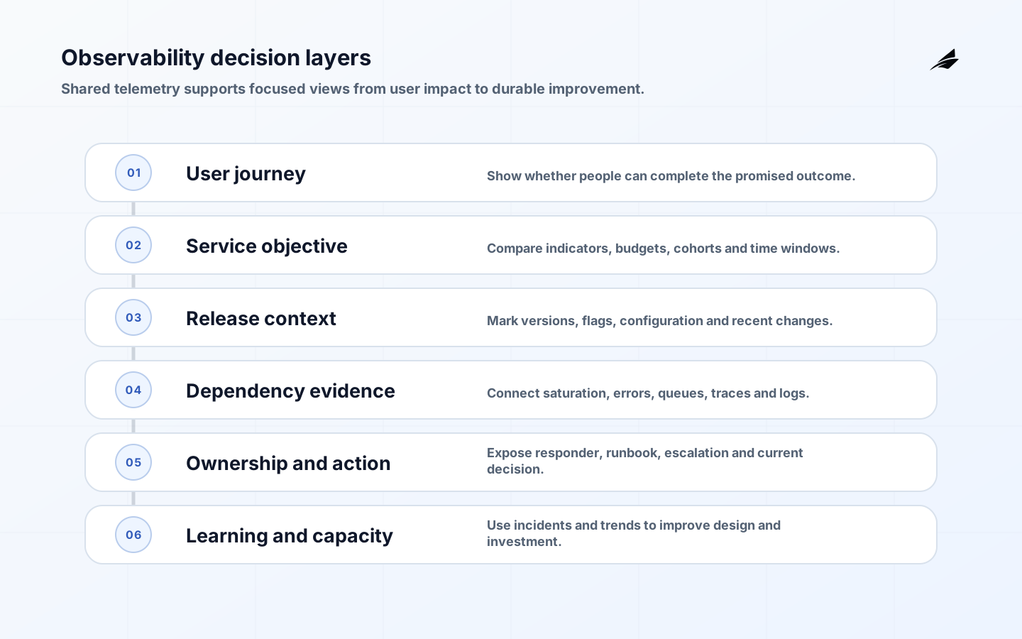
The first layer answers whether a service objective or critical journey is at risk. The second compares release, cohort, region or tenant. The third reveals dependency and saturation. The fourth links exemplars to traces and logs. The fifth shows ownership and the current runbook. The sixth provides history for capacity and investment. Avoid duplicating every panel for every audience; build reusable definitions and links. The Edilec observability engineering notes explain how telemetry becomes a decision system rather than a vendor feature list.
| Panel class | Useful question | Common failure |
|---|---|---|
| Objective | Are users receiving the promised outcome? | Showing uptime without correctness |
| Release comparison | Did the candidate change behavior? | No version or cohort dimension |
| Dependency | Which shared service contributes delay or errors? | Resource chart without service links |
| Investigation | Which requests and events explain the symptom? | Logs with no trace or correlation ID |
| Capacity | When will demand cross a safe limit? | Average utilization hiding tail saturation |
Keep alerts and dashboards connected
An alert should identify a condition requiring timely human action, not every unusual metric. It should open a dashboard already scoped to service, environment, time and relevant cohort, with recent changes and an owner. Google’s Monitoring Distributed Systems frames monitoring around latency, traffic, errors and saturation while warning against paging on causes that do not require action. Record why the alert exists, its expected response and how to test it. If responders repeatedly ignore it, improve or retire it rather than adding another panel.
Control telemetry cost and cardinality
Dimensions such as raw user ID, request URL, document name or unbounded error text can make metrics expensive and unsafe. Put high-cardinality detail in traces or controlled logs, and aggregate metrics by bounded dimensions that support a decision. Define retention by signal and purpose, sample traces intelligently, and protect personal or confidential content. Track ingestion volume, dropped data, query latency and cost by team or service. A dashboard that becomes unaffordable during an incident is not reliable infrastructure.
Make change visible
Annotate deployments, configuration changes, feature exposure, schema migration and dependency upgrades. Compare candidate and control rather than only before and after when traffic varies. Link the deployed artifact and change owner. For asynchronous work, follow the complete outcome across queues and retries. The distributed tracing guide details how to preserve one transaction across service and queue boundaries. Dashboards should show whether rollback restored the journey, not simply whether old instances returned.
Use objectives to manage attention
A service-level objective states an acceptable level of reliability for a defined indicator and window. It helps teams distinguish an isolated symptom from material risk. Google’s Implementing SLOs offers a practical process for selecting and refining objectives. Display remaining error budget and burn over useful windows, but do not turn the objective into a contractual promise without governance. Review objectives with product and operations when user behavior, architecture or commitments change.
Govern dashboards as maintained products
Assign owners, review dates and consumers. Store dashboard and alert definitions as code where the platform supports it. Test queries and links, monitor missing data, and include dashboard changes in service review. During post-incident analysis, ask which view accelerated diagnosis, which obscured it, and what context had to be gathered manually. The multi-team observability checklist helps maintain consistent ownership without forcing every team into identical panels.
Practical review checklist
- Give every critical dashboard a purpose statement naming audience, decision and expected response. If no operator can describe an action that a panel changes, move it to exploratory analysis or remove it.
- Test telemetry continuity during deploys, failover and collector pressure. Missing data should be visible as missing; it must not silently turn a dashboard green because no failing events arrived.
- Define service and resource identity centrally, including environment, region, version and owner. Validate attributes in CI or ingestion so teams do not create several names for the same service.
- Use exemplars or correlation links to move from an aggregate spike to representative traces and logs. Preserve time range and cohort so investigation does not restart from a blank search screen.
- Review dashboard accessibility and large-screen use as well as laptop use. Color must not be the only indicator, labels must remain readable, and dense incident views should work under low bandwidth.
- Maintain a telemetry data policy covering personal data, secrets, query access, retention and support access. Redaction belongs near collection, because removing sensitive data after broad ingestion may be too late.
A worked operating example
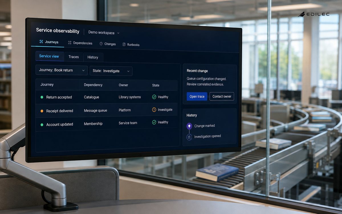
Suppose checkout completion falls while CPU, memory and aggregate HTTP success remain normal. A decision-oriented dashboard starts with the checkout success indicator, segments by release and payment route, and links a failing cohort to traces. Those traces show a queue delay after one provider response. The responder can see the owning service, recent configuration change and runbook without switching tools repeatedly. Platform charts then explain queue saturation, while logs provide the rejected message reason. Leadership does not need those details; its view shows objective impact, affected customers, current owner and recovery trend. Designing this navigation before an incident prevents the common situation in which dozens of healthy component panels obscure one broken user journey. The Edilec cloud monitoring and alerting guide adds practical alert-routing patterns. After the incident, review whether the first dashboard led to the right evidence and whether any displayed signal caused delay or false confidence.
Frequently asked questions
Should an organization have one universal dashboard?
Use shared definitions and a common entry point, but give each role a focused view. A universal wall of charts usually serves nobody. Navigation should preserve context so a manager can move from a journey objective to service and trace evidence without searching for the “real” dashboard.
Are logs enough for observability?
Logs are valuable but often lack aggregate trends and end-to-end context. Combine metrics for state and alerting, traces for request paths, logs for detailed events and profiles where code-level resource evidence is needed. Instrument only what supports an operating question and privacy policy.
Conclusion
Review this fallback whenever telemetry architecture or ownership changes.
Effective observability dashboards organize evidence around users, objectives, ownership and change. Consistent signals and layered views let IT managers see impact, responders find causes and platform teams improve shared systems. Measure success by faster, better decisions and clearer recovery—not by the number of panels on display.