BI dashboard design for operations teams begins with a recurring decision, not a collection of charts. An effective dashboard helps a named owner notice material deviation, understand its scope, inspect the underlying work and take a governed action. A passive display may be visually polished yet operationally useless if metrics have disputed definitions, data arrives too late, exceptions cannot be located or no one is accountable for responding.
This guide is for operations leaders, analysts, data engineers and BI developers creating daily or weekly management views. It assumes the organization will pair the dashboard with reliable pipelines; see the business reporting pipeline guide and SaaS data quality checks for those controls. The goal is a decision surface backed by governed definitions and traceable records.
Write a decision contract before selecting visuals
For each audience, record the decision, review cadence, accountable role, comparison, threshold and permitted response. A warehouse lead deciding where to reassign labor needs intraday queue age by location; an executive reviewing service health may need a weekly trend and forecast. Combining both on one page usually satisfies neither. Start with one primary question and a small set of supporting questions that explain change.
Define what should happen after a signal crosses a boundary. The dashboard may link to a filtered work queue, open a case, assign an owner or record an annotation. Make thresholds contextual rather than decorative: explain whether they come from an SLA, capacity plan, statistical baseline or policy. If a measure is informative but has no expected response, place it in exploratory reporting rather than the operational first view.
| Decision | Leading signal | Required action path |
|---|---|---|
| Protect service level | Oldest unassigned case and backlog age | Open filtered queue and assign capacity |
| Prevent fulfillment delay | Orders approaching cutoff without allocation | Investigate inventory or carrier exception |
| Control data quality | Critical records failing validation | Open failed records with owning source team |
| Manage workload | Demand versus staffed capacity by interval | Approve reassignment or escalation |
| Review improvement | Outcome trend with annotated interventions | Continue, adjust or stop the change |
Create a metric specification that can be tested
Every KPI needs a business name, purpose, formula, grain, inclusion and exclusion rules, dimensions, source fields, owner, refresh expectation and change history. Define time carefully: created date, event date, local business day and processing date answer different questions. Specify how reopened work, cancellations, missing values and late-arriving events affect the result. Put the definition near the dashboard and version it with the semantic model.
Use a governed semantic layer so the same measure is not rebuilt differently in every report. Microsoft's star schema guidance explains how dimension tables support filtering and grouping while fact tables support summarization, and stresses consistent fact grain. A practical operations model often has event or snapshot facts plus conformed date, customer, location, product and status dimensions. Keep business calculations centralized and testable.
Design the page around scan, diagnose and act
The first viewport should answer whether attention is needed, where and why. Use a compact headline set for outcome, volume, timeliness and quality; then a trend or distribution that provides context; then an exception table or drill-through. Microsoft's dashboard guidance describes a dashboard as a single-page canvas containing the most important elements. Do not use that constraint to squeeze in every department measure. Fewer well-labeled views improve comparison and reduce hunting.
Choose visuals by question. Lines show change over ordered time, bars compare categories, distributions reveal spread that an average hides, and tables support exact exception work. Avoid gauges without meaningful ranges, pie charts with many categories and maps when location is not the decision. Use direct labels and units, preserve a consistent status vocabulary and show the comparison period. Let users drill from an aggregate to contributing records without exposing fields they are not authorized to see.
| Question type | Useful visual | Common design failure |
|---|---|---|
| Is performance changing? | Line with target and annotations | Truncated axis or unexplained period comparison |
| Where is the problem concentrated? | Sorted bar or heat table | Unsorted categories and decorative color |
| How variable is the process? | Distribution, percentile band or box plot | Showing only an average |
| Which items need action? | Filtered detail table | Aggregate with no route to records |
| Is data trustworthy? | Freshness and quality indicator | Hiding missing or delayed feeds |
Expose freshness and quality as part of the answer
The UK Government Data Quality Framework frames quality as fitness for purpose and recommends assessment throughout the lifecycle, clear communication and attention to user needs. Apply that directly: define critical fields and acceptable completeness, validity, uniqueness, consistency, timeliness and accuracy for each decision. A dashboard should not silently calculate a precise number from a materially incomplete feed.
Display the latest completed refresh, coverage period and material caveats. Distinguish zero from missing and current from provisional. Quarantine failed records while showing their count and likely effect. Reconcile totals against an authoritative control where possible, and retain test results by model version. When a source definition changes, annotate the trend or restate history consistently; an unexplained break invites the wrong operational response.
Apply access, accessibility and change governance
Enforce access in the data model or platform, not by hiding tabs. Test row- and object-level security with representative roles, exports and shared links. Limit personal and commercially sensitive detail to what the task requires. Record who owns each workspace, dataset, refresh credential and distribution list. Separate development and production, review changes and keep a rollback path for model or report releases.
Meet WCAG 2.2 principles with keyboard access, useful focus order, adequate contrast, text alternatives and cues beyond color. Give visuals meaningful titles that state the measure and period. Ensure tooltips are supplemental rather than the only source of information. Test zoom, screen readers and exported formats used in actual meetings. Accessibility improves the clarity of a dense operations surface for everyone.
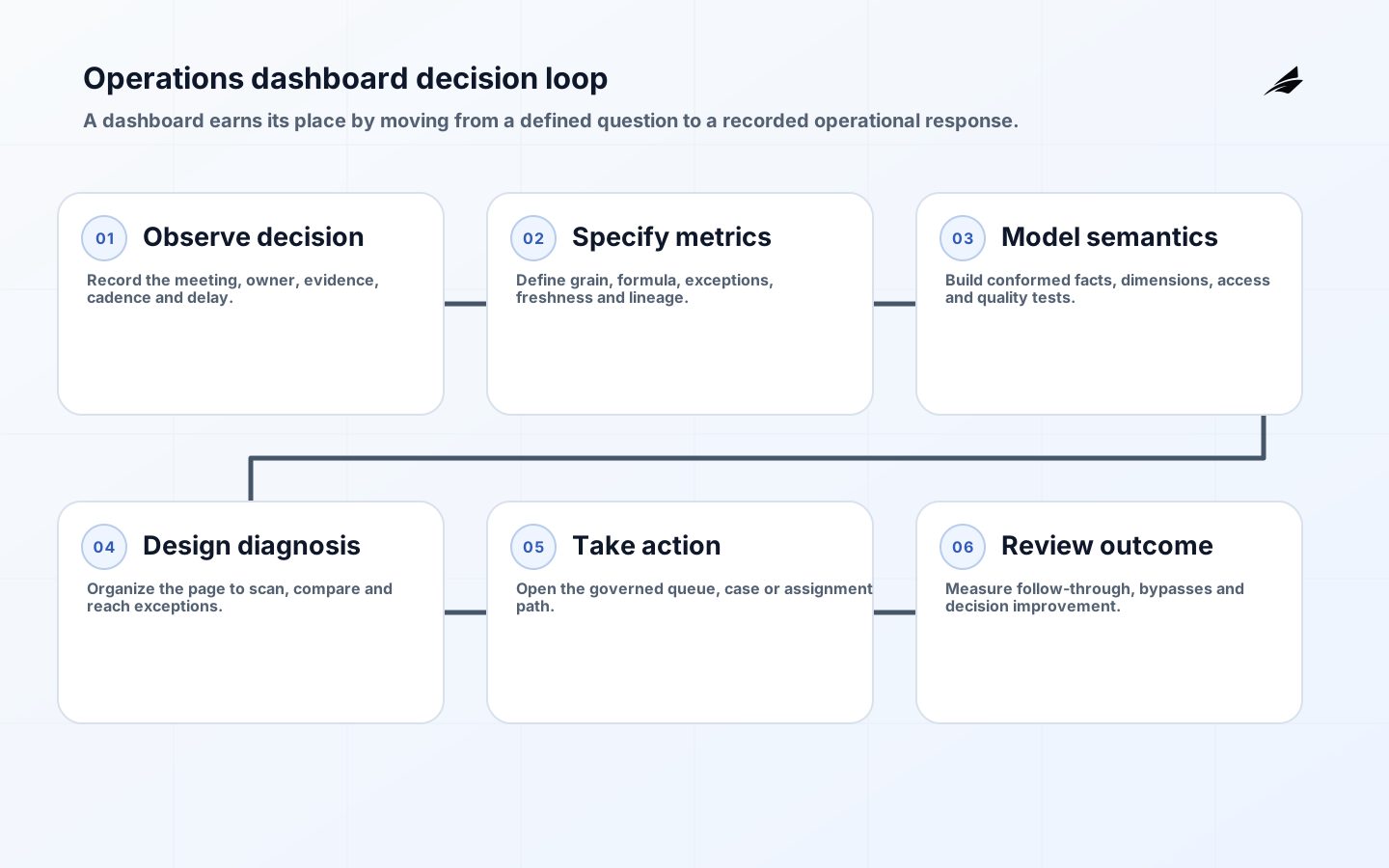
Build the dashboard through a six-step decision loop
- Observe the meeting or shift decision and record the current evidence and delay.
- Approve metric definitions, grain, source lineage, quality rules and access.
- Prototype the scan, diagnose and action sequence with realistic records.
- Build the semantic model, automated tests and customer-safe drill-through.
- Pilot in the real review cadence and capture decisions, confusion and bypasses.
- Refine thresholds and retire panels that do not change action.
Operate the dashboard as a product
Assign a product owner and a technical owner. Monitor refresh success, query performance, security changes, metric tests and broken drill paths. Provide a visible route to report a suspected data issue with the report, filter context and timestamp attached. Set a service expectation for critical defects. Avoid making analysts the permanent manual bridge between source-system owners and operations; assign root-cause remediation to the system that creates the defect.
Measure adoption through decisions and workflow outcomes, not views alone. Track recurring review attendance, exception follow-through, time from signal to action, manual exports and use of alternate spreadsheets. Interview non-users to find missing trust or task fit. The dashboard adoption plan provides a companion rollout approach. Remove unused measures after confirming they have no audit or contractual purpose.
Control metric change as carefully as dashboard code. A proposed definition change should identify affected reports, owners, historical comparability and expected decision impact. Run old and new calculations in parallel on representative periods, explain material differences and choose whether to restate history or mark a break. Notify users before release and preserve the prior definition and effective dates. This avoids a common failure in which a KPI appears to improve because its denominator changed, while operations interprets the movement as real performance. Assign periodic recertification so obsolete measures do not remain authoritative by inertia.
During each recertification, ask an owner to identify a recent decision supported by the metric and one condition in which it would mislead. This small challenge verifies that the KPI still has an active use, understood limits and a responsible audience.
Key takeaways
- Design around one recurring decision, accountable owner and response path.
- Specify metric grain, formula, exceptions, freshness and lineage before visual design.
- Use a governed semantic model and expose material data limitations.
- Organize the page for rapid scanning, diagnosis and drill-through to action.
- Treat security, accessibility, testing and adoption as ongoing product work.
Frequently asked questions
How many KPIs should an operations dashboard contain?
There is no fixed number. Include the smallest set that establishes outcome, demand, timeliness and material guardrails for the target decision. If a metric does not alter diagnosis or action, move it to a supporting report. A compact page with reliable drill-through is more useful than a wall of indicators.
Should an operations dashboard be real time?
Only when the action window requires it. Match refresh frequency to how quickly conditions change, the cost of delay and the team's ability to respond. Intraday staffing may need minutes; a monthly portfolio review does not. Faster refresh without dependable source updates only creates fresher-looking uncertainty.
When is a spreadsheet still appropriate?
A spreadsheet can be suitable for bounded exploration, planning or low-risk local analysis. It becomes a problem when it is the undocumented source for shared operational decisions, contains uncontrolled personal data or requires repeated manual assembly. Move stable, recurring and consequential logic into governed pipelines and semantic models.
Conclusion
An operations BI dashboard earns trust by connecting a defined decision to consistent metrics, visible data quality and an actionable workflow. Start with the meeting and owner, model the data at a clear grain, design for scan and diagnosis, and observe whether users act differently. The best dashboard is not the one with the most information; it is the one that helps the team make a defensible decision in time.