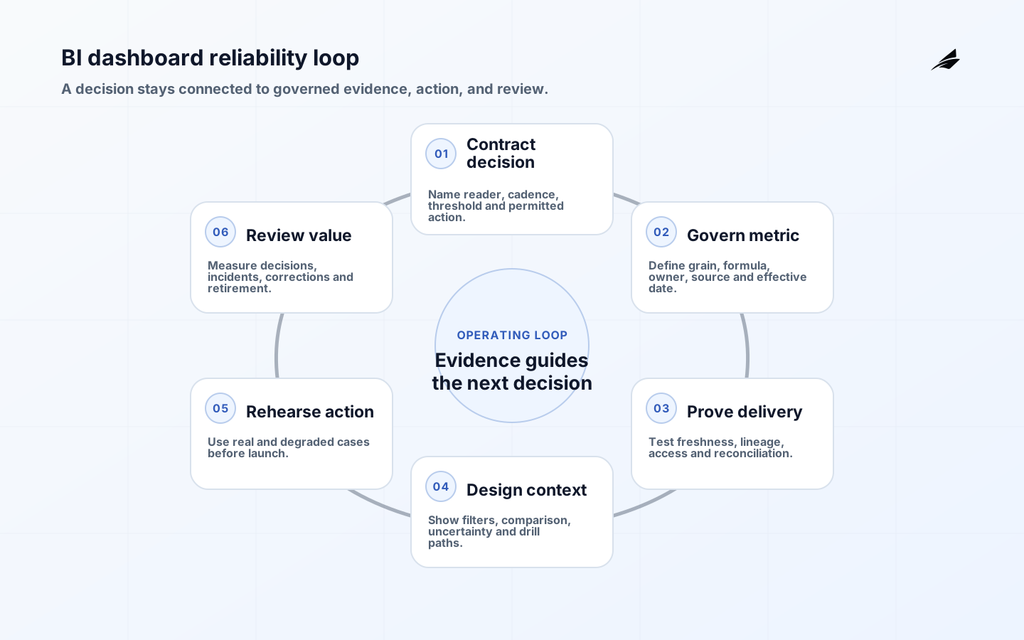
BI dashboards earn their place when a named person uses a trusted signal to make a better decision. A polished page that nobody can interpret, challenge, or act on is reporting theatre. A reliable dashboard makes the population, time period, freshness, definition, and accountable owner apparent; it also gives the reader a route from an unusual number to the underlying records and the next operational step.
This BI dashboards checklist starts with the decision rather than the chart. It complements Edilec's field guide to BI dashboards, executive dashboard guide, and dashboard adoption playbook. Use those guides for broader design and adoption choices; use this checklist to decide whether a particular dashboard is dependable enough for routine work.
Key takeaways
- Begin with a recurring decision, a decision owner, and an action window; do not begin with available fields.
- Give every important metric a definition, grain, source, owner, effective date, and reconciliation method.
- Show freshness, filters, units, comparison periods, and uncertainty where readers make interpretations.
- Test access, refresh failure, drill-through, export, accessibility, and rollback before treating a dashboard as operational.
- Measure decisions and resolved exceptions, not page views alone, and retire views that no longer change work.
Write a dashboard decision contract
A one-page decision contract prevents a dashboard from becoming a miscellaneous request queue. Name the primary reader, the question they must answer, how often it arises, the latest useful data time, material thresholds, and the permitted actions. Microsoft's BI strategy guidance similarly connects analytics solutions to business objectives and actions. If a sales leader reviews pipeline coverage each Monday, a daily refresh may be adequate; if a service manager routes urgent incidents, yesterday's snapshot is not. Different decisions can share a semantic model, but they should not be forced into one crowded page.
| Decision element | Question to settle | Acceptance evidence |
|---|---|---|
| Reader and owner | Who interprets the signal and who can act? | Named role plus escalation backup |
| Cadence | When does the decision happen? | Review calendar and data cutoff |
| Threshold | What change is material? | Documented rule tested on past cases |
| Action | What may the reader do next? | Workflow, ticket, or accountable handoff |
| Review | How will a wrong interpretation be corrected? | Feedback route and decision log |
Reject vague objectives such as 'increase visibility.' Replace them with observable use: 'Every Monday, the revenue operations lead identifies territories below agreed coverage, assigns an owner, and records the reason.' That sentence tells the team which grain, comparison, permissions, and drill path matter. It also reveals whether the dashboard is advisory or whether it initiates a controlled workflow.
Govern the metric before the visual
A metric is an interface between data producers and decision makers. Define its event grain, inclusion rules, dimensions, formula, timezone, late-arriving-data treatment, and owner. Keep the definition in a governed model rather than rebuilding it in individual visuals; the dbt Semantic Layer documentation illustrates how centrally defined metrics can be reused across downstream tools. Version material definition changes and show their effective date so a trend break is not mistaken for a business event.
Reconciliation should be designed, not improvised after an executive spots a mismatch. Choose an authoritative total, sample representative records, and document permitted differences such as currency conversion timing. For a support dashboard, reconcile opened and closed case counts against the system of record while separately testing reopened cases, merged cases, and records crossing midnight. Keep a link from the metric description to its lineage, owner, and known limitations.
Design a readable information order
The first view should establish context before detail: selected period, last successful refresh, material filters, and a concise set of signals. Use comparison periods that fit the operating rhythm. A week-over-week change is misleading for a highly seasonal process unless seasonality is acknowledged. Avoid colour-only status and unlabeled icons. The WCAG 2.2 standard provides the accessibility baseline; in practice, dashboard teams should also test keyboard navigation, focus order, screen-reader labels, zoom, and the readability of exported views.
- Put the most decision-relevant exception before explanatory detail.
- Label units and denominators; '12% conversion' is incomplete without the eligible population and period.
- Keep filter state visible and provide a reliable reset to the approved default.
- Use annotations for known incidents, campaigns, and definition changes that affect interpretation.
- Offer drill-through to contributing records only when the reader is authorised to see them.
Engineer refresh, access, and release reliability
Treat a widely used dashboard as a production application. Its dependency chain includes source events, ingestion, transformations, semantic definitions, refresh jobs, identity, row-level permissions, subscriptions, and exports. Define a service objective around the decision window, not an arbitrary uptime percentage. If the Monday meeting begins at 09:00, the meaningful objective may be 'validated data through Sunday 23:59 is available by 08:30, with a visible degraded state otherwise.' Never silently display stale values as current.
| Failure mode | Preventive control | Detection and response |
|---|---|---|
| Stale data | Dependency-aware refresh and freshness contract | Visible timestamp, alert, and approved fallback |
| Metric drift | Shared definition and version review | Reconciliation test and change annotation |
| Excess access | Role and row-level policy | Test accounts, access review, and audit trail |
| Broken drill path | Contract tests for identifiers and routes | Synthetic journey and owner alert |
| Unsafe release | Peer review and environment promotion | Smoke test, rollback, and incident record |
Microsoft's Fabric governance roadmap recommends governance that is iterative and proportionate to ownership, delivery scope, sensitivity, and criticality. Apply that logic: a personal exploration does not need the controls of a board report, but promotion to departmental or enterprise use should trigger ownership, testing, access review, support, and change-management requirements.
Rehearse the decision with real cases
Run a decision rehearsal before launch. Give representative users five historical situations: an obvious exception, a borderline case, stale data, an unauthorised drill-through attempt, and a corrected source record. Ask each user to explain what the dashboard says, what it does not say, and what they would do. Record disagreements. If two competent readers interpret a threshold differently, the design is not ready even if every query is technically correct.

Consider a fulfilment dashboard showing on-time dispatch. The overall rate falls from 96% to 91%. Drill-down shows one warehouse at 72%, but half its orders were imported late after an integration outage. A dependable view separates operational lateness from ingestion lateness, displays the incident annotation, and routes the manager to the affected orders. The meeting can then decide on capacity and data repair separately instead of debating one ambiguous percentage.
Operate the dashboard as a portfolio
After launch, monitor use in context. Page views can reveal reach but not value. Track completed decision reviews, assigned actions, resolved exceptions, definition questions, refresh breaches, access denials, and manual exports. Microsoft's tenant-level auditing guidance stresses assigning responsibility and tracking action when audit data reveals a concern. Pair telemetry with short interviews: a low-use page may be redundant, while a high-use export may signal that the actual workflow lives outside the dashboard.
Set a quarterly portfolio review. Confirm that each dashboard still has a decision owner, a supported data product, current permissions, and an action it improves. Consolidate near-duplicates carefully, deprecate obsolete pages with notice, and preserve an audit snapshot when policy requires it. The goal is not more dashboards; it is a smaller, clearer decision system that teams trust.
Run a dashboard release checklist
Before production, ask a person who did not build the dashboard to trace one metric from its displayed value to definition, source records, refresh status, and accountable owner. Repeat with an authorised reader, a restricted reader, and an export. Confirm that subscriptions preserve the intended filter context and that alerts link to a useful investigation view. Simulate a failed upstream job and verify that the dashboard declares the degraded state rather than preserving a misleading green indicator.
Record approval as a compact evidence bundle: decision contract, metric specification, reconciliation result, access matrix, accessibility test, refresh and failure test, rehearsal notes, support owner, and rollback reference. Schedule the first post-launch review while the team still remembers its assumptions. At that review, compare actual questions and actions with the contract; unexpected exports, parallel spreadsheets, or repeated definition questions are design signals, not user shortcomings.
Frequently asked questions
How many metrics should a BI dashboard contain?
Use as many as the decision requires and no more. A useful test is whether each first-view metric can change interpretation or action. Move diagnostic measures into a drill view. If nobody can name what would happen when a number moves, it is probably context, not a primary KPI.
Who owns dashboard correctness?
Ownership is shared but must be explicit. A business owner approves meaning and thresholds; a data owner controls source quality; an engineering owner operates delivery; and a content owner manages presentation and access. One accountable service owner coordinates incidents and changes across those boundaries.
When should a dashboard not answer the question?
It should declare uncertainty when data is stale, incomplete, outside the approved population, or too aggregated for the requested conclusion. A clear unavailable or degraded state is more trustworthy than a precise-looking answer assembled from invalid inputs.
Conclusion
Reliable BI dashboards connect governed evidence to a decision and preserve a route back to the facts. Write the decision contract, govern the metric, design accessible context, test failure states, and review whether actions improve. When those disciplines are visible, the dashboard becomes operational infrastructure rather than a decorative report.