In-app guidance for complex software should help a person complete a specific task at the moment they need support. It is not a layer of tours, badges and popovers added because the underlying product is difficult to understand. Guidance works when it clarifies a term, shows a valid example, explains current state, warns about consequence or reveals the next safe action. It fails when it obscures controls, interrupts experienced users, disappears before it can be read or compensates indefinitely for a broken workflow.
This guide gives product, design and engineering teams a practical method for selecting, implementing and measuring contextual help. It connects to customer onboarding systems that scale and product analytics for early SaaS teams. The objective is not maximum guidance engagement. It is better task completion with less avoidable support and no loss of accessibility or user control.
Diagnose the obstacle before adding guidance
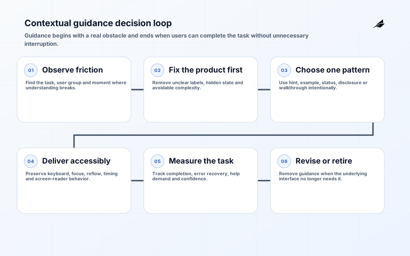
Observe users attempting the task with representative data and permissions. Record where they hesitate, make an incorrect prediction, abandon work, seek help or create a recoverable error. Combine research with support tickets, search queries, validation failures and workflow analytics. Segment new, occasional and expert users because the same intervention may help one group and slow another. Name the obstacle precisely: an unfamiliar term, missing prerequisite, hidden system state, ambiguous choice or fear of consequence.
Try to remove the obstacle in the product first. Replace internal jargon, clarify the label, expose status, simplify the decision or redesign an unsafe sequence. Guidance is appropriate when complexity is inherent, policy needs explanation, users need examples, or the workflow spans knowledge the interface cannot reasonably encode. Give each proposed intervention an owner, audience, trigger, desired behavior and removal condition. Without those fields, temporary help tends to become permanent clutter.
| Observed obstacle | Product fix first | Guidance if complexity remains |
|---|---|---|
| Unclear field | Use a specific label and input format | Short hint plus valid example |
| Hidden prerequisite | Show readiness and missing items | Link to the exact corrective task |
| Risky action | Improve preview and confirmation | Explain consequence and recovery |
| Long workflow | Show progress and saved state | Stage-specific checklist |
| New capability | Place it in the normal information architecture | Dismissible announcement for affected users |
Choose the smallest guidance pattern that fits the need
Persistent hint text suits information needed before entry. Examples clarify format without becoming placeholder text that vanishes. Inline validation explains how to recover after a specific error. Status messages confirm the result of an action. Progressive disclosure reveals supporting detail on demand. Empty states can explain purpose and the first meaningful action. Checklists help multi-step setup when the steps are real, ordered and resumable. Tours are useful only when spatial orientation matters and the user can pause, skip and return.
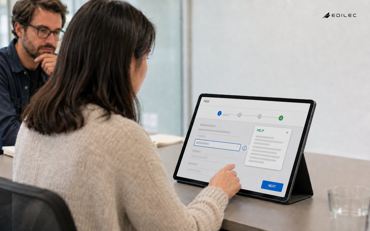
Tooltips are a narrow pattern, not a default help system. They are difficult on touch, can be missed by keyboard and screen-reader users, and often contain information that should be visible. Do not hide mandatory instructions or error recovery in hover-only content. Modals should be reserved for focused decisions or consequences, not routine announcements. Notification banners should describe material system state and a next action rather than compete continuously for attention.
Make contextual help accessible across the complete interaction
Start with native semantic controls and visible text. When a custom disclosure, dialog, tooltip or composite widget is necessary, follow the relevant W3C ARIA Authoring Practices and test the actual implementation. Programmatic relationships must connect help to the field or control it explains. Keyboard focus should move only when the interaction requires it and should return predictably. Dynamic status must be announced without dragging focus away from the user’s work.
Test every pattern at zoom, narrow reflow, with keyboard, screen reader, reduced motion and increased text spacing. WCAG 2.2 addresses content on hover or focus, status messages, consistent help, target size, focus visibility, redundant entry and accessible authentication among other criteria relevant to guidance. Timing must be adjustable; motion should not be the only cue; and a user must be able to dismiss nonessential overlays without losing progress. Test translated text and long labels before fixed containers reach production.
| Pattern | Accessibility requirement | Failure to test |
|---|---|---|
| Tooltip | Keyboard and pointer access; dismissible and persistent on hover | Content vanishes before it can be read |
| Dialog | Name, focus containment, close action and return focus | Keyboard trap or lost context |
| Status message | Programmatic announcement without focus theft | Success or error is visual only |
| Tour | Skip, pause, resume and logical focus order | User is forced through hidden controls |
| Checklist | Real progress state and accessible labels | Decorative completion that misstates readiness |
Govern guidance as product content
Write the action and consequence in the user’s vocabulary. Keep one idea per message. Avoid praise, jokes or urgency that distracts from high-consequence work. Use examples with realistic structure but no personal or secret data. If policy or product behavior changes, the guidance must change in the same release. Store content in version control or a governed content system with owner, audience, locale, review date and linked capability version.
Remote configuration can target segments and correct content quickly, but it also creates production risk. Validate payloads, apply safe defaults, preserve a rollback and restrict publishing. Do not let remote content change the meaning of a legal agreement or authorize a command outside normal review. For translated guidance, test expansion, pluralization, reading order and cultural meaning in context. A glossary is useful only when terms remain consistent across interface, documentation and support.
Personalize with observable need, not speculative profiling
Useful targeting can follow role, enabled capability, completed prerequisite, account state or repeated task failure. Explain why the guidance appears when that is not obvious. Avoid inferring sensitive traits or trapping users in a beginner experience because they skipped one step. Let people reopen dismissed material and discover help through a stable location. Respect tenant administration when organizations need to control rollout or training.
Adaptive systems should be bounded. If a model selects or writes help, restrict it to approved product sources, log the source and version, and prevent it from inventing permissions, prices or commitments. Provide a route to authoritative documentation and human support. Measure incorrect and unhelpful guidance, not only clicks. For consequential workflows, reviewed deterministic content is usually the safer default.
Measure task outcomes and unintended effects
Define success before launch. GOV.UK’s measurement guidance recommends combining performance metrics with user research. For guidance, compare task completion, error recovery, time, abandonment, support contact and confidence for relevant cohorts. Guidance views and clicks are diagnostic events, not business outcomes. A high open rate may mean the interface remains confusing.
Use controlled rollout when feasible and inspect individual sessions or support cases behind aggregate change. Watch for slower expert users, accidental dismissal, obscured controls, mobile failure and accessibility regressions. Repeat usability benchmarking on the complete journey, not a component preview. Retire an intervention when the obstacle is fixed, usage falls for the right reason, or evidence shows no benefit. Preserve the research and decision so the same pattern is not reintroduced without context.
Connect in-product help with documentation and support
In-app guidance should answer the immediate question and link to a stable, version-appropriate article when the user needs background, policy or a longer procedure. Preserve product context in the link without exposing sensitive data. Documentation should link back to the exact product location where possible. Keep one vocabulary and owner across interface, release notes, support macros and articles so users do not have to translate between competing names.
Route unresolved help into support with useful context: capability, page, tenant-safe record reference, recent validation and guidance already viewed. Let the user review what will be shared. Support outcomes should feed the content backlog with volume and consequence, while product defects feed the design backlog. Do not answer recurring workflow confusion by endlessly expanding a knowledge base; repeated demand is evidence that the software or policy boundary may need redesign.
Plan offline and degraded access for critical guidance. Operators may need recovery steps precisely when the product or identity service is unavailable. Keep emergency runbooks in a protected independent location with controlled access and review. Customer-facing help should state known outages and safe alternatives without exposing internal security detail. Test links and embedded media as part of release validation.
Key takeaways
- Observe a specific obstacle and improve the interface before adding help.
- Use the smallest persistent or on-demand pattern that fits the need.
- Test keyboard, screen reader, zoom, reflow, timing and focus in the full workflow.
- Version guidance with the capability and assign a content owner.
- Judge success by task completion, recovery and confidence rather than guidance clicks.
Frequently asked questions
Should every new user receive a product tour?
No. Start with the user’s first goal and reveal help in context. Use a tour only when orientation across several areas is necessary, and let users skip, resume and access the same information later.
When is video appropriate?
Video can demonstrate motion or a complex sequence, but it needs captions, transcript, controls and maintenance ownership. Do not use it as the only way to learn a required task; searchable written steps should remain available.
How often should guidance be reviewed?
Review it with every affected release and on a scheduled cadence. Prioritize high-use, regulated and high-consequence content. Automated checks can identify missing owners, expired review dates and references to retired capabilities.
Conclusion
Professional in-app guidance is restrained, contextual and accountable. It resolves an observed obstacle, respects access needs, travels with product change and disappears when no longer useful. Teams that measure the complete task can use guidance to build confidence without allowing explanations to become a substitute for good software.