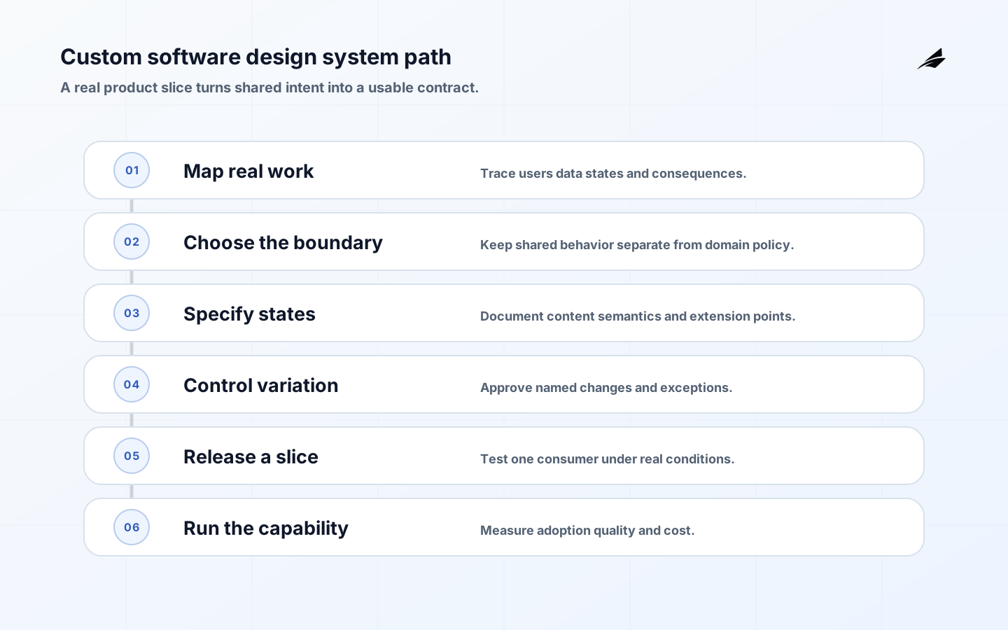
A design system for custom software should make repeated product decisions easier to carry across teams without pretending that every workflow is the same. Custom systems often combine distinctive domain language, internal roles, data-heavy screens, and long-lived operational states. A generic component catalog can look complete while leaving the hard questions unanswered: who owns a disabled state, how does a user recover from a failed save, which labels are accessible, and what happens when a product needs a legitimate exception? Treat the system as a maintained agreement between design, engineering, content, accessibility, and operations.
Define the design system boundary in the product
The U.S. Web Design System is a useful reference for connecting foundations, components, and guidance rather than treating code as the entire system. Its value here is structural: a custom software team should publish the reasoning, state behavior, and usage limits that let consumers choose a component responsibly. The local vocabulary can remain distinctive while the contract stays inspectable.
Map two or three real journeys before listing components. A case worker may need to search a record, review a permissioned history, correct an input, and submit a decision. A customer may need to upload a document, wait for processing, and understand an uncertain result. These journeys expose which foundations and behaviors recur. They also reveal where the system should stop: a shared table can standardize sorting and empty states, but the meaning of an approval workflow may remain in the product domain.
Write down the audiences and the promise. Designers need a vocabulary for intent; engineers need APIs and tests; content contributors need language rules; operations teams need release and support expectations. The W3C Design Tokens Community Group is useful context for sharing named values across tools, but a custom product still has to define its own ownership, naming, versioning, and fallback behavior. Link the system decision to the product’s internal tool UX work when operational users carry the most risk.
| Boundary | Include | Leave to the product domain |
|---|---|---|
| Foundations | Type, color meaning, spacing, focus, motion, density, token lifecycle | Brand or domain expression that has no repeated semantic use |
| Primitive components | Inputs, buttons, dialogs, notices, navigation, tables, status | A workflow whose state machine and data authority are unique |
| Patterns | Repeated search, validation, permission, upload, or review behavior | Rules that depend on one product’s business policy |
| Governance | API changes, accessibility proof, release, contribution, deprecation | Feature prioritization and domain-specific acceptance decisions |
Make component behavior explicit before styling
A component contract should describe intent, inputs, states, outputs, semantics, and constraints. For a form field, specify label association, hint and error behavior, required state, input mode, validation timing, disabled or read-only meaning, and how a server response is shown. For a table, specify header semantics, sorting, pagination, loading, empty, permission, and narrow-screen behavior. This detail is what makes a component reliable in custom software; a screenshot only proves one happy state.

Design the API around decisions
Prefer properties that express decisions, such as status, intent, size, or selection model, over escape hatches that inject arbitrary markup or styles. An API should make safe use easy and unsafe use visible. Document which values can be localized, which slots accept interactive content, and what consumers must provide for accessible names. The Material Design 3 guidance is a helpful comparison for component states and theming, but its patterns should be adapted to the product’s semantics and technical constraints.
Keep content and behavior versioned together. If a validation message changes, the component’s examples, automated checks, and migration note should change with it. Add long labels, missing data, translated text, high zoom, and slow dependencies to the example set. A consumer that cannot see how a component behaves under pressure will invent its own behavior, creating the very fragmentation the system is intended to reduce.
Support variation without creating forks
Custom software needs variation because teams serve different roles, permissions, data densities, and operating contexts. Make the safe variation explicit. A data table may support compact and comfortable density, but both should preserve sorting announcements and row relationships. A notice may support informational, warning, and error intent, but the semantics and next action should remain clear. Reject a customization when it changes focus behavior, validation meaning, or permission language without a new contract.
Use an exception route with a time-bound review. The request should include the user problem, contexts affected, why a current component cannot support it, the proposed extension, test evidence, owner, and migration path. A temporary local wrapper can be a sound choice when it prevents a rushed central API, provided the wrapper does not become an undocumented public dependency.
Build accessibility into the release proof
Accessibility is part of the component’s behavior, not a final visual review. Use WCAG 2.2 to shape acceptance criteria for keyboard access, focus, name and role, contrast, status, errors, target size, reflow, and input assistance. Test with the actual component in a consuming journey because composition creates failures that isolated examples miss. Make the expected behavior legible to product and support staff so an inaccessible result is not dismissed as a styling bug.
| Scenario | What can go wrong | Evidence to capture |
|---|---|---|
| Keyboard-only flow | Focus disappears after a modal, menu, or validation update | Recorded tab path, focus target, escape behavior, and visible focus state |
| Assistive technology | An error or status is visible but not announced meaningfully | Accessible name, role, state, and announcement check in a representative screen |
| Long or translated content | A label wraps into the action or truncates the correction | Localized and long-content screenshots plus a usable narrow layout |
| Permission boundary | A hidden or disabled control gives an incorrect reason | Role-specific rendering, server enforcement, and user-facing explanation |
| Reduced motion or zoom | Animation or scaling obscures a step | Reduced-motion behavior and high-zoom task completion |
Deliver a useful slice before expanding the catalog
Select a slice that crosses foundation, component, pattern, documentation, tests, and one consuming product. For example, implement a searchable review table with loading, empty, permission, validation, and error states. The slice will expose whether the token names make sense, whether the API supports real data, whether content guidance is sufficient, and whether the test environment reflects the product. It is a better investment than producing twenty isolated components that have never carried a real task.
Release the slice with a changelog, supported versions, adoption notes, and a contact route. Measure the effort required to integrate it, including time spent on gaps and exceptions. The frontend performance guide is a relevant companion because shared packages should improve interface consistency without causing a slower first interaction. Keep legacy code usable while the new boundary proves itself.
Run governance as a service to teams
Governance should answer questions quickly. Define who can approve a breaking API change, who reviews accessibility, who owns a deprecated component, and what evidence is required before a pattern becomes shared. Offer office hours, examples, and an issue template that asks for the user problem rather than a preferred implementation. Product teams should be able to contribute without waiting for a central group to infer their context.
Plan migration around change pressure
Prioritize screens that change often, fail visibly, or carry high accessibility or operational risk. Do not migrate a stable low-value screen simply to improve a dashboard percentage. Publish a trigger for legacy use, such as the next major edit, a recurring defect, or a platform upgrade. If the migration reveals that a shared pattern has the wrong boundary, revise the system instead of forcing the product to preserve a poor abstraction.
Measure whether the system is helping
A useful scorecard combines adoption with quality and cost. Measure the time to implement a repeated flow, the number of local variants, accessibility defects, visual regression noise, package weight, upgrade effort, and team satisfaction. Review support tickets for questions about status, errors, and permissions; they often show where the shared contract is incomplete. Compare before-and-after evidence for a migrated journey, and stop or reshape investments that do not improve an outcome.
| Measure | Healthy signal | If it worsens |
|---|---|---|
| Integration time | A new consumer can complete a common task with examples and little bespoke wiring | Pair with consumers; simplify APIs and document missing states |
| Variant count | Allowed variants remain small and semantically named | Remove accidental styling hooks and review local forks |
| Defect recurrence | The same validation or accessibility issue stops reappearing | Add a regression test or change the component contract |
| Release friction | Consumers can upgrade with published migration notes | Add compatibility, deprecations, or a staged rollout |
| User outcome | Fewer confusing states, support questions, or repeated corrections | Revisit content, permissions, and the journey rather than adding more components |
Avoid the traps that make custom systems brittle
The first trap is treating a framework as a design system. A component library gives code structure; it does not decide content, accessibility, data loading, or domain ownership. The second is centralizing every decision until teams bypass the system. The third is allowing local overrides that change semantics while preserving the same name. The fourth is measuring output—number of components or pages migrated—instead of outcomes. Use the custom software test strategy to keep verification close to the user behavior the system promises.
Practical design system takeaways
- Start from repeated user journeys and delivery friction, not an inventory target.
- Separate foundations, primitives, patterns, and product-specific workflows.
- Specify states, semantics, content, accessibility, and performance in each component contract.
- Offer controlled variation and a reviewed exception route instead of arbitrary overrides.
- Release one real product slice, measure integration and quality, then expand from evidence.
Design systems questions for custom software
Where should a team start?
Choose a journey with repeated UI decisions and visible user or support cost. Map its states, select the smallest shared primitives, and deliver them in the consuming product. This gives the system a real test and creates evidence for the next boundary.
How much variation is healthy?
Variation is healthy when it is named, tested, and preserves the component’s semantic and interaction contract. A growing number of one-off style props, wrappers, or undocumented slots usually means the boundary or API needs redesign.
Can teams keep local components?
Yes. Local ownership is appropriate for workflows that have one domain, one data authority, or a policy unlikely to recur. Make the local decision visible and reuse shared foundations so a future promotion remains possible without forcing premature generalization.
Conclusion: make custom reuse dependable
A custom software design system succeeds when it preserves the decisions that truly recur and leaves room for the work that is genuinely different. Define the boundary from real journeys, make behavior and accessibility explicit, roll out through a proof slice, and govern variation with evidence. The result is a system teams can trust and change without waiting for a catalog to solve every problem.