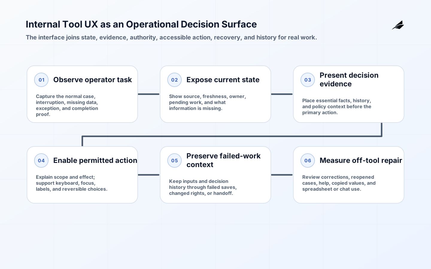
Internal tool UX is often judged too late, after the data model and workflow rules are fixed. That is backwards. An operations screen reveals whether a user can tell what needs attention, which action is permitted, and what consequence will follow. A tool for resolving payment exceptions has different needs from a consumer storefront: dense context, reversible actions, visible provenance, keyboard efficiency, and clear handoffs usually matter more than visual novelty.
Make internal tool UX an explicit operating decision
Start with observed work. Sit with the person who reconciles a record, approves an exception, or responds to a customer issue, and capture the normal case alongside interruptions and missing-data cases. Turn those observations into task states rather than a list of fields. The GOV.UK Design System patterns are useful examples of task-focused flows: ask only for information needed at the current decision, then make the next action explicit.
| Decision | Question to answer | Useful evidence |
|---|---|---|
| Task scope | Which recurring decision is costly or error-prone? | Observed workflow and user owner |
| Information hierarchy | What must be visible before action? | Decision evidence and source label |
| Permission feedback | Why can a user not act? | Clear prerequisite or escalation path |
| Recovery design | How does work resume after failure? | Preserved context and visible outcome |
Define the internal tool UX contract and boundaries
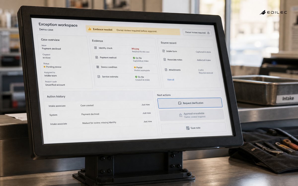
The interface contract includes more than API responses. Define which source a displayed value came from, when it was refreshed, what authority the user has, and whether an action is reversible. A disabled button with no explanation is not a permission model. Explain the missing prerequisite or provide a route to the owner. Apply the WCAG 2.2 principles to internal work too: employees and contractors deserve perceivable, operable, understandable, and robust tools.
- Choose one recurring, high-consequence task and map its actual states.
- Separate the primary decision from supporting evidence and history.
- Show source, freshness, and permission context near consequential actions.
- Test with missing data, long records, failed saves, and interrupted work.
- Meet keyboard, focus, label, and error-recovery expectations before rollout.
- Measure completion, correction, reopens, and off-tool work after launch.
Build and roll out internal tool UX in a bounded slice
Prototype the highest-risk task using realistic records, including a disputed, delayed, and partially authorized example. Design a stable page hierarchy: primary decision, essential evidence, history, and secondary tools. Submit actions should make progress and outcome visible without clearing the context an operator needs to recover. Test keyboard navigation, focus return after dialogs, labels, error summaries, and destructive-action confirmation. Instrument workflows by state transition, not merely page view.
| Failure mode | Guardrail | Signal to monitor |
|---|---|---|
| Ambiguous state | Operator cannot tell what happens next | Named state and primary action |
| Hidden evidence | Decision is made from stale or partial data | Source and freshness display |
| Keyboard trap | Dialog blocks an operator's flow | Focus and escape behavior test |
| Off-tool workaround | Users finish work in chat or spreadsheets | Workflow observation and correction metric |
Operate internal tool UX with evidence
Review time to correct completion, reopen rate, manual work outside the tool, failed submissions, and support requests per workflow. A slow screen may reflect a missing decision rule rather than a rendering problem. Pair session observation with event data; click counts alone cannot reveal whether an operator chose a workaround because the information was ambiguous.
Make internal tool UX tradeoffs explicit
Use progressive disclosure to keep the first view calm, but do not hide evidence needed for high-impact decisions. A supervisor approving a refund may need a transaction trail immediately; a front-line user may need only the next safe action. This balance connects naturally to the React state design guide, where state ownership determines whether the interface can preserve context during work.
A concrete example keeps the design grounded. A support specialist resolving a delivery dispute needs shipment status, the latest carrier event, customer contact history, and authority to issue a credit. Hiding the carrier timestamp behind a second tab may make the first screen tidy, but forces a consequential decision from partial evidence or a private spreadsheet. Use the example to identify the authoritative record, expected outcome, failure that changes it, and operator who must choose the next action. That turns an architectural claim into a reviewable slice of production behavior.
Run task tests with realistic volume, ambiguous records, keyboard-only navigation, failed updates, permission changes during work, and interrupted handoffs. Ask participants to explain what they believe will happen before submitting; their answer reveals whether labels and state communicate the real rule. Keep evidence with the change: a reproducible command, expected telemetry, and a note about the failure being exercised. Checks should state the capability being protected, not merely mirror implementation details.
A product owner defines the outcome, an operational lead validates the work model, engineers own performance and recovery, and accessibility expertise reviews interaction. Assign a steward for reference data and permission rules so a confusing screen is not blamed on the interface when its source is unclear. Agree on a review cadence and escalation route before the first exception arrives. The aim is a timely decision by someone with the right context, not a large committee or a static policy nobody can apply.
Introduce a workflow beside the existing path for a small group, but avoid duplicate entry for longer than necessary. Provide a blocking-case route, keep decision history during transition, and schedule observation after users have handled enough ordinary work to meet exceptions. Publish entry and exit criteria for each step, including the condition that stops expansion. A narrow rollout gives a better learning loop because intended and observed behavior can be compared while scope remains correctable.
Track completion with correction, time waiting for data, reopened cases, copied values, help requests, and fallback-channel use. Pair those signals with observation; an apparently faster task can conceal verification work moved into chat, email, or personal notes. Ask what action each signal would justify. A metric without an owner, threshold, or practical response is not useful observability; a smaller trusted set is stronger during a release or incident.
Treat labels, permissions, and evidence placement as versioned behavior. When policy or data sources change, retest affected task states and notify users in the context of work. A compact history explains why a confirmation or prerequisite appeared. Include this in dependency review, planning, and incident follow-up so it does not depend on one person's memory. Clear notes should cover normal operation, known limits, emergency authority, and recovery evidence.
Before treating a plan as ready, turn it into a small review exercise. Use a disputed record and a missing upstream value to verify that the screen exposes uncertainty without forcing an operator to guess. The exercise should name an owner, expected evidence, and a concrete result that would cause the team to pause. It is intentionally more demanding than a demo: demonstrations often assume ideal data and a cooperative dependency, while real confidence comes from showing that the boundary responds predictably when assumptions fail. Store the result with the relevant change record so the next engineer can repeat the check rather than reconstruct its purpose from an old ticket.
Failure rehearsals are a practical way to protect operational knowledge. Ask a shift lead to hand a case to another person using only the page and its history; lost context is an interface defect. The person running the rehearsal should use ordinary documentation and permitted tools, not private memory or administrator shortcuts. Note the time needed to detect the condition, make a decision, and verify recovery. Those observations often reveal a missing identifier, unclear authority, or unsafe default before an incident turns the same omission into customer harm. Feed the learning back into tests, runbooks, and the next release rather than treating the exercise as a one-time audit.
Change needs a decision record as well as code or configuration. Record workflow policy changes with their UI consequence so training and support material explain a new guardrail before it surprises a user. Include the scope, assumption, approval authority, observable success condition, rollback or correction route, and date for reconsideration. This discipline keeps temporary controls from becoming invisible permanent architecture. It also gives product, operations, security, and engineering a common artifact for resolving tradeoffs, which is far more useful than asking each group to infer intent from dashboards, implementation details, or an incomplete support history.
Design review should include the text that appears at decision time, not only component placement. A concise reason for a blocked action, a clear timestamp, and an accurate source label can prevent expensive escalation. Treat those words as product behavior and test them against the actual policy, especially where a user may be denied, delayed, or asked to override work.
Key internal tool UX takeaways
- Operational interfaces are decision surfaces, not smaller consumer apps.
- Observed work should shape states and page hierarchy.
- Permissions need explanations and recovery paths.
- Accessibility is a baseline for internal users as well.
- Evidence must appear before the consequential action.
- State-transition metrics are more useful than page-view counts.
Internal tool UX FAQ
Are internal tools exempt from accessibility standards? No. Accessibility improves resilience for every operator and may be a legal or contractual requirement. Should every field be editable? No; editability should follow authority and a correction path. How much analytics is enough? Capture state transitions, errors, and duration around meaningful tasks, then validate interpretations with the people doing the work.
Conclusion: make internal tool UX dependable
Strong internal tool UX turns operational rules into clear, accessible decisions. Build around the work people must complete, preserve evidence at the moment of action, and improve the tool from real exceptions rather than dashboard vanity metrics.