BI dashboards is often treated as a tool choice, but the harder question is operational: which operational questions deserve a maintained interface instead of logs, ad hoc queries, or a one-off report. In this guide, BI dashboards means a product surface for answering a bounded set of decisions with governed metrics, visible context, and a path to underlying evidence. That distinction matters because a technically correct implementation can still fail when readers cannot tell what a number means, who is allowed to act, or what happens when the evidence is late. Engineering teams should begin with a decision they already make, then design the data product around the evidence, timing, and handoff that decision requires.
Define the decision before designing BI dashboards
Write the decision as a sentence that includes a user, an action, a population, and a deadline. For BI dashboards, the essential inputs are named decisions, user roles, metric and dimensional definitions, drill paths, freshness status, performance expectations, and accessibility requirements. The exercise prevents teams from promising a universal solution when they really need a dependable answer to one recurring question. It also reveals constraints early: a measure may be correct at an account level but unsafe for an individual action; a result may be useful every morning but misleading during a source outage. The data lineage architecture guide is a helpful companion when the team needs to make that evidence trail inspectable.
- Name the person who can change an outcome after seeing the BI dashboards result, not merely the executive who requested it.
- State the unit of analysis and time basis in plain language; “customer,” “order,” and “active” rarely mean enough on their own.
- Record the source that is authoritative for each critical input and the maximum age at which it remains useful.
- Describe the exception route for missing, contradictory, or restricted records before people depend on the result.
- Choose one owner for meaning and one owner for technical operation; they may collaborate, but the responsibilities are different.
- Keep an example record or scenario that lets a new reader test whether the published definition matches the intended decision.
Design BI dashboards boundaries that readers can inspect
A durable design shows its limits. The most common failure is asking engineers to build visualizations before agreeing who will act differently when a number moves. Instead, make grain, time semantics, relationships, permissions, and freshness visible close to the result. This is not bureaucracy for its own sake; it lets a reader notice when a number is outside its intended use. Treat transformations and checks as part of the product. The data quality engineering guide explains why a quality check should test a declared promise, such as completeness or uniqueness, rather than merely count nulls after a complaint.
| Design question | Practical choice | Evidence to retain |
|---|---|---|
| Purpose | Which decision does this output support, and which decisions does it exclude? | A short decision statement, named audience, and example action. |
| Meaning | What is the grain, time rule, and inclusion logic? | Definitions, approved examples, and a link to transformation ownership. |
| Reliability | What happens when a source is late or an assumption fails? | Freshness threshold, visible status, and recovery procedure. |
| Access | Who needs detail and who only needs an aggregate? | Role-based scope, classification, and review record. |
Build the BI dashboards operating path
A practical first release should turn a single operational review into a dashboard brief, validate its data against real incidents, and release it with feedback and change ownership rather than a large chart inventory. Use a representative sample rather than only clean records. An engineering manager reviewing reliability needs a service-level view that reveals the period, population, error budget, and source of a breach. A collection of charts without ownership or drill paths creates a persuasive picture but a weak operating tool. Walk this situation with the people who will use the result, including the source owner and the team that handles exceptions. Their questions are design input: repeated requests to export data may signal a missing drill path; a dispute may reveal an unstated definition; a slow reconciliation may expose a time rule that needs to be explicit. Connect the work to the warehouse modeling fixes when relationship and history choices shape the answer.

| Operating moment | Control | Expected response |
|---|---|---|
| Normal publication | Check declared inputs and publish status with the result. | Readers can act and trace a material value to its evidence. |
| Late or failed input | Compare arrival against the agreed threshold. | Hold, qualify, or use an approved fallback; never silently substitute. |
| Definition change | Review a sample of old and new outputs before release. | Version the change, identify affected history, and notify dependent users. |
| Reader challenge | Capture the record, interpretation, and source evidence. | Resolve at the accountable layer and turn recurrent findings into a check or documentation update. |
Operate BI dashboards as a service
Ownership begins after the first release. Review access when roles change, test the promises readers rely on, and make incidents teach the next iteration. Governance is most useful when it appears inside the daily workflow: source status is visible, a definition has an owner, and a correction can be traced without a private spreadsheet. The NIST data governance profile frames governance as organizational roles, policies, and data-management practices working together. That is a stronger model than assigning a catalog owner and assuming the work is done. In BI dashboards, that discipline means treating the published output as a maintained service with its own scope, owners, and review cadence.
Measure whether BI dashboards improves the decision
Measure BI dashboards through behavior and operating outcomes, not page views or project completion alone. Useful signals include decision latency, drill-through use, dashboard load performance, stale-data notices, metric disputes, and retired charts. Compare the baseline with the first controlled release and investigate both improvement and unexpected movement. More usage can mean the output is valuable, but it can also mean readers have no better route to reliable evidence. Pair activity signals with periodic qualitative review: ask a reader to explain a result, identify its limitations, and show what they would do if its main input were delayed.
Review the BI dashboards practice
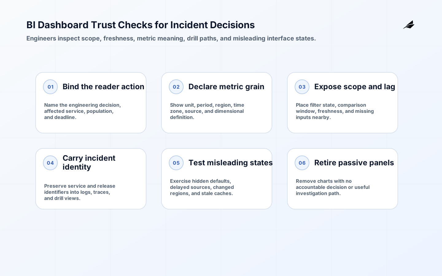
For BI dashboards, treat interaction design as part of data reliability. Put period, filter state, freshness, and unit near the visual; make a drill-through explain where a reader will land; and avoid controls that silently change the population. Test the interface with a real incident or planning review, not a scripted demo. Engineers should be able to tell whether a change in the chart reflects a production event, a model release, or a user-selected scope.
Work through a BI dashboards scenario
Consider a reliability dashboard used during an incident. An engineer sees errors rise after a deployment, but the chart’s default filter has switched to a different region and the time zone is hidden. A useful dashboard makes the current scope, comparison period, source delay, and affected service obvious before the reader draws a conclusion. Provide a drill path to traces or logs with the relevant identifiers already carried through, and preserve a stable incident view for later review. Test this with the engineers who take on-call shifts, including someone unfamiliar with the service. Their ability to explain the signal and reach evidence is a stronger quality check than a polished demonstration.
Key takeaways for BI dashboards
- BI dashboards should start with a bounded decision and a real user action, not a generalized technology promise.
- Make meaning, source authority, freshness, access, and exception handling visible enough for a reader to challenge a result.
- Pilot difficult cases deliberately; clean happy-path data rarely reveals the controls an operating team will need.
- Give business meaning and technical operation clear owners, then use incidents and disputes to improve the data product.
- Use decision latency, drill-through use, dashboard load performance, stale-data notices, metric disputes, and retired charts as signals for a review conversation, not as isolated targets that people can optimize without improving decisions.
Frequently asked questions about BI dashboards
Is BI dashboards mainly a software purchase? No. Software can support the work, but the durable asset is the agreement about decisions, definitions, ownership, and response to failure. How broad should the first release be? Narrow enough that one team can validate it with real work, yet complete enough to include sources, controls, and exceptions. Who should approve a change? The owner of the meaning and the owner of the implementation should both be involved; affected consumers need notice when a change alters an answer. When is it ready to scale? When the team can explain the output, recover from a known failure, and show evidence that the first decision improved.
Check BI dashboards before expanding
Before building the next BI dashboard, shadow the intended decision meeting and note which questions lead to an action, a drill-down, or an external spreadsheet. Build only the visual and interaction path that resolves those questions with governed evidence. Review the result after actual use and remove passive charts. This preserves engineering capacity for dashboards that help teams run systems rather than simply observe them.
Conclusion: make BI dashboards explainable before expanding it
BI dashboards becomes valuable when it helps a person make a timely, defensible decision without concealing the conditions behind the result. Begin with the smallest meaningful workflow, preserve evidence and uncertainty, and give the operating team a way to correct what it learns. That approach makes expansion calmer: each new user or use case inherits a clear model instead of another opaque layer of reporting.