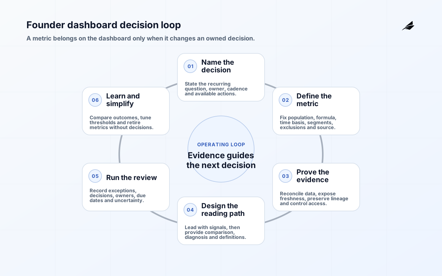
BI dashboards for founders should make recurring business decisions clearer, faster and more accountable. They should not display every metric a company can calculate. A useful founder dashboard shows a small set of signals tied to pricing, cash, customer retention, product adoption, service delivery or hiring; makes timing and uncertainty visible; and provides a controlled path from an exception to the records and owner who can explain it.
The hardest work is not chart selection. It is agreeing what a metric means, which population and period it covers, when it becomes reliable, and what action follows. Use the dashboard adoption guide when usage is the problem, the semantic layer plan when definitions need reuse and the metric layer guide when product and analytics systems need the same measures.
1. Start with founder decisions, not available charts
List the questions the leadership team must answer at a real cadence: Is cash usage changing enough to alter hiring? Are new customers reaching value and staying? Is one acquisition channel producing durable customers? Are service failures threatening renewal? Which product constraint deserves the next investment? For each question, define owner, review cadence, comparison, threshold, diagnostic path and available action. If no plausible action follows, the measure belongs in analysis rather than the primary dashboard.
Separate operating signals from settled financial facts. Product events can appear quickly but change with instrumentation and identity resolution. Finance results follow defined accounting processes and close timing. Label preliminary, estimated and finalized states. Reconcile dashboard figures to the appropriate system without suggesting that an operating dashboard replaces financial records. A visible qualification is better than false precision.
| Founder decision | Primary signal | Diagnostic view | Possible action |
|---|---|---|---|
| Adjust acquisition spend | Cohort acquisition cost and qualified conversion | Channel, campaign, segment and lag | Reallocate budget or change qualification |
| Protect retention | Renewal or retained-use cohort | Reason, plan, account age and product behavior | Customer intervention or product change |
| Manage cash | Cash balance, forecast and material variance | Collections, payroll, commitments and scenarios | Change hiring, timing or collection action |
| Prioritize product | Adoption and successful critical journey | Cohort, version, error and support cause | Fix friction or change roadmap |
| Improve service | Objective attainment and customer-impact minutes | Journey, tenant, dependency and release | Reliability work or supplier escalation |
| Control delivery | Lead time and failed-change impact | Service, change class, queue and rework | Remove constraint or reduce release risk |
2. Design a layered reading path
The first view should answer what changed, compared with what, whether the change is material and who owns follow-up. Use a stable layout and direct labels. Show period, currency, unit, population and freshness next to the number. Use a trend with meaningful comparison rather than a decorative single value. Reserve color for status that is also communicated through text or shape. Do not compress marketing, finance, product and operations into one unprioritized wall.

From signal to diagnosis
Provide one deliberate drill-down per expected question: cohort for retention, channel for acquisition, plan and tenant for service, or cost category for cash. Preserve filters and definitions as the reader moves. Show the total before segments so users can detect selection bias. Link to a definition and data-status view, not directly to an unrestricted raw table. Exploratory analysis remains valuable, but it should not make the recurring operating review unstable.
3. Define metrics as governed products
Create a metric contract with name, purpose, owner, formula, grain, population, source, event or posting time, exclusions, dimensions, update schedule, quality checks and change history. Define edge cases in examples: refunds, reactivations, plan changes, deleted accounts, internal users, test traffic and late events. Version material changes and show their effective date. Never splice incompatible definitions into one trend without a visible break or restatement.
Use a semantic or metric layer when several dashboards and applications need the same definition, but keep business ownership explicit. Code review can protect implementation; it cannot decide whether an active customer means paid, contracted, recently engaged or eligible for renewal. Keep calculation logic testable and reconcile material totals to authoritative systems. Sample individual records after aggregate reconciliation because matching totals can still contain offsetting errors.
W3C Data on the Web Best Practices covers metadata, provenance, data quality, versioning and reuse concepts that transfer well to internal analytics. W3C PROV-O represents entities, activities and agents. In practice, a dashboard result should identify source intervals, transformation or metric version, refresh run and accountable owners so a surprising number can be investigated rather than debated from memory.
| Metric contract field | Example | Why the founder needs it |
|---|---|---|
| Decision purpose | Review whether onboarding changes improve retained activation | Prevents a metric from becoming a vanity score |
| Population | New paid organizations, excluding staff and test tenants | Makes denominator and exclusions visible |
| Time basis | Signup cohort by calendar week; activated within 14 days | Prevents mixing event and reporting periods |
| Formula | Organizations completing three named value events divided by eligible cohort | Makes implementation testable |
| Freshness and status | Daily at 06:00 UTC; last two days provisional | Prevents premature reaction |
| Owner and change | Product owner; metric version 3 effective July 1 | Creates authority and historical context |
4. Build trust, privacy and accessibility into the dashboard
Display data freshness, failed sources, partial periods, known quality incidents and last successful refresh. A dashboard should fail visibly rather than repeat yesterday's result without explanation. Set alerts on material data health conditions and route them to an analytics owner. Maintain a correction procedure: identify affected periods and decisions, publish the corrected result, notify users according to consequence and record the cause and prevention work.
Restrict data by business purpose and role. A founder may need totals without unrestricted customer, employee or compensation detail. Control exports, shared links, subscriptions and cached extracts. Mask sensitive fields in lower environments and support views. The NIST Privacy Framework helps organizations reason about privacy risk from data processing; use it alongside applicable legal, contractual and records requirements rather than assuming internal access has no privacy consequence.
Apply WCAG 2.2 to the web interface: keyboard operation, visible focus, text alternatives, contrast, reflow, status messages, accessible authentication and clear errors. Charts need concise summaries and data access that does not depend on color or pointer hover. Tables need meaningful headers. Test zoom, keyboard and screen-reader journeys, including filters, tooltips, exports and drill-downs. Accessibility also improves resilience in dense, high-pressure reviews.
5. Run the dashboard as an operating review
Use the dashboard in a real weekly or monthly meeting. Begin with exceptions to agreed thresholds, then record the decision, owner, due date and uncertainty. Keep commentary close to the period it explains. Avoid asking every function to narrate every chart. The meeting should choose actions and request deeper analysis where evidence is insufficient. A dashboard that consumes meeting time without changing decisions should lose scope.
Set thresholds from action and observed variation, not arbitrary red and green bands. A threshold should state the condition that changes behavior, account for seasonality or cohort maturity where relevant and identify an owner. Review false alarms and missed material changes. Do not reward teams for making one metric look good when they can shift cost, delay recognition or degrade another outcome. Pair growth, quality, reliability and cash consequences where tradeoffs matter.
Example: a subscription founder reviews new-customer activation by weekly cohort, retained use, support burden and cash collection. A fall in headline activation is isolated to one acquisition channel and a new onboarding version. The team records a product fix and pauses channel spend rather than changing company strategy from the total alone. Two weeks later it compares the affected cohorts and support contacts, documents the outcome and adjusts the threshold.
6. Control metric requests, changes and retirement
Require every new primary metric request to name the decision, action, owner, cadence, definition, source and expected shelf life. Start new measures in an exploratory view until they prove recurring value. Review dashboard usage and decision logs quarterly or after a material business-model change. Remove duplicate charts, stale experiments and metrics without owners. Archive definitions and change history so removal does not erase the evidence behind earlier decisions.
Budget improvements by reduced uncertainty. The highest-value work may be source reconciliation, an explicit provisional state, a safer permission model or a better diagnostic segment rather than another visualization. Monitor refresh reliability, query performance, data cost, support requests and manual correction. Scale platform investment when repeated demand justifies shared capability; a young company should not build an elaborate analytics estate before core definitions and review habits stabilize.
Key takeaways
- Put a metric on the founder dashboard only when it supports a recurring owned decision.
- Show period, population, comparison, freshness and uncertainty beside important values.
- Define formulas, edge cases, source lineage and change history before debating chart style.
- Use layered drill-downs that answer expected questions without destabilizing the review.
- Record actions and outcomes so thresholds and metrics improve from evidence.
- Retire measures that no longer have a decision, owner or trustworthy source.
Founder BI dashboard FAQ
How many metrics should a founder dashboard have? Enough to cover the recurring decisions and no more. Start with a small set of outcomes and balanced constraints, then add a measure only when a real review repeatedly needs it.
Does the dashboard need real-time data? Only when a faster signal changes an action within that window. Reliable daily or weekly data is often more useful for leadership decisions and easier to reconcile.
Should every employee see the founder dashboard? Share decision context broadly where appropriate, but tailor sensitive detail and functional views by purpose. Transparency does not require unrestricted personal or customer-level access.
Can a BI dashboard replace analysis? No. It answers recurring questions consistently and surfaces exceptions. Novel causes, forecasts and strategic choices still require focused analysis, research and judgment.
Who owns a metric? A business owner owns meaning and action; analytics or engineering owners implement and operate it. Material changes need both perspectives and a visible effective date.
Conclusion: make every dashboard signal earn attention
Founders get value from BI dashboards when every signal has a decision, definition, evidence trail and owner. Design the review before the screen, expose uncertainty honestly, investigate through stable drill-downs and remove noise. The result is not a cockpit for everything; it is a dependable instrument for the few decisions that shape the company.