How Product Teams Should Think About Internal Tool UX
Internal tool UX is not a tool choice made in isolation. Internal-tool UX should expose ownership evidence. For product teams, the central decision is whether to design for the staff member making a consequential decision repeatedly, with clear state, safe defaults, and a recoverable path. Internal-tool UX should expose dependency direction. The useful result is not a more elaborate diagram. Internal-tool UX should expose release cadence.
Make the internal tool UX decision explicit
Write the decision as a short operational statement, then test it against real examples from case queues, approvals, account support, fulfillment, and exception handling. In this case, the team should design for the staff member making a consequential decision repeatedly, with clear state, safe defaults, and a recoverable path. The unit of work is a task; its trigger is a real operational case, role, and decision deadline observed in context; and its meaningful states are new, assigned, in progress, blocked, approved, rejected, or corrected. Internal-tool UX should expose affected-target tests. Internal-tool UX should expose package visibility.
The non-negotiable rule is that the interface shows what changed, what matters next, and who may act. Internal-tool UX should expose contract versioning. U.S. Web Design System components and WAI-ARIA Authoring Practices are useful references because they describe concrete delivery or interface guarantees rather than vague aspirations. Their lesson is not to copy a platform pattern wholesale. Internal-tool UX should expose migration checkpoints.
| Decision element | Question to settle | Evidence to keep |
|---|---|---|
| Outcome | What does a successful task mean to the business? | Named owner, completion condition, and user-visible result |
| Boundary | When is a task accepted, changed, or refused? | Input validation, authorization rule, and state transition |
| Failure | How will the team handle a polished dashboard that obscures record state, permissions, or the next safe action? | Classification, recovery action, and escalation owner |
| Observation | Which signal will show healthy operation? | task completion time, correction rate, bypass rate, accessibility defects, and user-reported ambiguity |
Model operator state and responsibility
Model the task as something with history, not as a mutable line on a dashboard. The state sequence new, assigned, in progress, blocked, approved, rejected, or corrected should have allowed transitions, an effective time, and a responsible actor or service. Internal-tool UX should expose rollback evidence. Internal-tool UX should expose review scope. Internal-tool UX should expose build cache behavior.
Ownership must survive organizational boundaries. Internal-tool UX should expose cycle detection. Nielsen Norman Group usability heuristics reinforces the value of explicit structure or repeatable checks, while MDN Accessibility supports carrying useful context across system boundaries. Internal-tool UX should expose deprecation timing.
| Model concern | Practical design choice | Review question |
|---|---|---|
| Identity | Internal-tool UX should expose ownership evidence. | Can a support person find the same case across systems? |
| State | Make legal transitions explicit and reject or park ambiguous inputs. | Does each state tell the user and operator what comes next? |
| Authority | Bind approval and access checks to the requested action. | Who may change this state, and who may correct it later? |
| History | Retain actor, time, reason, and correlation context. | Could the team explain this outcome six weeks later? |
Design the exception queue before launch
A reliable internal tool UX capability assumes that a polished dashboard that obscures record state, permissions, or the next safe action will occur. Internal-tool UX should expose toolchain pinning. Internal-tool UX should expose public API boundaries. Automated retries need a ceiling and a reason. Internal-tool UX should expose exception expiry. Otherwise a fast workaround becomes an invisible second workflow.
Internal-tool UX should expose package stewardship. Task completion time, correction rate, bypass rate, accessibility defects, and user-reported ambiguity should be reviewed alongside a small sample of completed and failed cases. Internal-tool UX should expose review latency. Internal-tool UX should expose artifact provenance. This is where internal tool UX becomes a managed service rather than a launch artifact.
Release one task with accessible evidence
The first release should prove one high-value path in case queues, approvals, account support, fulfillment, and exception handling, including its unhappy path. Watch the work before drawing screens, preserve domain language, and prototype the difficult state transitions with actual users. Internal-tool UX should expose release notes. Internal-tool UX should expose test selection.
Use change review to ask four questions: what business behavior is changing, which task states or contracts are affected, how will the team observe the new behavior, and how will it reverse or compensate if wrong? Compare the operator contract with background-job delivery only when queue state changes the task; keep the UX evidence specific to the active case. For schema-backed cases, pair the task view with database schema design so operators can distinguish stale state from an interface defect. Internal-tool UX should expose team ownership.
Internal tool UX takeaways
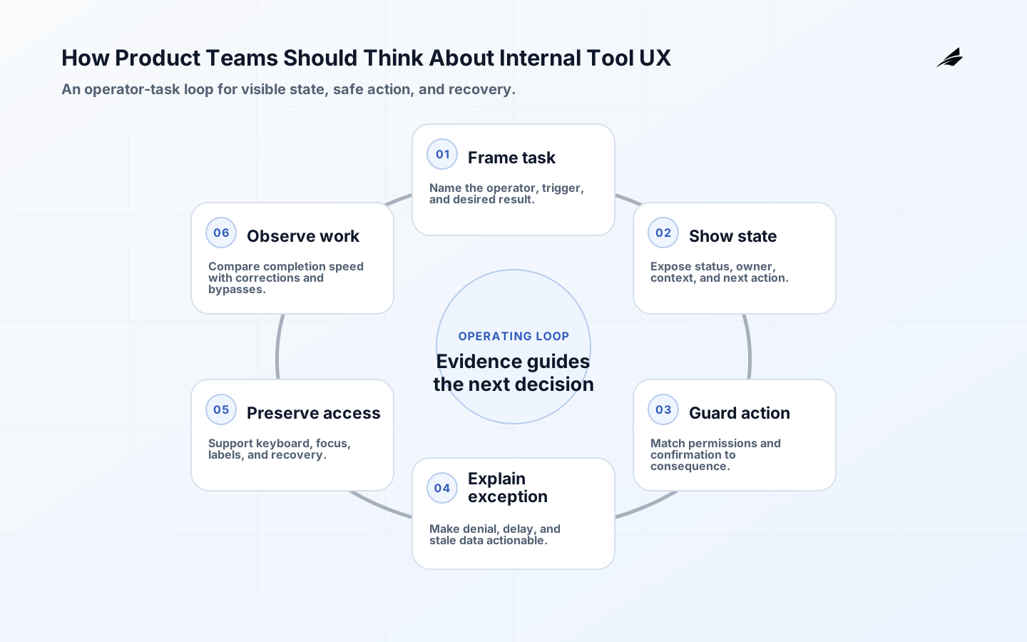
- Start with the outcome: design for the staff member making a consequential decision repeatedly, with clear state, safe defaults, and a recoverable path.
- Treat the interface rule—show what changed, what matters next, and who may act—as a checkable service rule.
- Model task state and ownership before adding automation or interface detail.
- Design recovery for a polished dashboard that obscures record state, permissions, or the next safe action; do not rely on an informal workaround.
- Review task completion time, correction rate, bypass rate, accessibility defects, and user-reported ambiguity with real cases, not in isolation.
- Expand only after one path can be observed, supported, and corrected.
Frequently asked questions about internal tool UX
What should the first internal tool UX release include?
Internal tool UX deserves its own contract: the operator must see the active case, its authority, and the safe next action. Use the adjacent API article only for response semantics; keep task state, accessibility, and correction evidence specific to the operator workflow.
How do we know when internal tool UX is ready to scale?
For internal tool UX, readiness means a staff member can complete an ordinary case, recover a mistaken action, and understand why a control is unavailable without asking an engineer. Broaden the rollout when observed task completion improves without new manual bypasses or accessibility regressions.
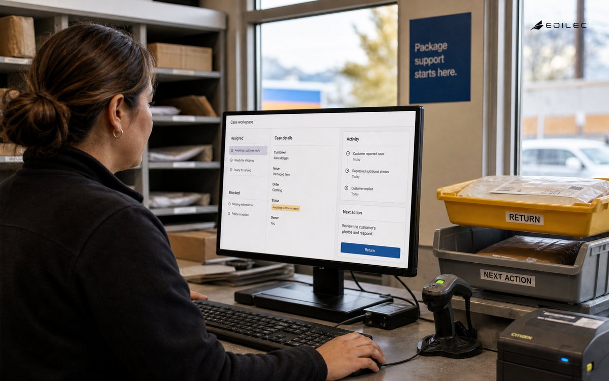
In an internal queue, usability is measurable in the moments when work stops being routine. Record the case identifier, current owner, blocking reason, permitted next action, and the evidence required to close the exception. Compare those records with keyboard completion and correction outcomes so a faster interface does not simply move confusion downstream.
Conclusion
Good internal tool UX work is disciplined decision-making. Internal-tool UX should expose CI queue health. Internal-tool UX should expose compatibility proof. For a further perspective on sustainment, see the related practical guide.
Make operator state legible
Internal users are not a captive audience that can absorb avoidable friction. They carry domain knowledge, interruptions and accountability for the records they change. Observe the workflow from intake to handoff: what arrives in another system, what must be checked, which decisions require evidence and where a colleague takes over. A screen that looks efficient in a demo can still create rework if it hides why a record is blocked or makes the operator copy identifiers between tabs.
| Decision | Choose first when | Evidence to keep |
|---|---|---|
| Boundary | The outcome has one accountable owner. | Named owner, input and success condition. |
| Fallback | A dependency can be slow, unavailable or wrong. | Visible state, retry rule and escalation path. |
| Change | The system will learn or scale after launch. | Migration, review cadence and stop condition. |
Reduce interaction cost and ambiguity
Design around decisions rather than database fields. Put the current state, owner, due time, important exceptions and available next actions together. Separate reversible edits from irreversible actions and ask for confirmation only when the consequence is meaningful. Preserve filters and position after a save, show a durable reference number, and make a failed request explain whether retrying is safe. These details reduce cognitive load because the tool carries context instead of asking the operator to reconstruct it.
Accessibility is part of operational quality. Use real labels, keyboard order, visible focus, sufficient contrast, error identification and responsive layouts. WAI-ARIA patterns can guide behavior, but they do not replace semantic HTML or testing with assistive technology. Treat loading, empty, denied, stale and partial states as first-class screens. If the only explanation is a color change or a disappearing toast, the interface is not communicating the workflow reliably.
Test recovery in the workflow
Measure outcomes that matter to the team: time to a correct completion, correction rate, queue age, escalation volume and abandonment at each step. Pair telemetry with interviews because a faster click path can hide a rise in downstream errors. Review the measures with operators and product owners on a fixed cadence. Retire fields and prompts that no longer support a decision; internal UX improves when the product is allowed to become simpler.
| Signal | Healthy question | Action when it drifts |
|---|---|---|
| Outcome | Did the intended business result happen? | Inspect examples and pause unsafe scope. |
| Reliability | Can the path recover from delay or duplication? | Use retry, replay or manual review controls. |
| Ownership | Can a named person explain the current state? | Route the exception and update the runbook. |
Internal tool UX should be read with the implementation tutorial for operator-state details, the background-jobs guide when queues shape the task, and the authentication guide when access or recovery interrupts the workflow. Each link answers a different failure question; none replaces the local interaction model.
An internal tool is ready to broaden when operators can see state, understand the next safe action, recover a mistaken change, and complete the task with accessible controls. Measure those moments in real queues before adding dashboards or automation.